0

NOTE that I'm not asking how to align items in navbr menu (left or right), but how to dynamically move items from navbar to dropdown.

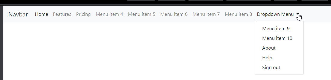
I'm using Bootstrap 4.1 in my project. My top main menu contains many links. The last item is a dropdown which contains additional links: Bootstrap navbar

I want, when resizing the window, the right items for which doesn't have enough space in the header, to be moved into the dropdown item.

What I want: Bootstrap wanted functionality

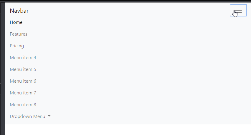
But when resizing, the items are shrinking. Then, for "md" (and smaller) breakpoints, the default navbar functionality is activated: Bootstrap default functionality Bootstrap mobile navbar

Solutions with flexbox are acceptable, too. Link to simple demo with default Bootstrap navbar: CodePen

<nav class="navbar navbar-expand-lg navbar-light bg-light">
  <a class="navbar-brand" href="#">Navbar</a>
  <button class="navbar-toggler" type="button" data-toggle="collapse" data-target="#navbarNavDropdown" aria-controls="navbarNavDropdown" aria-expanded="false" aria-label="Toggle navigation">
    <span class="navbar-toggler-icon"></span>
  </button>
  <div class="collapse navbar-collapse" id="navbarNavDropdown">
    <ul class="navbar-nav">
      <li class="nav-item active">
        <a class="nav-link" href="#">Home <span class="sr-only">(current)</span></a>
      </li>
      <li class="nav-item">
        <a class="nav-link" href="#">Features</a>
      </li>
      <li class="nav-item">
        <a class="nav-link" href="#">Pricing</a>
      </li>
      <li class="nav-item">
        <a class="nav-link" href="#">Menu item 4</a>
      </li>
      <li class="nav-item">
        <a class="nav-link" href="#">Menu item 5</a>
      </li>
      <li class="nav-item">
        <a class="nav-link" href="#">Menu item 6</a>
      </li>
      <li class="nav-item">
        <a class="nav-link" href="#">Menu item 7</a>
      </li>
      <li class="nav-item">
        <a class="nav-link" href="#">Menu item 8</a>
      </li>
      <li class="nav-item dropdown">
        <a class="nav-link dropdown-toggle" href="#" id="navbarDropdownMenuLink" role="button" data-toggle="dropdown" aria-haspopup="true" aria-expanded="false">
          Dropdown Menu
        </a>
        <div class="dropdown-menu" aria-labelledby="navbarDropdownMenuLink">
          <a class="dropdown-item" href="#">Menu item 9</a>
          <a class="dropdown-item" href="#">Menu item 10</a>
          <a class="dropdown-item" href="#">About</a>
          <a class="dropdown-item" href="#">Help</a>
          <a class="dropdown-item" href="#">Sign out</a> 
        </div>
      </li>
    </ul>
  </div>
</nav>

Thank you!

EDIT:

This is the window's resize function on which I'm currently working:

let addMenu = $("#navbarNavDropdown > ul >li.dropdown"),
    addMenuList = addMenu.children("ul"),
    menuItems = $("#navbarNavDropdown > ul > li:visible:not('.dropdown')");

function _resize() {
    var itemsWidth = 0,
        startWrap = false,
        navWidth = $("#navbarNavDropdown").width() - addMenu.width();
    menuItems.each(function () {
        if (startWrap == false) {
            if (itemsWidth + $(this).width() < navWidth) {
                itemsWidth += $(this).width();
            }
            else {
                startWrap = true;
                addMenuList.prepend(this);
            }
        }
        else {
            addMenuList.prepend(this);
        }
    });
}
window.onresize = _resize;

Link above has been updated, too.

It works when making the screen smaller, but I need to implement:

  • when increasing the screen's width;
  • in "md" (or smaller) breakpoint, to use the default bootstrap's functionality
Pepo
  • 135
  • 1
  • 10
  • @Zim, I saw that you have marked the question as "Duplicate", but I'm not asking how to align items in navbr menu (left or right), but how to dynamically move items from navbar to dropdown. – Pepo Oct 02 '18 at 11:24
  • The post has been updated with simple code. – Pepo Oct 02 '18 at 12:29

2 Answers2

1

Instead use height to detect when the Navbar items have wrapped. You'll may need to adjust the JS to accomodate the other menu items (About, Help, Sign-out). Here's the jQuery function for Bootstrap 4...

var autocollapse = function (menu,maxHeight) {

    var nav = $(menu);
    var navHeight = nav.innerHeight();
    if (navHeight >= maxHeight) {
        $(menu + ' .dropdown').removeClass('d-none');
        while (navHeight > maxHeight) {
            var children = nav.children(menu + ' li:not(:last-child)');
            var count = children.length;
            $(children[count - 1]).prependTo(menu + ' .dropdown-menu');
            navHeight = nav.innerHeight();
        }
    }
    else {
        var collapsed = $(menu + ' .dropdown-menu').children(menu + ' li');

        if (collapsed.length===0) {
          $(menu + ' .dropdown').addClass('d-none');
        }

        while (navHeight < maxHeight && (nav.children(menu + ' li').length > 0) && collapsed.length > 0) {
            collapsed = $(menu + ' .dropdown-menu').children('li');
            $(collapsed[0]).insertBefore(nav.children(menu + ' li:last-child'));
            navHeight = nav.innerHeight();
        }

        if (navHeight > maxHeight) { 
            autocollapse(menu,maxHeight);
        }
    }
};


$(document).ready(function () {

    // when the page laods
    autocollapse('#nav',50); 

    // when the window is resized
    $(window).on('resize', function () {
        autocollapse('#nav',50); 
    });

});

Demo: https://www.codeply.com/go/wKWHgsMXah


Related: Bootstrap navbar hide menu elements when resizing

Carol Skelly
  • 351,302
  • 90
  • 710
  • 624
  • 1
    Thank you, @Zim! Yes, it works correctly! I didn't write before, because I want to add my custom changes and then to upload the updated demo. I have used your code + some additional changes: - Add "fixed" items in dropdown menu, regardless the screen resolution; - On mobile, move out all items from the dropdown (to work with default Bootstrap's mobile navbar); - Add a dropdown-divider when resizing; [Demo here](https://codepen.io/anon/pen/ePpVZe) – Pepo Oct 03 '18 at 11:45
0

Above response from @Zim works as I expected. Thank you, @Zim! I've made some changes for my project's needs, like:

  • Add "fixed" items in dropdown menu, regardless the screen resolution. They will be always in dropdown;
  • On mobile, move out all items from the dropdown, to work with default Bootstrap's mobile navbar;
  • Add a dropdown-divider, to show above the "fixed" items.

Demo here

$(function() {
var autocollapse = function (menu, maxHeight) {
    var nav = $(menu);

    if ($(window).width() <= 768) {
        $(menu + ' .additional-dropdown-menu').children(menu + ' li').each(function() {
            _moveDropdownItemToNavbar(this, nav, menu);
        });
        $(menu + ' .additional-menu').hide();
    }
    else {
        $(menu + ' .additional-menu').show();
        var navHeight = nav.innerHeight();
        if (navHeight >= maxHeight) {
            while (navHeight > maxHeight) {
                var children = nav.children(menu + ' li:not(:last-child)');
                var count = children.length;
                $(children[count - 1]).prependTo(menu + ' .additional-dropdown-menu').removeClass("nav-item").find("a").toggleClass("nav-link dropdown-item");
                navHeight = nav.innerHeight();
                $(menu + ' .additional-dropdown-menu .extra-divider').removeClass("d-md-none"); //show the extra divider when items is added to the additional dropdown
            }
        }
        else {
            var collapsed = $(menu + ' .additional-dropdown-menu').children(menu + ' li');

            if (collapsed.not(".additional-item-locked").length == 0) { //if there are only locked items - hide the extra divider. 
                $(menu + ' .additional-dropdown-menu .extra-divider').addClass("d-md-none");
            }
            while (navHeight < maxHeight && (nav.children(menu + ' li').length > 0) && collapsed.length > 0) {
                collapsed = $(menu + ' .additional-dropdown-menu').children('li:not(.additional-item-locked)');
                _moveDropdownItemToNavbar(collapsed[0], nav, menu);
                navHeight = nav.innerHeight();
            }

            if (navHeight > maxHeight) {
                autocollapse(menu, maxHeight);
            }
        }
    }
};

function _moveDropdownItemToNavbar(item, nav, menu) {
    $(item).insertBefore(nav.children(menu + ' li:last-child')).addClass("nav-item").find("a").toggleClass("nav-link dropdown-item");
}

autocollapse('#navbar > ul', 50);

// when the window is resized
$(window).on('resize', function () {
    autocollapse('#navbar > ul', 50);
});

});

Pepo
  • 135
  • 1
  • 10