0

Having trouble with something that I'm sure is simple but can't figure it out.

On the site https://maxdupain.com.au homepage there is a group of two rows of images that link to the different galleries. Each of these resides within a div and is set to equal width (100% / 7).

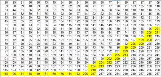
The issue I'm having is that on some screen widths the second row shows an empty space for the first image and the last image in that row carries over to the third row.

See image below. Hope someone can please advise. I noticed on the body there was a weird padding-right:10px which I removed but it doesn't seem to do anything. When I cross it out in inspector it seems to work but then when I resize the window I see the issue again.

Hope that makes sense and appreciate your support.
enter image description here

Saiyan Prince
  • 3,930
  • 4
  • 28
  • 71
  • #featured-categories {display: flex; flex-wrap: wrap;} The floats for the flex items will be ignored/can be removed. – Gerard Oct 03 '18 at 11:17
  • Perfect @Gerard. Sorry this wasn't listed as an answer so I can't mark it as the answer. Will respond as answer though. – Tim Sutherland Oct 06 '18 at 22:42

2 Answers2

1

Add height to your fp-category-container class.

.fp-category-container {
    width: calc(100% / 7);
    height: 143px; // give this a value based on your use case
}
Constantin Chirila
  • 1,979
  • 2
  • 19
  • 33
ashish singh
  • 6,526
  • 2
  • 15
  • 35
0

@Gerard solution was the most elegant. Thanks!

#featured-categories {
  display: flex;
  flex-wrap: wrap;
}
David Thomas
  • 249,100
  • 51
  • 377
  • 410