Goal
Using JHipster v5.0.1, Bootstrap v4.0.0
I want to fix the first column and scroll if necessary when the screen size become smaller.
++ The first column can contain various content-length. I want its size to be coherent with its content-length.
  <table class="table table-striped table-bordered table-responsive">

        <thead>
            <th> Title to be fixed </th>
            <th> Title to be scrolled A</th>
            <th> Title to be scrolled B</th>
            <th> Title to be scrolled C</th>
            <th> Title to be scrolled E</th>
            <th> Title to be scrolled F</th>
            <th> Title to be scrolled G</th>
            <th> Title to be scrolled H</th>
            <th> Title to be scrolled I</th>
            <th> Title to be scrolled J</th>
            <th> Title to be scrolled K</th>
            <th> Title to be scrolled L</th>
            <th> Title to be scrolled M</th>
            <th> Title to be scrolled N</th>
            <th> Title to be scrolled O</th>
            <th> Title to be scrolled P</th>
            <th> Title to be scrolled Q</th>
            <th> Title to be scrolled R</th>
            <th> Title to be scrolled S</th>
            <th> Title to be scrolled T</th>
            <th> Title to be scrolled U</th>
            <th> Title to be scrolled V</th>
            <th> Title to be scrolled W</th>
            <th> Title to be scrolled X</th>
            <th> Title to be scrolled Y</th>
            <th> Title to be scrolled Z</th>
        </thead>

        <tbody>
            <td> Content to be fixed </td>
            <td> Content to be scrolled A</td>
            <td> Content to be scrolled B</td>
            <td> Content to be scrolled C</td>
            <td> Content to be scrolled E</td>
            <td> Content to be scrolled F</td>
            <td> Content to be scrolled G</td>
            <td> Content to be scrolled H</td>
            <td> Content to be scrolled I</td>
            <td> Content to be scrolled J</td>
            <td> Content to be scrolled K</td>
            <td> Content to be scrolled L</td>
            <td> Content to be scrolled M</td>
            <td> Content to be scrolled N</td>
            <td> Content to be scrolled O</td>
            <td> Content to be scrolled P</td>
            <td> Content to be scrolled Q</td>
            <td> Content to be scrolled R</td>
            <td> Content to be scrolled S</td>
            <td> Content to be scrolled T</td>
            <td> Content to be scrolled U</td>
            <td> Content to be scrolled V</td>
            <td> Content to be scrolled W</td>
            <td> Content to be scrolled X</td>
            <td> Content to be scrolled Y</td>
            <td> Content to be scrolled Z</td>
        </tbody>

    </table>
I would like something like this but with a fixed first column:
Try
I tried several codes I found in stackoverflow and more particularly in this issue: how do I create an HTML table with fixed/frozen left column and scrollable body?
However, most of them use a table fixed width and with this kind of style in the td style="width:200px". It is a problem for me because I want the table to adapt to the size of the screen user and not the table being size-fixed. Also, most of the codes I found get rid of the table-responsive class which I would like to keep for the scrollling activation because it adapts with table size and screen size.
Try 2
I also tried to use solutions from here of scooterlord for example: How to make fixed header table with table and cell width in percents in CSS?
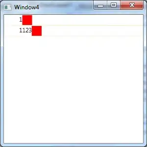
and I can't make it work in my page. The headers do not appear. Here is an overview:
And if I can finally make them appear, I loose all advantages of table bootstrap classes?!
Try 3
    .table-centered td, th {
    text-align: center !important;
    vertical-align: middle !important;
    white-space: nowrap !important;
    padding: 0.2rem !important;
}

input {
    vertical-align: middle;
    text-align: center;
}

.position-fixed {
    background-color: white;
}


<div>
             <table class="table table-striped table-bordered table-responsive">
                <thead>
                <tr>

                    <th class="position-fixed"> Title to be fixed </th>
                    <th> Title to be scrolled A</th>
                    <th> Title to be scrolled B</th>
                    <th> Title to be scrolled C</th>
                    <th> Title to be scrolled E</th>
                    <th> Title to be scrolled F</th>
                    <th> Title to be scrolled G</th>
                    <th> Title to be scrolled H</th>
                    <th> Title to be scrolled I</th>
                    <th> Title to be scrolled J</th>
                    <th> Title to be scrolled K</th>
                    <th> Title to be scrolled L</th>
                    <th> Title to be scrolled M</th>
                    <th> Title to be scrolled N</th>
                    <th> Title to be scrolled O</th>
                    <th> Title to be scrolled P</th>
                    <th> Title to be scrolled Q</th>
                    <th> Title to be scrolled R</th>
                    <th> Title to be scrolled S</th>
                    <th> Title to be scrolled T</th>
                    <th> Title to be scrolled U</th>
                    <th> Title to be scrolled V</th>
                    <th> Title to be scrolled W</th>
                    <th> Title to be scrolled X</th>
                    <th> Title to be scrolled Y</th>
                    <th> Title to be scrolled Z</th>
                </tr>
                </thead>

                <tbody>
                <tr>
                    <td class="position-fixed"> Content to be fixed </td>
                    <td> Content to be scrolled A</td>
                    <td> Content to be scrolled B</td>
                    <td> Content to be scrolled C</td>
                    <td> Content to be scrolled E</td>
                    <td> Content to be scrolled F</td>
                    <td> Content to be scrolled G</td>
                    <td> Content to be scrolled H</td>
                    <td> Content to be scrolled I</td>
                    <td> Content to be scrolled J</td>
                    <td> Content to be scrolled K</td>
                    <td> Content to be scrolled L</td>
                    <td> Content to be scrolled M</td>
                    <td> Content to be scrolled N</td>
                    <td> Content to be scrolled O</td>
                    <td> Content to be scrolled P</td>
                    <td> Content to be scrolled Q</td>
                    <td> Content to be scrolled R</td>
                    <td> Content to be scrolled S</td>
                    <td> Content to be scrolled T</td>
                    <td> Content to be scrolled U</td>
                    <td> Content to be scrolled V</td>
                    <td> Content to be scrolled W</td>
                    <td> Content to be scrolled X</td>
                    <td> Content to be scrolled Y</td>
                    <td> Content to be scrolled Z</td>
                </tr>
                </tbody>

            </table>
        </div>
Still not good, the cell sizes are not coherent with the rest of the table. And the first columns found after the "fixed" one is hidden.
Try 4
Ok this works. Not perfect but better than nothing. However, the position is fixed both in x and y axis which is a problem. Is there a way to fix it only in x and not in y?
.table-centered td, th {
text-align: center !important;
vertical-align: middle !important;
white-space: nowrap !important;
/*padding: 0.2rem !important;*/
}

.second-column {
    padding-left: 20rem !important;
}

input {
    vertical-align: middle;
    text-align: center;
}

.position-fixed {
    background-color: white;
    width: 18rem;
}

    <div>
         <table class="table table-striped table-bordered table-responsive table-centered">

                <thead>
                <tr>

                    <th class="position-fixed"> Title to be fixed </th>
                    <th class="second-column"> Title to be scrolled A</th>
                    <th> Title to be scrolled B</th>
                    <th> Title to be scrolled C</th>
                    <th> Title to be scrolled E</th>
                    <th> Title to be scrolled F</th>
                    <th> Title to be scrolled G</th>
                    <th> Title to be scrolled H</th>
                    <th> Title to be scrolled I</th>
                    <th> Title to be scrolled J</th>
                    <th> Title to be scrolled K</th>
                    <th> Title to be scrolled L</th>
                    <th> Title to be scrolled M</th>
                    <th> Title to be scrolled N</th>
                    <th> Title to be scrolled O</th>
                    <th> Title to be scrolled P</th>
                    <th> Title to be scrolled Q</th>
                    <th> Title to be scrolled R</th>
                    <th> Title to be scrolled S</th>
                    <th> Title to be scrolled T</th>
                    <th> Title to be scrolled U</th>
                    <th> Title to be scrolled V</th>
                    <th> Title to be scrolled W</th>
                    <th> Title to be scrolled X</th>
                    <th> Title to be scrolled Y</th>
                    <th> Title to be scrolled Z</th>
                </tr>
                </thead>

                <tbody>
                <tr>
                    <td class="position-fixed"> Content to be fixed </td>
                    <td class="second-column"> Content to be scrolled A</td>
                    <td> Content to be scrolled B</td>
                    <td> Content to be scrolled C</td>
                    <td> Content to be scrolled E</td>
                    <td> Content to be scrolled F</td>
                    <td> Content to be scrolled G</td>
                    <td> Content to be scrolled H</td>
                    <td> Content to be scrolled I</td>
                    <td> Content to be scrolled J</td>
                    <td> Content to be scrolled K</td>
                    <td> Content to be scrolled L</td>
                    <td> Content to be scrolled M</td>
                    <td> Content to be scrolled N</td>
                    <td> Content to be scrolled O</td>
                    <td> Content to be scrolled P</td>
                    <td> Content to be scrolled Q</td>
                    <td> Content to be scrolled R</td>
                    <td> Content to be scrolled S</td>
                    <td> Content to be scrolled T</td>
                    <td> Content to be scrolled U</td>
                    <td> Content to be scrolled V</td>
                    <td> Content to be scrolled W</td>
                    <td> Content to be scrolled X</td>
                    <td> Content to be scrolled Y</td>
                    <td> Content to be scrolled Z</td>
                </tr>
                </tbody>

            </table>
        </div>
Do you know a way to keep advantage of a table-responsive table and at the same time, be able to keep a column fixed? Please?
Thanks,
Manuela


