31

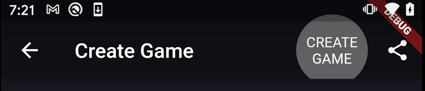
I am aware that I can use IconButton in the actions of the AppBar in Flutter. But instead of the icon, I'd like the user to see the words 'Save' or 'Back' or 'Cancel' and click on them in the AppBar. How can I achieve this? Here is part of my code that shows the AppBar. Instead of the save Icon, I'd like to use 'Save'

return Scaffold(
    appBar: AppBar(
      leading: IconButton(icon: Icon(Icons.arrow_back),
      tooltip: "Cancel and Return to List",
      onPressed: () {
        Navigator.pop(context, true);
      },
    ),
      automaticallyImplyLeading: false,
      title: Text(title),
      actions: <Widget>[

        IconButton(
          icon: Icon(Icons.save),
          tooltip: "Save Todo and Retrun to List",
          onPressed: () {
            save();
          },
        )
      ],
    ),//AppBar
RRy
  • 433
  • 1
  • 5
  • 15
  • You can Use FlatButton.icon(onPressed: (){save();}, icon: Icon(Icons.save), label: 'Save'); Instead of Iconbutton. – anmol.majhail Oct 09 '18 at 06:21
  • Thank you so much! I needed a flat button actually. – RRy Oct 09 '18 at 06:59
  • But it didn't work for the arrow_back – RRy Oct 09 '18 at 07:06
  • to be exact: there is not enough space for word 'cancel' in the leading section instead of the arrow_back – RRy Oct 09 '18 at 07:14
  • For those who want an icon instead of text, see [How to add icon to AppBar in Flutter](https://stackoverflow.com/questions/57941227/how-to-add-icon-to-appbar-in-flutter) – Suragch Oct 13 '19 at 04:33
  • **ElevatedButton** will workout instead of TextButton or IconButton to display text with click action in Appbar's actions menu – Deva Mar 25 '23 at 17:49

6 Answers6

53

You can use FlatButton within an AppBar's actions list:

appBar: AppBar(
  title: Text("Test Screen"),
  actions: <Widget>[
    FlatButton(
      textColor: Colors.white,
      onPressed: () {},
      child: Text("Save"),
      shape: CircleBorder(side: BorderSide(color: Colors.transparent)),
    ),
  ],
),

onPressed must be defined or the button will appear disabled. Also note that by default the shape of the button will create a filled rectangle for the InkWell effect. By setting the shape property to CircleBorder, we get a nicer effect for the pressed state.

E.g.

Not pressed:

Pressed:

Sandy Chapman
  • 11,133
  • 3
  • 58
  • 67
  • 3
    FlatButton() has been replaced by TextButton() [docs] (https://docs.flutter.dev/release/breaking-changes/buttons#:~:text=The%20FlatButton%2C%20RaisedButton%20and%20OutlineButton%20widgets%20have%20been%20replaced%20by%20TextButton%2C%20ElevatedButton%2C%20and%20OutlinedButton%20respectively.) – Umberto Fontanazza Sep 25 '22 at 23:40
12

Use TextButton:

appBar: AppBar(
  actions: <Widget>[
    TextButton(
      onPressed: () {},
      child: Text('Save'),
    ),
  ],
)
CopsOnRoad
  • 237,138
  • 77
  • 654
  • 440
5

If you have short string then you can pass Text widget in place of Icon into the IconButton.icon argument:

IconButton(
  icon: Text(
    "Save",
    style: Theme.of(context).textTheme.button.apply(
      color: Theme.of(context).appBarTheme.actionsIconTheme.color,
    ),
  ),
  onPressed: _save,
),

Unfortunately, it will not work for a longer text like Cancel.

wrozwad
  • 2,610
  • 1
  • 30
  • 38
  • 2
    This works but you have to change the icon size. IconButton( iconSize: 50, icon: Text("DONE"), ), – Pedro Romão Apr 28 '20 at 18:03
  • Agreed. By default it will work for most single letters (e.g. R, S) but not for longer ones like 'm'. – rjh Nov 08 '21 at 20:19
5

It's the second time I come to this thread to find a solution. I actually had upvoted a few answers that I found interesting.

@sosite solution's is almost perfect and changing the iconSize allows to display longer texts. But, it's not perfect because the button's splash radius will be too large.

The best approach is using the constraints: BoxConstraints(width: ...). It will mimic the default IconButton's splash radius.

We can use bigger texts, multi-world texts and align the text to the center to be perfectly aligned.

IconButton(
            constraints: BoxConstraints.expand(width: 80),
            icon: Text('CREATE GAME', textAlign: TextAlign.center),
            onPressed: () {},
          ),

If the text is cut, increase the width value :)

enter image description here

Pedro Romão
  • 2,285
  • 28
  • 22
1

The key is to use Center to wrap your control and give it a little space to the right when the control is the most right one. Whatever is inside is not important.

AppBar(
      title: Text('The tile'),
      actions: [Center(
        child: Padding(
          padding: const EdgeInsets.fromLTRB(0,0,8,0),
          child: InkWell(
            onTap: (){},
            child: Text(
              'Send',
              textScaleFactor: 1.5,
              style: TextStyle(
                color: Colors.white,
              ),
            ),
          ),
        ),
      )],
    ),
Eric Yuan
  • 1,213
  • 11
  • 13
-3

Use new version Flutter 2.0

appBar: AppBar(
  title: Text(""),
  actions: <Widget>[
    TextButton(
      textColor: Colors.white,
      onPressed: () {},
      child: Text(""),
      shape: CircleBorder(side: BorderSide(color: )),
    ),
  ],
),