2

I'm trying to get something like:

goal

I'm using Bulma and currently I'm using Columns with is_multiline option. But the only thing I can get is something like:

what I have now

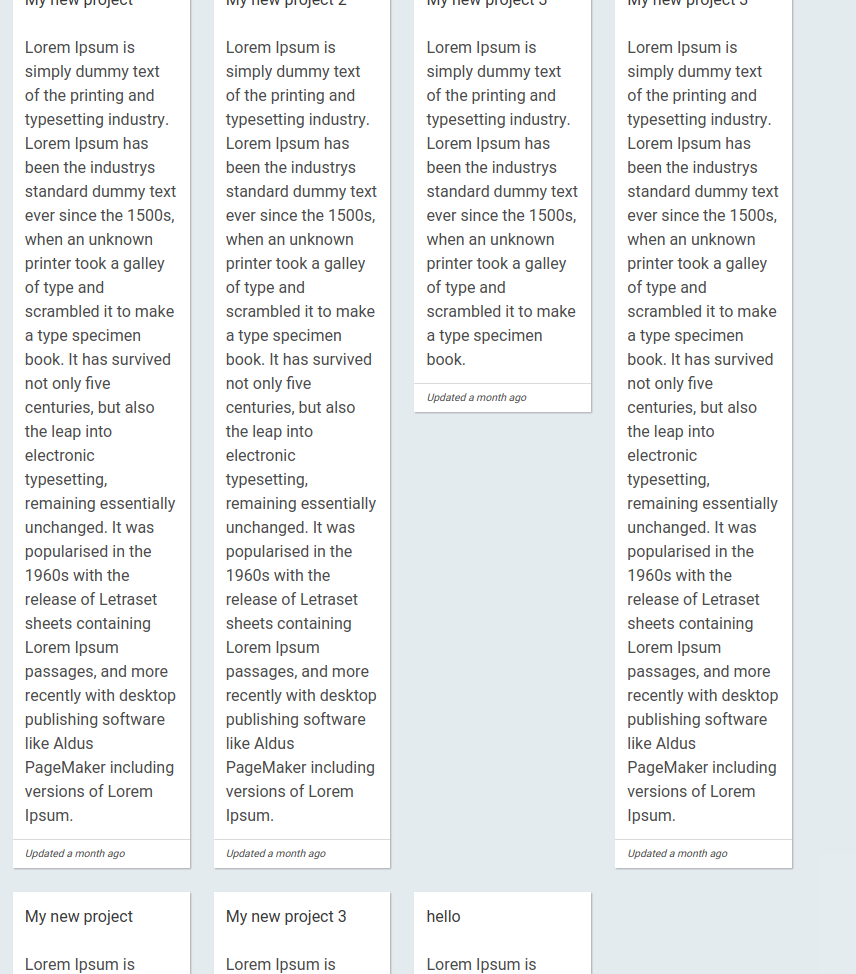
I would like to remove the gap between the Cards, I guess using more flexbox options. It has to be responsive as well.

.card-columns {
  column-count: 1;
  column-gap: 1.5rem;
  padding: 1.5rem;
}

.card-columns .card {
  display: inline-block;
  width: 100%;
  margin-bottom: 1.5rem;
}

.columns-6 {
    column-count: 6;
  }
  .columns-5 {
    column-count: 5;
  }
  .columns-4 {
    column-count: 4;
  }
  .columns-3 {
    column-count: 3;
  }
  .columns-2 {
    column-count: 2;
  }
  .columns-1 {
    column-count: 1;
  }

  @media (max-width: 768px) {
    .columns-6-mobile {
      column-count: 6;
    }
    .columns-5-mobile {
      column-count: 5;
    }
    .columns-4-mobile {
      column-count: 4;
    }
    .columns-3-mobile {
      column-count: 3;
    }
    .columns-2-mobile {
      column-count: 2;
    }
    .columns-1-mobile {
      column-count: 1;
    }
  }

  @media (min-width: 769px) { 
    .columns-6-tablet {
      column-count: 6;
    }
    .columns-5-tablet {
      column-count: 5;
    }
    .columns-4-tablet {
      column-count: 4;
    }
    .columns-3-tablet {
      column-count: 3;
    }
    .columns-2-tablet {
      column-count: 2;
    }
    .columns-1-tablet {
      column-count: 1;
    }
  }

  @media (min-width: 1024px) { 
    .columns-6-desktop {
      column-count: 6;
    }
    .columns-5-desktop {
      column-count: 5;
    }
    .columns-4-desktop {
      column-count: 4;
    }
    .columns-3-desktop {
      column-count: 3;
    }
    .columns-2-desktop {
      column-count: 2;
    }
    .columns-1-desktop {
      column-count: 1;
    }
  }

  @media (min-width: 1216px) { 
    .columns-6-widescreen {
      column-count: 6;
    }
    .columns-5-widescreen {
      column-count: 5;
    }
    .columns-4-widescreen {
      column-count: 4;
    }
    .columns-3-widescreen {
      column-count: 3;
    }
    .columns-2-widescreen {
      column-count: 2;
    }
    .columns-1-widescreen {
      column-count: 1;
    }
  }

  @media (min-width: 1408px) { 
    .columns-6-fullhd {
      column-count: 6;
    }
    .columns-5-fullhd {
      column-count: 5;
    }
    .columns-4-fullhd {
      column-count: 4;
    }
    .columns-3-fullhd {
      column-count: 3;
    }
    .columns-2-fullhd {
      column-count: 2;
    }
    .columns-1-fullhd {
      column-count: 1;
    }
  }
<link href="https://cdnjs.cloudflare.com/ajax/libs/bulma/0.7.2/css/bulma.css" rel="stylesheet"/>

<div class="card-columns columns-6-fullhd columns-5-widescreen columns-4-desktop columns-3-tablet columns-2-mobile">
    <div class="card card-content">Lorem Ipsum is simply dummy text of the printing and typesetting industry. Lorem Ipsum has been the industry's standard dummy text ever since the 1500s, when an unknown printer took a galley of type and scrambled it to make a type specimen book.</div>
    <div class="card card-content">It is a long established fact that a reader will be distracted by the readable content of a page when looking at its layout. </div>
    <div class="card card-content">There are many variations of passages of Lorem Ipsum available</div>
    <div class="card card-content">Lorem Ipsum is simply dummy text of the printing and typesetting industry. Lorem Ipsum has been the industry's standard dummy text ever since the 1500s, when an unknown printer took a galley of type and scrambled it to make a type specimen book.</div>
    <div class="card card-content">Latin words, combined with a handful of model sentence structures, to generate Lorem Ipsum which looks reasonable. The generated Lorem Ipsum is therefore always free from repetition, injected humour, or non-characteristic words etc.</div>
    <div class="card card-content">There are many variations of passages of Lorem Ipsum available</div>
    <div class="card card-content">It is a long established fact that a reader will be distracted by the readable content of a page when looking at its layout. </div>
    <div class="card card-content">Latin words, combined with a handful of model sentence structures, to generate Lorem Ipsum which looks reasonable. The generated Lorem Ipsum is therefore always free from repetition, injected humour, or non-characteristic words etc.</div>
</div>

EDIT: I tried one of the solution under and it's not working above 4 columns. I updated the snippet.

Cyril F
  • 1,247
  • 3
  • 16
  • 31
  • 1
    Is JavaScript an option here? It's trivial with that, otherwise see https://stackoverflow.com/questions/43901955/create-a-masonry-grid-with-flexbox-or-other-css which is basically this. Also https://stackoverflow.com/questions/44377343/css-only-masonry-layout – TylerH Oct 16 '18 at 21:09
  • Did you consider `css grids` or are you looking for a fully cross browser solution. – Bobby Axe Oct 16 '18 at 21:14
  • @BobbyAxe An important caveat for CSS Grid layout is that it only works for a masonry layout if you know the dimensions of each box beforehand; it doesn't work dynamically. That may not be an issue here, but I feel it ought to be mentioned just in case. – TylerH Oct 16 '18 at 21:42
  • @BobbyAxe No I didn't but it seems to be a good solution for me because I'm gonna know the dimensions of each box. – Cyril F Oct 17 '18 at 14:34

2 Answers2

6

In your case i think you should use the column an make multiple css class and with the help of media you can set the column number as you like, Try this solution hope it will help :

.card-columns {
    column-count: 1;
    column-gap: 1.5rem;
    padding: 1.5rem;
}

.card-columns .card {
   display: inline-block;
   width: 100%;
   margin-bottom: 1.5rem;
}

.columns-6 {
   column-count: 6;
}
.columns-5 {
   column-count: 5;
}
.columns-4 {
   column-count: 4;
}
.columns-3 {
   column-count: 3;
}
.columns-2 {
   column-count: 2;
}
.columns-1 {
   column-count: 1;
}

@media (min-width: 576px) {
  .columns-6-sm {
    column-count: 6;
  }
  .columns-5-sm {
    column-count: 5;
  }
  .columns-4-sm {
    column-count: 4;
  }
  .columns-3-sm {
    column-count: 3;
  }
  .columns-2-sm {
    column-count: 2;
  }
  .columns-1-sm {
    column-count: 1;
  }
}

@media (min-width: 768px) {
  .columns-6-md {
    column-count: 6;
  }
  .columns-5-md {
    column-count: 5;
  }
  .columns-4-md {
    column-count: 4;
  }
  .columns-3-md {
    column-count: 3;
  }
  .columns-2-md {
    column-count: 2;
  }
  .columns-1-md {
    column-count: 1;
  }
}

@media (min-width: 992px) { 
  .columns-6-lg {
    column-count: 6;
  }
  .columns-5-lg {
    column-count: 5;
  }
  .columns-4-lg {
    column-count: 4;
  }
  .columns-3-lg {
    column-count: 3;
  }
  .columns-2-lg {
    column-count: 2;
  }
  .columns-1-lg {
    column-count: 1;
  }
}

@media (min-width: 1200px) { 
  .columns-6-xl {
    column-count: 6;
  }
  .columns-5-xl {
    column-count: 5;
  }
  .columns-4-xl {
    column-count: 4;
  }
  .columns-3-xl {
    column-count: 3;
  }
  .columns-2-xl {
    column-count: 2;
  }
  .columns-1-xl {
    column-count: 1;
  }
}
<link href="https://bulma.io/css/bulma-docs.min.css?v=201810132054" rel="stylesheet" />

<div class="card-columns  columns-6-xl columns-5-lg columns-4-md columns-3-sm ">

    <div class="card card-content">Lorem Ipsum is simply dummy text of the printing and typesetting industry. Lorem Ipsum has been the industry's standard dummy text ever since the 1500s, when an unknown printer took a galley of type and scrambled it to make a type specimen book.</div>

    <div class="card card-content">It is a long established fact that a reader will be distracted by the readable content of a page when looking at its layout. </div>

    <div class="card card-content">There are many variations of passages of Lorem Ipsum available</div>

    <div class="card card-content">Lorem Ipsum is simply dummy text of the printing and typesetting industry. Lorem Ipsum has been the industry's standard dummy text ever since the 1500s, when an unknown printer took a galley of type and scrambled it to make a type specimen book.</div>

    <div class="card card-content">Latin words, combined with a handful of model sentence structures, to generate Lorem Ipsum which looks reasonable. The generated Lorem Ipsum is therefore always free from repetition, injected humour, or non-characteristic words etc.</div>

    <div class="card card-content">There are many variations of passages of Lorem Ipsum available</div>

    <div class="card card-content">It is a long established fact that a reader will be distracted by the readable content of a page when looking at its layout. </div>

    <div class="card card-content">Latin words, combined with a handful of model sentence structures, to generate Lorem Ipsum which looks reasonable. The generated Lorem Ipsum is therefore always free from repetition, injected humour, or non-characteristic words etc.</div>

    <div class="card card-content">Latin words, combined with a handful of model sentence structures, to generate Lorem Ipsum which looks reasonable. The generated Lorem Ipsum is therefore always free from repetition, injected humour, or non-characteristic words etc.</div>
    
        <div class="card card-content">Lorem Ipsum is simply dummy text of the printing and typesetting industry. Lorem Ipsum has been the industry's standard dummy text ever since the 1500s, when an unknown printer took a galley of type and scrambled it to make a type specimen book.</div>

    <div class="card card-content">It is a long established fact that a reader will be distracted by the readable content of a page when looking at its layout. </div>

    <div class="card card-content">There are many variations of passages of Lorem Ipsum available</div>

    <div class="card card-content">Lorem Ipsum is simply dummy text of the printing and typesetting industry. Lorem Ipsum has been the industry's standard dummy text ever since the 1500s, when an unknown printer took a galley of type and scrambled it to make a type specimen book.</div>

    <div class="card card-content">Latin words, combined with a handful of model sentence structures, to generate Lorem Ipsum which looks reasonable. The generated Lorem Ipsum is therefore always free from repetition, injected humour, or non-characteristic words etc.</div>

    <div class="card card-content">There are many variations of passages of Lorem Ipsum available</div>

    <div class="card card-content">It is a long established fact that a reader will be distracted by the readable content of a page when looking at its layout. </div>

    <div class="card card-content">Latin words, combined with a handful of model sentence structures, to generate Lorem Ipsum which looks reasonable. The generated Lorem Ipsum is therefore always free from repetition, injected humour, or non-characteristic words etc.</div>

    <div class="card card-content">Latin words, combined with a handful of model sentence structures, to generate Lorem Ipsum which looks reasonable. The generated Lorem Ipsum is therefore always free from repetition, injected humour, or non-characteristic words etc.</div>

</div>
Djamel Kr
  • 759
  • 1
  • 4
  • 14
  • I want to have up to 6 columns for big screens and it's not working! – Cyril F Oct 18 '18 at 19:20
  • just add **6 columns classes** it will be easy if you are using **sass** but i will edit the my answer !! and try again – Djamel Kr Oct 18 '18 at 20:01
  • I did update my snippet above and it's not working. Am I missing something? – Cyril F Oct 18 '18 at 20:02
  • you need to set also the **classes** inside the **Media Query**, i did update on my answer check it – Djamel Kr Oct 18 '18 at 20:07
  • I did it, it seems I did the exact same thing, what am I missing!? – Cyril F Oct 18 '18 at 20:27
  • at this point the children will be filled from left to right, if you will add more children it will look perfect – Djamel Kr Oct 18 '18 at 20:46
  • Okay that's why. When I add more children it's working as expected. The thing is I need to be able to display correctly even just few cards. I need something consistant. Maybe with Grid? – Cyril F Oct 18 '18 at 20:48
  • This is how **masonry layout based columns works** it will fill the first column then pass to the next column !! or maybe use some **js** to render it to row – Djamel Kr Oct 18 '18 at 21:03
1

I hope you are looking for this, please have a look at the below working snippet.

<link href="https://bulma.io/css/bulma-docs.min.css?v=201810132054" rel="stylesheet" />

<br>
<div class="container">
  <div class="columns is-multiline is-mobile">
    <div class="column is-one-fifth-widescreen is-one-quarter-desktop is-one-third-tablet is-half-mobile">
      <div class="card bd-klmn">
        <div class="card-content">Lorem Ipsum is simply dummy text of the printing and typesetting industry. Lorem Ipsum has been the industry's standard dummy text ever since the 1500s, when an unknown printer took a galley of type and scrambled it to make a type specimen book.</div>
      </div>
      <div class="card bd-klmn">
        <div class="card-content">It is a long established fact that a reader will be distracted by the readable content of a page when looking at its layout.</div>
      </div>
      <div class="card bd-klmn">
        <div class="card-content">There are many variations of passages of Lorem Ipsum available</div>
      </div>
    </div>
    <div class="column is-one-fifth-widescreen is-one-quarter-desktop is-one-third-tablet is-half-mobile">
      <div class="card bd-klmn">
        <div class="card-content">It is a long established fact that a reader will be distracted by the readable content of a page when looking at its layout.</div>
      </div>
      <div class="card bd-klmn">
        <div class="card-content">There are many variations of passages of Lorem Ipsum available</div>
      </div>
      <div class="card bd-klmn">
        <div class="card-content">Latin words, combined with a handful of model sentence structures, to generate Lorem Ipsum which looks reasonable. The generated Lorem Ipsum is therefore always free from repetition, injected humour, or non-characteristic words etc.</div>
      </div>
    </div>
    <div class="column is-one-fifth-widescreen is-one-quarter-desktop is-one-third-tablet is-half-mobile">
      <div class="card bd-klmn">
        <div class="card-content">There are many variations of passages of Lorem Ipsum available</div>
      </div>
      <div class="card bd-klmn">
        <div class="card-content">Lorem Ipsum is simply dummy text of the printing and typesetting industry. Lorem Ipsum has been the industry's standard dummy text ever since the 1500s, when an unknown printer took a galley of type and scrambled it to make a type specimen book.</div>
      </div>
      <div class="card bd-klmn">
        <div class="card-content">Latin words, combined with a handful of model sentence structures, to generate Lorem Ipsum which looks reasonable. The generated Lorem Ipsum is therefore always free from repetition, injected humour, or non-characteristic words etc.</div>
      </div>
    </div>
    <div class="column is-one-fifth-widescreen is-one-quarter-desktop is-one-third-tablet is-half-mobile">
      <div class="card bd-klmn">
        <div class="card-content">Latin words, combined with a handful of model sentence structures, to generate Lorem Ipsum which looks reasonable. The generated Lorem Ipsum is therefore always free from repetition, injected humour, or non-characteristic words etc.</div>
      </div>
      <div class="card bd-klmn">
        <div class="card-content">There are many variations</div>
      </div>
      <div class="card bd-klmn">
        <div class="card-content">It is a long established fact that a reader will be distracted by the readable content of a page when looking at its layout.</div>
      </div>
    </div>
  </div>
</div>

Updated answer based on updated question requirement, just a minor update to the column class and we are done

<link href="https://cdnjs.cloudflare.com/ajax/libs/bulma/0.7.2/css/bulma.css" rel="stylesheet"/>
<style>
  .mb-medium { margin-bottom: 1.5rem }
</style>
<br>
<div class="container">
  <div class="columns is-multiline is-mobile">
    <div class="column is-one-fifth-widescreen is-one-quarter-desktop is-one-third-tablet is-half-mobile">
      <div class="card mb-medium">
        <div class="card-content">Lorem Ipsum is simply dummy text of the printing and typesetting industry. Lorem Ipsum has been the industry's standard dummy text ever since the 1500s, when an unknown printer took a galley of type and scrambled it to make a type specimen book.</div>
      </div>
      <div class="card mb-medium">
        <div class="card-content">It is a long established fact that a reader will be distracted by the readable content of a page when looking at its layout.</div>
      </div>
      <div class="card mb-medium">
        <div class="card-content">There are many variations of passages of Lorem Ipsum available</div>
      </div>
    </div>
    <div class="column is-one-fifth-widescreen is-one-quarter-desktop is-one-third-tablet is-half-mobile">
      <div class="card mb-medium">
        <div class="card-content">It is a long established fact that a reader will be distracted by the readable content of a page when looking at its layout.</div>
      </div>
      <div class="card mb-medium">
        <div class="card-content">There are many variations of passages of Lorem Ipsum available</div>
      </div>
      <div class="card mb-medium">
        <div class="card-content">Latin words, combined with a handful of model sentence structures, to generate Lorem Ipsum which looks reasonable. The generated Lorem Ipsum is therefore always free from repetition, injected humour, or non-characteristic words etc.</div>
      </div>
    </div>
    <div class="column is-one-fifth-widescreen is-one-quarter-desktop is-one-third-tablet is-half-mobile">
      <div class="card mb-medium">
        <div class="card-content">There are many variations of passages of Lorem Ipsum available</div>
      </div>
      <div class="card mb-medium">
        <div class="card-content">Lorem Ipsum is simply dummy text of the printing and typesetting industry. Lorem Ipsum has been the industry's standard dummy text ever since the 1500s, when an unknown printer took a galley of type and scrambled it to make a type specimen book.</div>
      </div>
      <div class="card mb-medium">
        <div class="card-content">Latin words, combined with a handful of model sentence structures, to generate Lorem Ipsum which looks reasonable. The generated Lorem Ipsum is therefore always free from repetition, injected humour, or non-characteristic words etc.</div>
      </div>
    </div>
    <div class="column is-one-fifth-widescreen is-one-quarter-desktop is-one-third-tablet is-half-mobile">
      <div class="card mb-medium">
        <div class="card-content">Latin words, combined with a handful of model sentence structures, to generate Lorem Ipsum which looks reasonable. The generated Lorem Ipsum is therefore always free from repetition, injected humour, or non-characteristic words etc.</div>
      </div>
      <div class="card mb-medium">
        <div class="card-content">There are many variations</div>
      </div>
      <div class="card mb-medium">
        <div class="card-content">It is a long established fact that a reader will be distracted by the readable content of a page when looking at its layout.</div>
      </div>
    </div>
  </div>
</div>
Girisha C
  • 1,922
  • 1
  • 12
  • 20
  • Thanks for your answer but I updated my snippet for you to see that I want to have it responsive depending on the device I'm using. – Cyril F Oct 15 '18 at 15:30
  • @Cyril, please have a look at the above code based on updated requirement, hope it helps :) – Girisha C Oct 18 '18 at 09:38
  • It's a good start but it doesn't work as expected. There is no way to have 5 columns. With 3 columns, there are some non expected gaps. – Cyril F Oct 18 '18 at 16:11