Talking about grid system of bootstrap 3. If we use col-xs-12 class in our code it will also works for big screen along with small screen, though not necessary to use col-sm-12 or col-md-12 or col-lg-12 class.
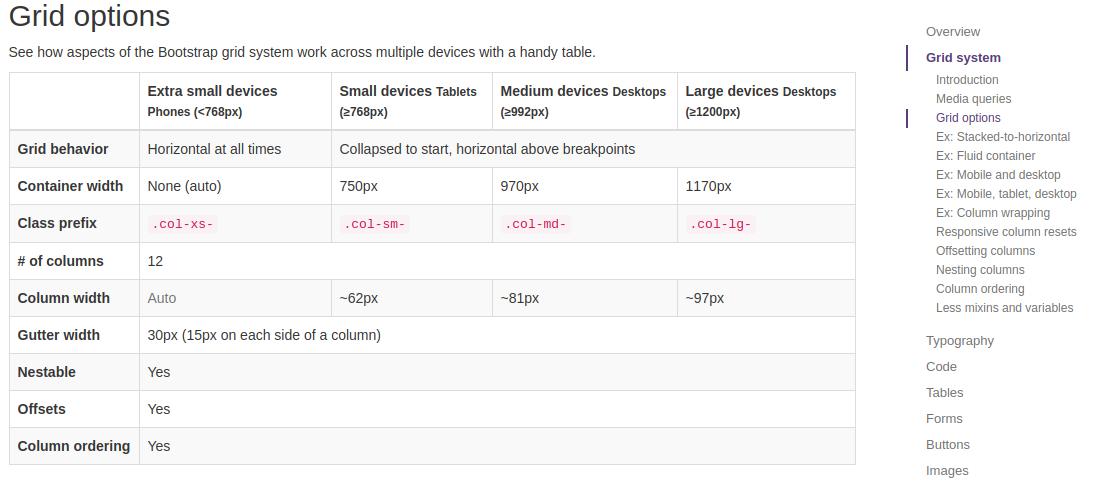
From the below image, it is clearly saying extra small size devices which is col-xs-12 are used for <768px. Then how can it works for large screen when we use col-xs-12 only ?
From coding, this below codes will also work for large screen also though I used only class="col-xs-12", did not use class="col-sm-12" or class="col-md-12" or class="col-lg-12"
<div class="container">
    <div class="row">
        <div class="col-xs-12">ABC</div>
    </div>
</div>