Currently i have a div that contains some icons in it. I have it sitting outside of my nav container, which is how I want it. The only way i've been able to seem to make it work is by making the css div absolute or giving it a margin-left: -110px .
My problem. This is fine when being displayed in desktop but breaks when its being displayed on mobile. When i don't do that, the div pushes my nav container to the right. I havne't figured out a way to make it mobile or know if its possible. Please see the image of what i'm trying to achieve.
Here is my current code
<nav class="navbar navbar-expand-lg bg-light navbar-dark fixed-top" id="mainNav">
    <div class="mysocion text-white ml-5">
      <a href="https://www.facebook.com/xxxxxxx">
        <i class="fab fa-facebook fa-2x mr-2"></i>
      </a>
      <a href="">
        <i class="fab fa-twitter fa-2x mr-2"></i>
      </a>
      <a href="https://www.instagram.com/xxxxxxxxx">
        <i class="fab fa-instagram fa-2x"></i>
      </a>
    </div>
    <div class="container">
      <div class="headerlogo">
        <a class="navbar-brand" href="#page-top">
          <img src="img/xxxxxxxx.png" alt="" class="img-fluid">
        </a>
      </div>
      <button class="navbar-toggler navbar-toggler-right" type="button" data-toggle="collapse" data-target="#navbarResponsive"
        aria-controls="navbarResponsive" aria-expanded="false" aria-label="Toggle navigation">
        Menu
        <i class="fa fa-bars"></i>
      </button>
      <div class="collapse navbar-collapse" id="navbarResponsive">
        <ul class="navbar-nav text-uppercase mr-auto">
          <li class="nav-item dropdown">xxxxxxxxxxxxxx</a>
            <ul class="dropdown-menu">
              <li>
                <a href="xxxxxxxxxxx.html" class="dropdown-item">xxxxxxxxxxx</a>
              </li>
              <li>
                <a href="xxxxxxxx.html" class="dropdown-item">xxxxxxxxxxx</a>
              </li>
              <li>
                <a href="xxxxxxxxx.html" class="dropdown-item">xxxxxxxxxxxx</a>
              </li>
            </ul>
          </li>
          <li class="nav-item dropdown">
            <a class="nav-link js-scroll-trigger dropdown-toggle" href="xxxxxxxxxxx.html" data-toggle="dropdown">xxxxxxx</a>
            <ul class="dropdown-menu">
              <li>
                <a href="xxxxx.html" class="dropdown-item">Trash It Door Step</a>
              </li>
              <li>
                <a href="xxxxxxxxx.html" class="dropdown-item">xxxxxxxx</a>
              </li>
            </ul>
          </li>
          <li class="nav-item">
            <a class="nav-link js-scroll-trigger" href="aboutxxxx.html">xxxxxxxxxxx</a>
          </li>
          <li class="nav-item">
            <a class="nav-link js-scroll-trigger" href="requestxxxxx.html">xxxxxxxxx</a>
          </li>
          <li class="nav-item">
            <a class="nav-link js-scroll-trigger" href="xxxxxt.html">xxxxxx Us</a>
          </li>
        </ul>
      </div>
    </div>
  </nav>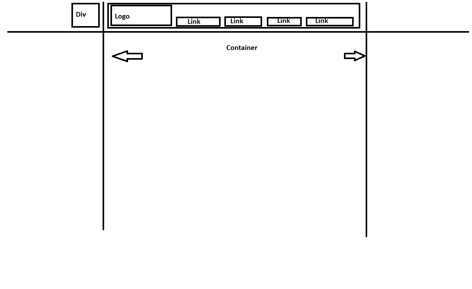