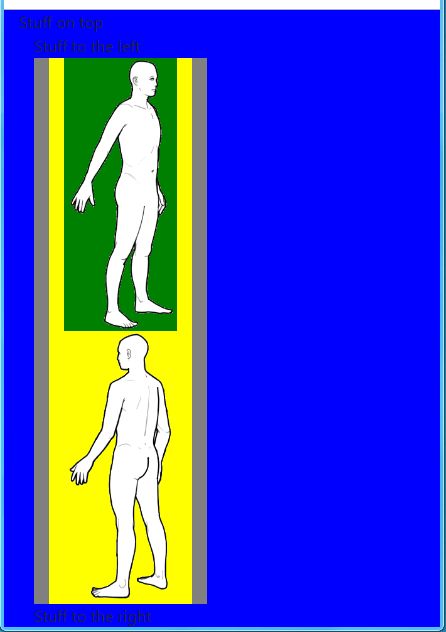
I have a one-row grid that is supposed to place two images on top of each other once the screen gets small enough.
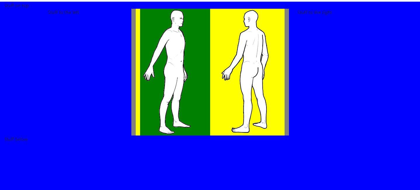
It works ok, but, once the screen gets too small, the images don't get centered. In fact,the grid itself isn't centered.
I tried many approaches, but nothing seems to work.
All I want is for the two images to be centered on the screen when the screen gets too small.
All the code is inside a component. And the component itself is inside a 3 column grid (that's the one you see with the "stuff on the left" and "stuff on the right" labels).
Here's my code. I changed the background-color of each element, so I can know what's what. Also, I'm trying to center everything in many different ways:
<body class="justify-content-md-center" style="justify-content: center; align-items: center; background-color: blue">
            <div class="container justify-content-md-center" style="width: auto; justify-content: center; align-items: center; background-color: grey">
        <div class="container center" style="justify-content: center; background-color: yellow"> <!-- global canvas -->
            <div class="row no-gutters justify-content-md-center style="justify-content: center; background-color: red">


                <div class="col-sm" style="justify-content: center; background-color: green">
                        <img src="./images/fssFront.png" class="img-fluid" alt="Responsive image">
                </div>

                <div class="col-sm">
                    <div class="center-content">
                        <img src="./images/fssBack.png" class="img-fluid" alt="Responsive image">
                    </div>

                </div>
            </div>
        </div> <!-- global canvas -->
        </div>
    </body>
I'm pretty new to CSS, html and bootstrap. I'm sure I'm missing something.
Can you please help me out?
Thank you.