I’m building a MVVM app using .Net 4.7.2 that works like a wizard (based on https://www.codeproject.com/KB/WPF/InternationalizedWizard.aspx?display=Print), so no additional frameworks, just the RelayCommand class, a MainWindow.cs that hosts the Main view (the view that has navigation items of the wizard on the left side, and the right side area that hosts the subviews which display based on the stage of the wizard).
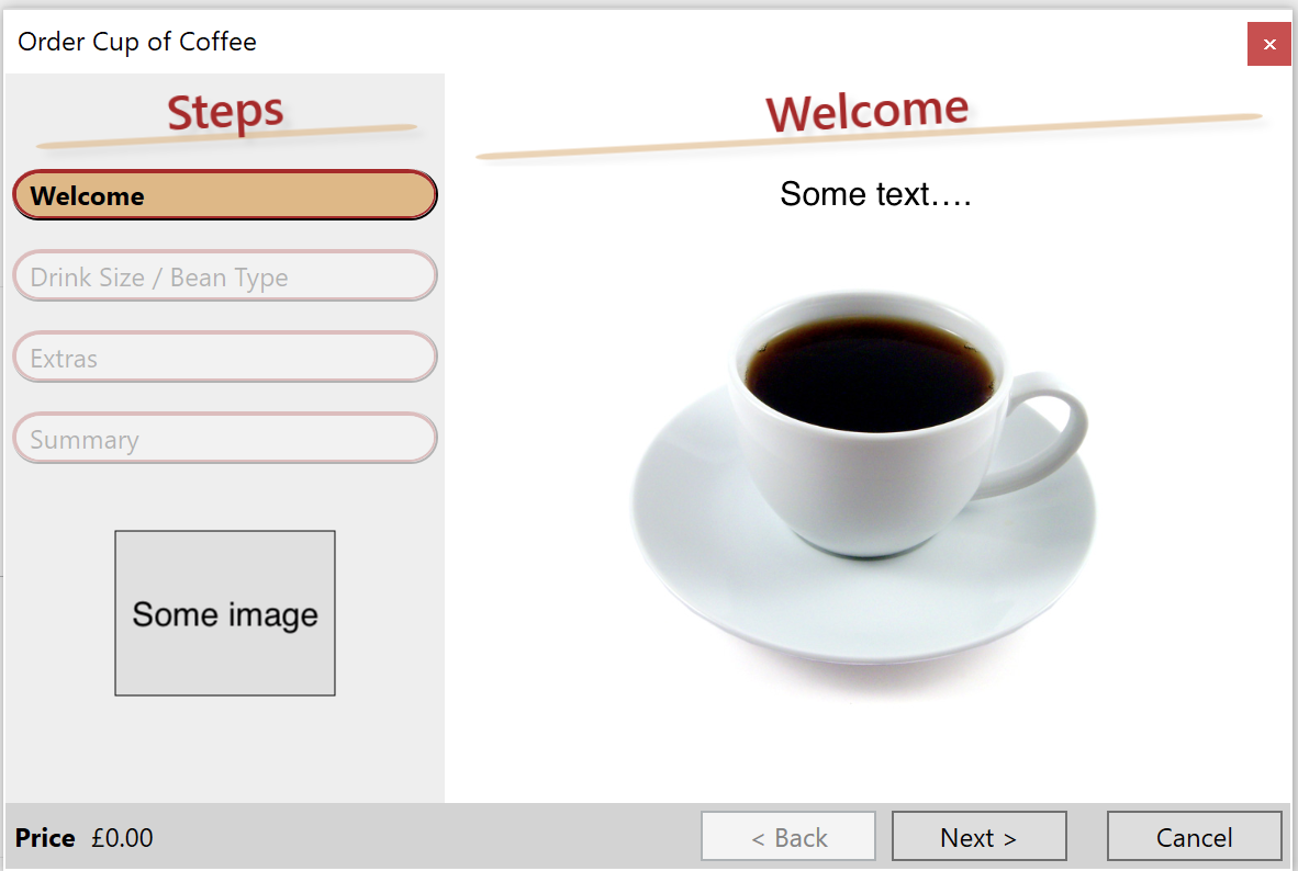
Mi issue is that one of my users is experiencing a very strange behaviour with the controls. This is a sample photo of what the application should look like:
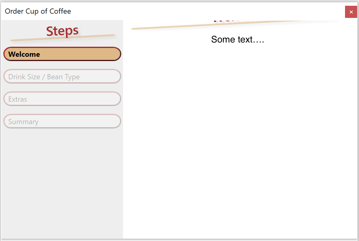
And this is a sample photo of what happens to the user. Notice that the image on the bottom left disappears, the bar on the bottom left also disappears, the heading and top text have moved up and clipped inside the window, and the rest of the content in the right side disappears.
Similar to the base InternationalizedWizard App I placed the controls in a grid that has horizontal + vertical alignment set to stretch. The
        <Border Background="White" Grid.Column="1" Grid.Row="0">
                <ScrollViewer>
                    <HeaderedContentControl Content="{Binding Path=CurrentPage}" Header="{Binding Path=CurrentPage.DisplayName}" />
                </ScrollViewer>
            </Border>
I applied this style to the HeaderedContentControl:
<Style TargetType="{x:Type HeaderedContentControl}">
    <Setter Property="Template">
        <Setter.Value>
            <ControlTemplate TargetType="{x:Type HeaderedContentControl}">
                <StackPanel Margin="2,0">
                    <Grid Margin="1,1,1,12" RenderTransformOrigin="0.5,0.5">
                        <Rectangle Fill="{DynamicResource {x:Static SystemColors.AppWorkspaceBrushKey}}" Height="3" Margin="10,-4" Opacity="0.6" RadiusX="8" RadiusY="8" VerticalAlignment="Bottom" />
                        <ContentPresenter ContentSource="Header" TextBlock.FontSize="22" TextBlock.FontWeight="DemiBold" TextBlock.Foreground="Black" HorizontalAlignment="Center" VerticalAlignment="Center" OpacityMask="Black" />
                        <Grid.Effect>
                            <DropShadowEffect Opacity="0.1" />
                        </Grid.Effect>
                        <Grid.RenderTransform>
                            <RotateTransform Angle="0" />
                        </Grid.RenderTransform>
                    </Grid>
                    <Grid>
                        <Rectangle Fill="{TemplateBinding Background}" />
                        <ContentPresenter ContentSource="Content" />
                    </Grid>
                </StackPanel>
            </ControlTemplate>
        </Setter.Value>
    </Setter>
</Style>
The scrollviewer only scrolls up and down if the content is large, but in this case the content should fit fine so as expected the user won't see the scrollviewer.
The image from the bottom left that strangely disappear was placed in the column 0, row 0 of the grid a custom margin so it remains in that area:
<Image Grid.Column="0" Grid.Row="0" Source="..\Assets\SplashLogo.png" HorizontalAlignment="Center" VerticalAlignment="Bottom" Stretch="None" Margin="20,20,20,20"/>
The first page (e.g. Welcome) that displays has another grid with two
<Grid>
        <Grid.RowDefinitions>
            <RowDefinition MinHeight="30" MaxHeight="60"/>
            <RowDefinition Height="*" MinHeight="200"/>
        </Grid.RowDefinitions>
        <TextBlock Grid.Row="0"  Text="{x:Static res:Strings.SomeText_Description}" FontSize="15" FontWeight="Light" Margin="20,0,20,0"  TextWrapping="Wrap" />
        <StackPanel Grid.Row="1" Orientation="Horizontal" VerticalAlignment="Center" HorizontalAlignment="Center">
            <Label   Content="{x:Static res:Strings.WelcomeView_SomeText}" FontSize="15" FontWeight="Light" HorizontalAlignment="Center" VerticalAlignment="Center" Margin="20,0,20,0" />
            <TextBox   Text="{Binding Path=SomeInput, UpdateSourceTrigger=PropertyChanged}" Height="25" Width="200" FontSize="15" FontWeight="Light" HorizontalAlignment="Left">
                <TextBox.InputBindings>
                    <KeyBinding Key="Enter" Command="{Binding MoveNextFromWelcomeCommand}" CommandParameter="{Binding Path=Text, RelativeSource={RelativeSource AncestorType={x:Type TextBox}}}" />
                </TextBox.InputBindings>
            </TextBox>
        </StackPanel>
    </Grid>
But the contents of the stack panel completely disappear of view.
Finally, the bottom area of the main view is created in a border like this one, which also completely disappears from view:
<Border Grid.Column="0" Grid.Row="1" Background="LightGray" Grid.ColumnSpan="2">

                        <Grid >
                            <Grid.ColumnDefinitions>
                                <ColumnDefinition Width="Auto" />
                                <ColumnDefinition Width="*" />
                                <ColumnDefinition Width="Auto" />
                            </Grid.ColumnDefinitions>

                            <Grid.RowDefinitions>
                                <RowDefinition Height="*" />
                                <RowDefinition Height="*" />
                            </Grid.RowDefinitions>

                            <TextBlock Grid.Column="0" Grid.Row="1" Grid.ColumnSpan="5" Margin="4" FontSize="15" Text="{Binding Path=ReportStatus}" VerticalAlignment="Center" Visibility="{Binding Path=ShowReportStatus}" />

                            <!-- NAVIGATION BUTTONS -->
                            <Grid Grid.Column="2" Grid.Row="0" Grid.IsSharedSizeScope="True" HorizontalAlignment="Right" >
                                <Grid.ColumnDefinitions>
                                    <ColumnDefinition SharedSizeGroup="Buttons" />
                                    <ColumnDefinition SharedSizeGroup="Buttons" />
                                    <ColumnDefinition SharedSizeGroup="Buttons" />
                                    <ColumnDefinition SharedSizeGroup="Buttons" />
                                </Grid.ColumnDefinitions>
                                <Button Grid.Column="1" Grid.Row="0" Command="{Binding Path=MovePreviousCommand}" Style="{StaticResource movePreviousButtonStyle}" />
                                <Button Grid.Column="2" Grid.Row="0" Command="{Binding Path=MoveNextCommand}" Style="{StaticResource moveNextButtonStyle}" />
                                <Button Grid.Column="3" Grid.Row="0" Command="{Binding Path=CancelCommand}" Style="{StaticResource cancelButtonStyle}" />

                            </Grid>
                        </Grid>
                    </Border>
I initially thought there could be an issue with the version of .NET or OS, but my users has the latest version of Windows 10 Enterprise (10.0.17134) and dual screen with 1: 3840x2160 2: 2560x1600. I have tried to replicate that on my own computer but everything works fine for me. I also tested the App in Windows 7 and it works with no issues.
I really don't understand what could be happening, does it have anything to do with the user's DPI settings or any accessibility feature?
EDIT:
To make things a bit easier, this is the full code of the main view's xaml:
<UserControl x:Class="MyCompany.MyAppName.App.View.MyAppView"
             xmlns="http://schemas.microsoft.com/winfx/2006/xaml/presentation"
             xmlns:x="http://schemas.microsoft.com/winfx/2006/xaml"
             xmlns:mc="http://schemas.openxmlformats.org/markup-compatibility/2006"
             xmlns:d="http://schemas.microsoft.com/expression/blend/2008"
             xmlns:local="clr-namespace:MyCompany.MyAppName.App.View"
             xmlns:viewModel="clr-namespace:MyCompany.MyAppName.App.ViewModel"
             xmlns:view="clr-namespace:MyCompany.MyAppName.App.View"
             xmlns:res="clr-namespace:MyCompany.MyAppName.App.Assets"
             xmlns:util="clr-namespace:MyCompany.MyAppName.App.Utils"
             mc:Ignorable="d"
             x:Name="configuratorControl" d:DesignHeight="600" d:DesignWidth="600"
             >

    <UserControl.Resources>
        <util:PercentageConverter x:Key="percentageConverter"/>

        <DataTemplate DataType="{x:Type viewModel:ObjectSelectionViewModel}">
            <view:ObjectSelectionPageView/>
        </DataTemplate>

        <DataTemplate DataType="{x:Type viewModel:CurrentObjectComponentsViewModel}">
            <view:CurrentObjectComponentsView/>
        </DataTemplate>

        <DataTemplate DataType="{x:Type viewModel:CurrentObjectOptionsViewModel}">
            <view:CurrentObjectOptionsView/>
        </DataTemplate>

        <DataTemplate DataType="{x:Type viewModel:SageFourViewModel}">
            <view:SageFourView/>
        </DataTemplate>

        <DataTemplate DataType="{x:Type viewModel:SageThreeViewModel}">
            <view:SageThreeView/>
        </DataTemplate>

        <DataTemplate DataType="{x:Type viewModel:ObjectViewModel}">
            <view:MyNumberView/>
        </DataTemplate>

        <Style TargetType="{x:Type Button}">
            <Setter Property="Padding" Value="3.5,0" />
            <Setter Property="Margin" Value="3.5" />
            <Setter Property="MinWidth" Value="80" />
            <Setter Property="FontSize" Value="15"/>
            <Setter Property="FontWeight" Value="Regular"/>
        </Style>

        <!-- This Style inherits from the Button style seen above. -->
        <Style BasedOn="{StaticResource {x:Type Button}}" TargetType="{x:Type Button}" x:Key="moveNextButtonStyle">
            <Setter Property="Content" Value="{x:Static res:Strings.MyAppView_Button_MoveNext}" />
            <Style.Triggers>
                <DataTrigger Binding="{Binding Path=IsOnLastPage}" Value="True">
                    <Setter Property="Content" Value="{x:Static res:Strings.SageThreeView_Confirm}" />
                </DataTrigger>
                <DataTrigger Binding="{Binding Path=IsOnCreateSageThreePage}" Value="True">
                    <Setter Property="Content" Value="{x:Static res:Strings.MyAppView_Button_CreateSageThree}" />
                </DataTrigger>
            </Style.Triggers>

        </Style>

        <Style BasedOn="{StaticResource {x:Type Button}}" TargetType="{x:Type Button}" x:Key="cancelButtonStyle">
            <Setter Property="Content" Value="{x:Static res:Strings.MyAppView_Button_Cancel}" />
            <Style.Triggers>
                <DataTrigger Binding="{Binding Path=IsOnLastPage}" Value="True">
                    <Setter Property="Content" Value="{x:Static res:Strings.MyAppView_Button_ExportPDF}" />
                </DataTrigger>
            </Style.Triggers>
        </Style>

        <Style BasedOn="{StaticResource {x:Type Button}}" TargetType="{x:Type Button}" x:Key="movePreviousButtonStyle">
            <Setter Property="Content" Value="{x:Static res:Strings.MyAppView_Button_MovePrevious}" />
        </Style>

        <!-- HEADERED CONTENT CONTROL STYLE -->
        <Style TargetType="{x:Type HeaderedContentControl}">
            <Setter Property="Template">
                <Setter.Value>
                    <ControlTemplate TargetType="{x:Type HeaderedContentControl}">
                        <StackPanel Margin="2,0">
                            <Grid Margin="1,1,1,12" RenderTransformOrigin="0.5,0.5">
                                <Rectangle Fill="{DynamicResource {x:Static SystemColors.AppWorkspaceBrushKey}}" Height="3" Margin="10,-4" Opacity="0.6" RadiusX="8" RadiusY="8" VerticalAlignment="Bottom" />
                                <ContentPresenter ContentSource="Header" TextBlock.FontSize="22" TextBlock.FontWeight="DemiBold" TextBlock.Foreground="Black" HorizontalAlignment="Center" VerticalAlignment="Center" OpacityMask="Black" />
                                <Grid.Effect>
                                    <DropShadowEffect Opacity="0.1" />
                                </Grid.Effect>
                                <Grid.RenderTransform>
                                    <RotateTransform Angle="0" />
                                </Grid.RenderTransform>
                            </Grid>
                            <Grid>
                                <Rectangle Fill="{TemplateBinding Background}" />
                                <ContentPresenter ContentSource="Content" />
                            </Grid>
                        </StackPanel>
                    </ControlTemplate>
                </Setter.Value>
            </Setter>
        </Style>

        <DataTemplate x:Key="workflowStepTemplate">
            <Border x:Name="bdOuter" BorderBrush="Black" BorderThickness="0,0,1,1" CornerRadius="12" Margin="1,1,1,12" Opacity="0.25" SnapsToDevicePixels="True">
                <Border x:Name="bdInner" Background="White" BorderBrush="DarkBlue" BorderThickness="2,2,1,1" CornerRadius="12" Padding="2">
                    <TextBlock x:Name="txt" Margin="4,0,0,0" FontSize="15" FontWeight="Light" Text="{Binding Path=DisplayName}" />
                </Border>
            </Border>

            <DataTemplate.Triggers>
                <DataTrigger Binding="{Binding Path=IsCurrentPage}" Value="True">
                    <Setter TargetName="txt" Property="FontWeight" Value="SemiBold" />
                    <Setter TargetName="bdInner" Property="Background" Value="White" />
                    <Setter TargetName="bdOuter" Property="Opacity" Value="1" />
                </DataTrigger>
            </DataTemplate.Triggers>
        </DataTemplate>

    </UserControl.Resources>

    <Canvas HorizontalAlignment="Stretch" VerticalAlignment="Stretch" Width="{Binding ActualWidth, ElementName=configuratorControl}" Height="{Binding ActualHeight, ElementName=configuratorControl}">
        <Canvas x:Name="searchCanvas" HorizontalAlignment="Stretch" VerticalAlignment="Stretch" Panel.ZIndex="3" Width="{Binding ActualWidth, ElementName=configuratorControl}" Height="{Binding ActualHeight, ElementName=configuratorControl}" Visibility="{Binding SearchBoxVisibility}">
            <Grid Panel.ZIndex="4" Width="{Binding ActualWidth, ElementName=searchCanvas}" Height="{Binding ActualHeight, ElementName=searchCanvas}">
                <StackPanel Panel.ZIndex="4" Orientation="Vertical" Width="270" Height="70" VerticalAlignment="Center" HorizontalAlignment="Center" >
                    <StackPanel Orientation="Horizontal" >
                        <TextBlock Margin="5" FontSize="15"  Text="Serial Number:" Width="100" Height="25" TextAlignment="Center"  VerticalAlignment="Center" HorizontalAlignment="Center" />
                        <TextBox Text="{Binding MyNumber, UpdateSourceTrigger=PropertyChanged}" Margin="5" Width="150" Height="25" />
                    </StackPanel>
                    <DockPanel HorizontalAlignment="Stretch">
                        <Button Margin="5" Content="Dismiss" Width="100" HorizontalAlignment="Left" Command="{Binding DismissSearchDraftCommand}"/>
                        <Button Margin="5" Content="Search" Width="100" HorizontalAlignment="Right" Command="{Binding StartSearchDraftCommand}"/>
                    </DockPanel>
                </StackPanel>
                <Rectangle Panel.ZIndex="3" Fill="LightBlue" Width="300" Height="100" />
            </Grid>
            <Rectangle Panel.ZIndex="2" Fill="LightGray" Opacity="0.4" Canvas.Left="0" Canvas.Top="0" HorizontalAlignment="Stretch" VerticalAlignment="Stretch" Width="{Binding ActualWidth, ElementName=configuratorControl}" Height="{Binding ActualHeight, ElementName=configuratorControl}" />
        </Canvas>

        <Grid Background="#11000000" Margin="1" Panel.ZIndex="2" IsEnabled="{Binding GridResultsEnabled}" VerticalAlignment="Stretch" HorizontalAlignment="Stretch" Height="{Binding ActualHeight, ElementName=configuratorControl, Converter={StaticResource percentageConverter}, ConverterParameter=99.5}" Width="{Binding ActualWidth, ElementName=configuratorControl, Converter={StaticResource percentageConverter}, ConverterParameter=99.5}">
                    <Grid.BitmapEffect>
                        <BlurBitmapEffect Radius="{Binding GridBoxBlur}" KernelType="Box" />
                    </Grid.BitmapEffect>
                    <Grid.ColumnDefinitions>
                        <ColumnDefinition Width="220" />
                        <ColumnDefinition Width="*" />
                    </Grid.ColumnDefinitions>
                    <Grid.RowDefinitions>
                        <RowDefinition Height="*" />
                        <RowDefinition Height="60" />
                    </Grid.RowDefinitions>

                    <!-- Workflow step listing -->
                    <HeaderedContentControl Header="{x:Static res:Strings.MyAppView_HeaderSteps}">
                        <ItemsControl ItemsSource="{Binding Path=Pages}" ItemTemplate="{StaticResource workflowStepTemplate}" />
                    </HeaderedContentControl>

                    <Button FontSize="15" Style="{StaticResource HyperLinkButtonStyle}" Margin="20,20,20,140"  VerticalAlignment="Bottom" HorizontalAlignment="Center" Content="{x:Static res:Strings.MyAppView_Button_Search_Full}" Command="{Binding Path=OpenSearchFullCommand}"/>
            <Button FontSize="15" Style="{StaticResource HyperLinkButtonStyle}" Margin="20,20,20,170"  VerticalAlignment="Bottom" HorizontalAlignment="Center" Content="{x:Static res:Strings.MyAppView_Button_Search_Draft}" Command="{Binding Path=OpenSearchDraftCommand}"/>

                    <Button Margin="20,295,20,20" Command="{Binding Path=StartAgainCommand}" Content="{x:Static res:Strings.SageThreeView_StartAgain}"  VerticalAlignment="Top" />
                    <Image Grid.Column="0" Grid.Row="0" Source="..\Assets\SplashLogo.png" HorizontalAlignment="Center" VerticalAlignment="Bottom" Stretch="None" Margin="20,20,20,20"/>

                    <!-- CURRENT PAGE AREA -->
                    <Border Background="White" Grid.Column="1" Grid.Row="0">
                        <ScrollViewer>
                            <HeaderedContentControl Content="{Binding Path=CurrentPage}" Header="{Binding Path=CurrentPage.DisplayName}" />
                        </ScrollViewer>
                    </Border>

                    <Border Grid.Column="0" Grid.Row="1" Background="LightGray" Grid.ColumnSpan="2">

                        <Grid >
                            <Grid.ColumnDefinitions>
                                <ColumnDefinition Width="Auto" />
                                <ColumnDefinition Width="*" />
                                <ColumnDefinition Width="Auto" />
                            </Grid.ColumnDefinitions>

                            <Grid.RowDefinitions>
                                <RowDefinition Height="*" />
                                <RowDefinition Height="*" />
                            </Grid.RowDefinitions>

                            <TextBlock Grid.Column="0" Grid.Row="1" Grid.ColumnSpan="5" Margin="4" FontSize="15" Text="{Binding Path=SageThreeStatus}" VerticalAlignment="Center" Visibility="{Binding Path=ShowSageThreeStatus}" />

                            <!-- NAVIGATION BUTTONS -->
                            <Grid Grid.Column="2" Grid.Row="0" Grid.IsSharedSizeScope="True" HorizontalAlignment="Right" >
                                <Grid.ColumnDefinitions>
                                    <ColumnDefinition SharedSizeGroup="Buttons" />
                                    <ColumnDefinition SharedSizeGroup="Buttons" />
                                    <ColumnDefinition SharedSizeGroup="Buttons" />
                                    <ColumnDefinition SharedSizeGroup="Buttons" />
                                </Grid.ColumnDefinitions>
                                <Button Grid.Column="1" Grid.Row="0" Command="{Binding Path=MovePreviousCommand}" Style="{StaticResource movePreviousButtonStyle}" />
                                <Button Grid.Column="2" Grid.Row="0" Command="{Binding Path=MoveNextCommand}" Style="{StaticResource moveNextButtonStyle}" />
                                <Button Grid.Column="3" Grid.Row="0" Command="{Binding Path=CancelCommand}" Style="{StaticResource cancelButtonStyle}" />

                            </Grid>
                        </Grid>
                    </Border>
                </Grid>


    </Canvas>


</UserControl>