I'm fairly new to coding and need help.
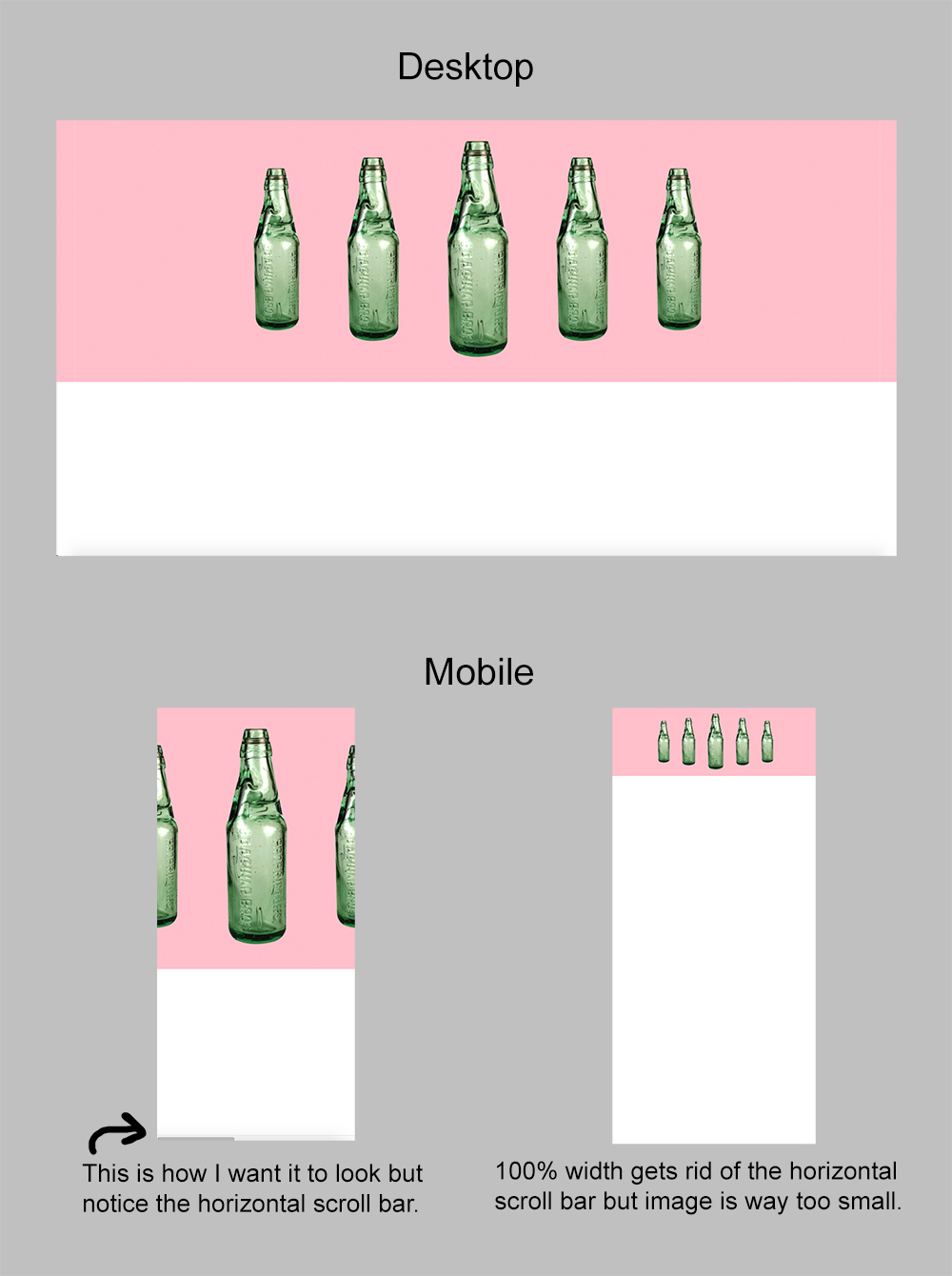
I'm creating a responsive site and I am stuck with the header image. On desktop, it looks fine. When I go to mobile, I like the size of it but the image breaks out of the container and shows a horizontal scroll bar. I tried (overflow-x: hidden;) which did the job of hiding the scrollbar but it ended up messing up the image in mobile view.
I then gave the image container a width of 100% and it fits perfectly onto the screen with no horizontal bar, but the image is way too small.
I was wondering how I can get the image to stay the same but fit into the container?
I attached an image to further explain what I'm talking about. Thanks!