My code for graphing is as below:
ax30 = df5.plot(kind="scatter", x='Data Numbers', y='y', color="red", label="67890")
ax33 = ax30.twinx()
df8.plot(kind="scatter", x='Data Numbers', y='y', color="blue", label="12345", ax=ax33, secondary_y = True)

ax30.set_ylabel("A")
ax33.set_ylabel("B")
ax30.set_xlabel("C")
ax30.set_title("DDD")
ax30.set_xlim([0,150])
ax30.set_ylim([0,40000])
ax33.set_xlim([0,150])
ax33.set_ylim([0,40000])
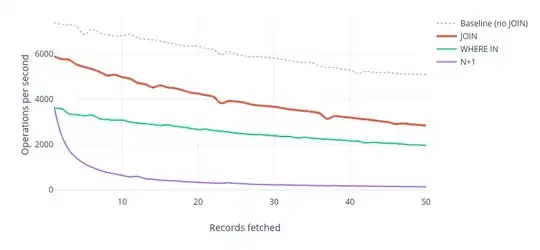
I am trying to plot a data with two different y axis, but it seems like the legends are overlapping. How can I overcome this issue and put the legends back together?The current figure is as below:
Current resulting figure from the code
