72

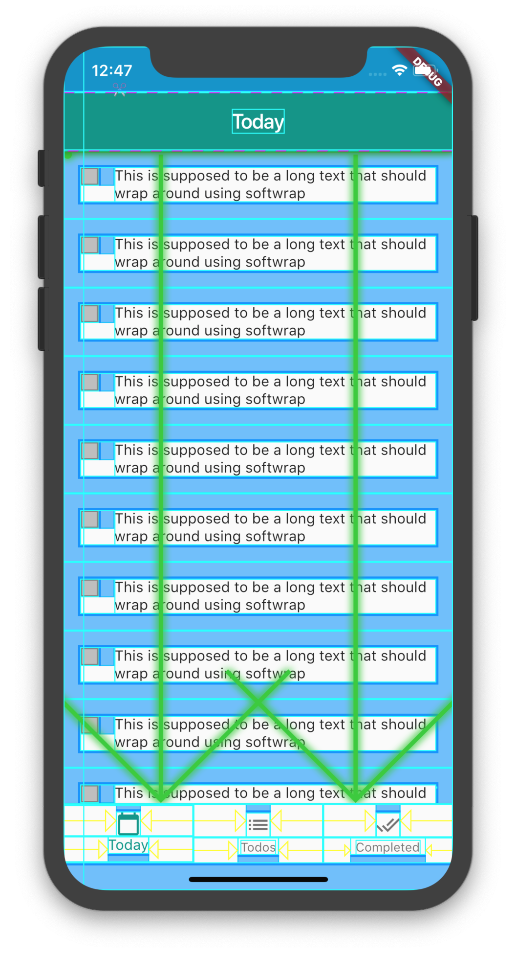
I am facing a problem with the default padding of the widgets (IconButton, CheckBox, FlatButton). I have searched a lot for this concern but with no success.

enter image description here

In the above image, the outer blue rect is the actual size of these widgets and I have to remove that space.

Checkbox(
          onChanged: (value) {
            setState(() {
              _rememberMeFlag = !_rememberMeFlag;
            });
          },
          value: _rememberMeFlag,
          activeColor: const Color(0xff00bbff),
          materialTapTargetSize: MaterialTapTargetSize.shrinkWrap,
        )

and below is the widget code for hide/show widget icon:

new Container(
          child: TextFormField(
            decoration: InputDecoration(
              labelText: "Password",
              suffixIcon: Padding(
                padding: EdgeInsetsDirectional.zero,
                child: GestureDetector(
                  child: Icon(
                    hidePassword ? Icons.visibility : Icons.visibility_off,
                    size: 20.0,
                    color: Colors.black,
                  ),
                ),
              ),
              contentPadding: const EdgeInsets.only(
                  left: 0.0, top: 6.0, bottom: 6.0, right: 0.0),
            ),
            obscureText: !hidePassword,
            maxLength: 20,
          ),
        )

I have tried to set the container size too but no luck. Also tried the padding properties of the widgets but with no success.

Is there any way to remove this extra spacing from these widgets?

Rahul Sharma
  • 12,515
  • 6
  • 21
  • 30
  • why dont you use standard [CheckboxListTile](https://docs.flutter.io/flutter/material/CheckboxListTile-class.html)? – pskink Nov 05 '18 at 12:05
  • 2
    @pskink it is causing more spacing then required one. Project owner is asking us to reduce that space. – Rahul Sharma Nov 08 '18 at 09:48

13 Answers13

154

wrap your CheckBox inside SizedBox will resize the padding of the check box

  SizedBox(
    height: 24.0,
    width: 24.0,
    child: Checkbox(...),
 )
Afinas EM
  • 2,755
  • 1
  • 15
  • 28
  • 2
    Simple yet effective. Additional plus for using standard widgets without relying on method overriding. – Alex Semeniuk Apr 22 '20 at 11:31
  • 1
    Not working for me with a CheckboxListTile, touch space area is not changing and it is overlapping. I have 3 CheckboxListTile, if set height on SizedBox it looks as I want but when tap on one check box other activates. – Inmer Sep 10 '20 at 15:09
  • @Inmer FYI CheckboxistTile having touch in the entire tile I guess, if you want to customize the touch space and all, you have to create your own tile with a row. – Afinas EM Sep 11 '20 at 09:03
  • 1
    working even for TabBar unwanted top|bottom Tab padings – Vladyslav Ulianytskyi Sep 19 '20 at 16:32
30

EDIT

Set the value of materialTapTargetSize to MaterialTapTargetSize.shrinkWrap

Checkbox(
   materialTapTargetSize: MaterialTapTargetSize.shrinkWrap,
    ...
 )

Alternatively, you can achieve this by customising the Checkbox widget.

  1. Create a CustomCheckbox using the exact code from flutter/packages/flutter/lib/src/material/checkbox.dart.

  2. Add a new field to your CustomCheckbox widget

         final bool useTapTarget;
    
  3. Make sure to add the new field to your constructor with it default value set to true.

         this.useTapTarget = true
    
  4. Modify the build method in the _CheckboxState method. Add this block of code above the return call.

         Size noTapTargetSize = Size(CustomCheckbox.width, 
         CustomCheckbox.width);
         final BoxConstraints additionalConstraints = 
         BoxConstraints.tight(widget
            .useTapTarget? size : noTapTargetSize);
    
  5. Finally, use your CustomCheckbox widget in your code, and set your custom field to false to remove material padding. example

    Container(
            margin: EdgeInsets.only(right: 15),
            child:CustomCheckbox(
                value: _checked,
                onChanged: _onCheckBoxChange,
                useTapTarget: false,
                activeColor: Colors.teal),
          )
    

Screenshot

Myorh
  • 551
  • 5
  • 10
28

There are three options:

1.

 // or Checkbox()
Radio( 
    materialTapTargetSize: MaterialTapTargetSize.shrinkWrap,
)

 // or Checkbox()
Radio(
    visualDensity: VisualDensity(horizontal: -4, vertical: -4),
)

SizedBox(
    height: 20, 
    width: 20, 
 // or Checkbox()
    child: Radio()
    )

Omid Raha
  • 9,862
  • 1
  • 60
  • 64
9

The default dimensions of Checkbox widget is 48x48. So, as per the above answer, if we wrap Checkbox inside SizedBox then the white spacing reduces. I tried with 24x24 and all the spacing was gone.

SizedBox(
  width: 24.0,
  height: 24.0,
  child: Checkbox(),

After this, I wrapped SizedBox inside the Padding widget to give any side of spacing I want.

Padding(
  padding: const EdgeInsets.only(right: 8.0),
  child: SizedBox(
    width: 24.0,
    height: 24.0,
    child: Checkbox(),
  ),
)
Germa Vinsmoke
  • 3,541
  • 4
  • 24
  • 34
6

For those looking for copy and paste ;), here is what I use

enter image description here

import 'package:flutter/material.dart';

class NoPaddingCheckbox extends StatelessWidget {
  final bool isMarked;
  final Function(bool newValue) onChange;
  final double size;

  NoPaddingCheckbox({
    @required this.isMarked,
    @required this.onChange,
    this.size = 24,
  });

  @override
  Widget build(BuildContext context) {
    return ConstrainedBox(
      constraints: BoxConstraints(maxHeight: size, maxWidth: size),
      child: RawMaterialButton(
        shape: RoundedRectangleBorder(borderRadius: BorderRadius.circular(4)),
        child: Icon(_getIconData(), size: size),
        onPressed: () => onChange(!isMarked),
      ),
    );
  }

  IconData _getIconData() {
    if (isMarked) {
      return Icons.check_box;
    }

    return Icons.check_box_outline_blank;
  }
}
DeC
  • 2,226
  • 22
  • 42
Genix
  • 153
  • 1
  • 9
5
Wrap(
    children: <Widget>[
        Text('radio'),
        Radio(
            groupValue: _character,
            onChanged: (value){},
            materialTapTargetSize: MaterialTapTargetSize.shrinkWrap,
        )
    ],
    crossAxisAlignment: WrapCrossAlignment.center,
),

this removes lots of spaces

CopsOnRoad
  • 237,138
  • 77
  • 654
  • 440
shahab sadeghi
  • 139
  • 2
  • 2
1

The simplest method I found is to create your version of the widget usually by combining GestureDetector Widget with something. For example, here's a version of the IconButton which doesn't have the default Material Design padding:

GestureDetector(
  onTap: () {
    //do stuff here
  },
  child: Icon(
    Icons.icon_choice
  ),
)
soupjake
  • 3,293
  • 3
  • 17
  • 32
1

You can try changing things by opening IconButton class by clicking on IconButton while pressing ctrl in windows. Then you will find a variable Padding = EdgeConsts.all(8.0) . Keep changing it and play with it according to your needs.

Harsha pulikollu
  • 2,386
  • 15
  • 28
1

If you want the padding removed because it is causing the control to be too far to the right or too far down (I wanted the control to be perfectly left aligned), you could wrap it in a TransForm.translate.

Transform.translate(
  offset: const Offset(-24, 0),
  child: Checkbox(...),
)
BeniaminoBaggins
  • 11,202
  • 41
  • 152
  • 287
0

You can achieve this by customising the Checkbox widget's _outerRectAt method:

RRect _outerRectAt(Offset origin, double t) {
    final double inset = 1.0 - (t - 0.5).abs() * 2.0;
    final double size = _kEdgeSize - inset * _kStrokeWidth;
    //final Rect rect = Rect.fromLTWH(origin.dx + inset, origin.dy + inset, size, size); //ORIGINAL
    final Rect rect = Rect.fromLTWH(0, origin.dy + inset, size, size); //CUSTOM
    return RRect.fromRectAndRadius(rect, _kEdgeRadius);
}

With this modification the result is :

enter image description here

Last, but not least, you need to change the _drawCheck method like this :

void _drawCheck(Canvas canvas, Offset origin, double t, Paint paint) {
    assert(t >= 0.0 && t <= 1.0);
    // As t goes from 0.0 to 1.0, animate the two check mark strokes from the
    // short side to the long side.
    final Path path = Path();
    const Offset start = Offset(_kEdgeSize * 0.15, _kEdgeSize * 0.45);
    const Offset mid = Offset(_kEdgeSize * 0.4, _kEdgeSize * 0.7);
    const Offset end = Offset(_kEdgeSize * 0.85, _kEdgeSize * 0.25);
    if (t < 0.5) {
        final double strokeT = t * 2.0;
        final Offset drawMid = Offset.lerp(start, mid, strokeT);

        //NEW
        path.moveTo(0 + start.dx, origin.dy + start.dy);
        path.lineTo(0 + drawMid.dx, origin.dy + drawMid.dy);

        //OLD
        /*path.moveTo(origin.dx + start.dx, origin.dy + start.dy);
        path.lineTo(origin.dx + drawMid.dx, origin.dy + drawMid.dy);*/
    } else {
        final double strokeT = (t - 0.5) * 2.0;
        final Offset drawEnd = Offset.lerp(mid, end, strokeT);

        //NEW
        path.moveTo(0 + start.dx, origin.dy + start.dy);
        path.lineTo(0 + mid.dx, origin.dy + mid.dy);
        path.lineTo(0 + drawEnd.dx, origin.dy + drawEnd.dy);

        //OLD
        /*path.moveTo(origin.dx + start.dx, origin.dy + start.dy);
        path.lineTo(origin.dx + mid.dx, origin.dy + mid.dy);
        path.lineTo(origin.dx + drawEnd.dx, origin.dy + drawEnd.dy);*/
    }
    canvas.drawPath(path, paint);
}
Andrea Rubeis
  • 21
  • 1
  • 4
0

Screenshot:

enter image description here


Code (Also solves circular tap effect's size):

@override
Widget build(BuildContext context) {
  var size = 20.0; // Your desired size.
  return Scaffold(
    body: Center(
      child: SizedBox.fromSize(
        size: Size.fromRadius(size / 2),
        child: IconButton(
          padding: EdgeInsets.zero,
          splashRadius: size,
          iconSize: size,
          icon: Icon(Icons.mail),
          onPressed: () {},
        ),
      ),
    ),
  );
}
CopsOnRoad
  • 237,138
  • 77
  • 654
  • 440
0

this is for particular for Checkbox

assign following property for remove padding

materialTapTargetSize:MaterialTapTargetSize.shrinkWrap,

show code

 Checkbox(
       materialTapTargetSize: MaterialTapTargetSize.shrinkWrap,
           value: agreeForTC, // bool value 
                          onChanged: (bool? update) {
                            setState(() => agreeForTC = update!); // update bool
                            debugPrint('agreeForTC : $agreeForTC');
                        },
           )

but this will still have some required padding and remove this just wrap Checkbox in SizeBox and give width and height

   SizedBox(
                        width: 30,
                        height: 30,
                        child: Checkbox(
                          materialTapTargetSize:
                              MaterialTapTargetSize.shrinkWrap,
                       
                          value: agreeForTC,
                          onChanged: (bool? update) {
                            setState(() => agreeForTC = update!);
                            debugPrint('agreeForTC : $agreeForTC');
           },
    ),
),
0

Use Checkbox instead of CheckboxListTile and wrap CheckBox with Transform.scale,

 Transform.scale(
         scale: 1.2,
         child: Checkbox(), 
          )