2

I'm trying to make an egg-style image with CSS but I can't get it quite right. I want to make the top of the egg come in a little more narrow.

 .egg {
    width: 136px;
    height: 190px;
    background: #ffc000;
    display: block;
    -webkit-border-radius: 63px 63px 63px 63px / 108px 108px 72px 72px;
    border-radius: 50% 50% 50% 50% / 60% 60% 40% 40%;
    }
<div class="egg"></div>      

I want the egg to show up like the image below, but I can't seem to adjust border-radius correctly!

What I want the egg to look like

TylerH
  • 20,799
  • 66
  • 75
  • 101
Adam B
  • 55
  • 1
  • 3
  • 1
    Might help you change the shape: https://stackoverflow.com/questions/18796538/explain-the-usage-of-css3-in-an-egg-shape – Pete Nov 13 '18 at 16:35
  • 1
    Frankly, I would be *really* suprised if that shape is achievable with CSS on a single element. – Paulie_D Nov 13 '18 at 16:37
  • Also related: https://stackoverflow.com/questions/30711203/how-do-i-create-a-teardrop-in-html – Danield Nov 13 '18 at 17:19
  • @Pete OP's code looks exactly like the top answerer's code from that link... probably safe to say they have seen that one already. – TylerH Nov 13 '18 at 21:38
  • Think i already asked a question similar to this one. – Persijn Nov 18 '18 at 20:12

3 Answers3

7

You can do something like below use of border-radius wisely.

See the Snippet below:

.egg-shape{
  width: 70px;
  height: 70px;
  border-radius: 80% 15% 55% 50% / 55% 15% 80% 50%;
  border: 3px solid #1c446b;
  transform: rotate(-45deg);
  margin-top: 30px;
  background: #ffc000;
}
<div class="egg-shape"></div>
Nimitt Shah
  • 4,477
  • 2
  • 10
  • 21
2

its easy to create only you need to change the and calculate the % of border-radius.

.egg {
width: 136px;
height: 190px;
background: #ffc000;
display: block;
border-radius: 50% 60% 50% 50% / 70% 70% 40% 40%;}
<div class="egg"></div>

try this and go ahead.

dev_ramiz_1707
  • 671
  • 4
  • 20
1

Though this does not answer you question as far as CSS, I do think I have a better solution for you.

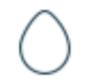
When you want a specific shape, you can use SVG vector graphics to accomplish the best result.

Look at the example and the classes that are added to the path. The only issue you have is that you must create the SVG image where you can optimize your shape, or find one. Or use the one given here.

You can alter the CSS and change color and size.

.svg_egg {
  width: 120px;
}

path.eggcolor {
  fill: pink;
  stroke: #000000;
  stroke-width: 2;
  stroke-miterlimit: 10;
}
<svg class='svg_egg'  version="1.1" id="Layer_1" xmlns="http://www.w3.org/2000/svg" xmlns:xlink="http://www.w3.org/1999/xlink" x="0px" y="0px"
  viewBox="0 0 132.2 189" style="enable-background:new 0 0 132.2 189;" xml:space="preserve">
<path class='eggcolor' class="st0" d="M131.2,101.7c4.1,56.2-28.6,86.3-64.6,86.3S-3.7,157.2,1,101.7C6,43,45,1,66.1,1C86,1,127,44,131.2,101.7z"/>
</svg>

edit As mentioned by @Danield, the SVG image can be incorporated within the CSS, making placement of the SVG image as simple as adding the class name.

<div class="svg_egg"></div>

.svg_egg {
    width: 120px;
    height: 170px;
    background: url('data:image/svg+xml;charset=UTF-8,<svg width="100%" 
        height="100%" 
        viewBox="0 0 132.2 189" xmlns="http://www.w3.org/2000/svg">
        <path fill="pink" stroke="black" d="M131.2,101.7c4.1,56.2-28.6,86.3-64.6,86.3S-3.7,157.2,1,101.7C6,43,45,1,66.1,1C86,1,127,44,131.2,101.7z"/></svg>') no-repeat;
}

Codepen by Danield: https://codepen.io/danield770/pen/rQyyOo

Daniel
  • 4,816
  • 3
  • 27
  • 31
  • 1
    It might be useful to mention that you could inline the svg as a css background - https://codepen.io/danield770/pen/rQyyOo - this way no additional elements are required – Danield Nov 14 '18 at 08:46
  • @Danield - very nice. I'll incorporate that option and copy from your codepen. Just to keep stuff together here in SO. – Daniel Nov 14 '18 at 16:59