0

Please help me figure out these tick marks. I have been working on this for hours and I can't find a solution. This data set is a collection of average house prices for various cities, from 1996-04 to late 2018. Here is my code:

# Plotting Hot Springs housing value over time
fig=plt.figure(figsize=(20, 8), dpi= 80, facecolor='w', edgecolor='k')
ax=plt.axes
plt.plot(syrHST['71913'],color='blue')
plt.plot(syrHST['71901'],color='red')
plt.xticks(rotation='vertical', fontsize=20)
plt.ylabel('Average Housing Value', fontsize=20)
plt.gca().legend(('71913','71901'), fontsize=20, loc='upper left')
fig.suptitle('Hot Springs', fontsize=40)
plt.show()

Here's what it's showing me:

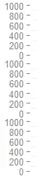
Obviously those tick labels along the x-axis are no good. I need to find a way to reduce the number of labels to about 22 so they can be read clearly. I have tried rotating the labels, but that doesn't help. Please help me.

Banghua Zhao
  • 1,518
  • 1
  • 14
  • 23
Jack Harris
  • 245
  • 4
  • 13
  • Possible duplicate of [Changing the "tick frequency" on x or y axis in matplotlib?](https://stackoverflow.com/questions/12608788/changing-the-tick-frequency-on-x-or-y-axis-in-matplotlib) – user8408080 Nov 16 '18 at 01:10

2 Answers2

0

You can set the ticks to some output of np.arange using something like this:

def aranger(cols, n_ticks):
    return np.arange(cols.min(), cols.max(), (cols.max()-cols.min())/n_ticks)

# Plotting Hot Springs housing value over time
fig=plt.figure(figsize=(20, 8), dpi= 80, facecolor='w', edgecolor='k')
ax=plt.axes
index = aranger(syrHST[['71913','71901']], 10)
plt.plot(syrHST['71913'],color='blue')
plt.plot(syrHST['71901'],color='red')
plt.xticks(index, rotation='vertical', fontsize=20)
plt.ylabel('Average Housing Value', fontsize=20)
plt.gca().legend(('71913','71901'), fontsize=20, loc='upper left')
fig.suptitle('Hot Springs', fontsize=40)
plt.show()

Without dummy data I can't test that, but it's the general pattern I think you can use for this problem.

Charles Landau
  • 4,187
  • 1
  • 8
  • 24
0

Your dates are strings. They are hence interpreted as categories and each category receives its own label. What you want to do is to convert them to an actual date.

df.index = pd.to_datetime(df.index)

If you then plot a column from the dataframe it would show you some automatic number of dates (not more than 9 along the axis in most cases).

ImportanceOfBeingErnest
  • 321,279
  • 53
  • 665
  • 712