38

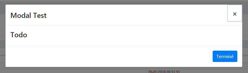
we just upgraded our application to angular 7 and we noticed that all ngBootstrap modals have now a default autofocus on the close button like the following picture.

modal image

here is my code:

html modal code:

<form [formGroup]="storeForm" novalidate>
    <div class="modal-content">
        <div class="modal-header">
            <h4 class="modal-title">Modal Test</h4>
            <button type="button" class="close" aria-label="Close" 
               (click)="activeModal.dismiss('Cross click')">
               <span aria-hidden="true">&times;</span>
            </button>
        </div>
        <div class="modal-body">
            <h4>Todo</h4>
        </div>
        <div class="modal-footer">
            <button role="button" type="submit" class="btn btn-primary" 
               (click)="activeModal.close('Finish click')" prevent-double- 
               submit>{{ 'store.add.finish' | translate }}</button>
       </div>
    </div>
</form>

and how is the modal called thanks to my component.ts

    const modal = this._modalService.open(ModalComponent, { backdrop: 
       'static', size: 'lg'});
    modal.result.then(
        (data) => {
           // some code
        },
        () => {
        }
    );

My question is how can i remove this default autofocus that doesn't fit with our expected behaviour?

Thanks for the reading and please forgive the misspellings.

Flow
  • 550
  • 1
  • 4
  • 12

7 Answers7

76

The focus is needed to be within modal for accessibility and keyboard navigation reasons. By default the focus is on the first focusable element within modal, which in your case is the close button. You can add ngbAutofocus attribute to the element where you want the focus to be.

Focus management demo.

<button type="button" ngbAutofocus class="btn btn-danger"
      (click)="modal.close('Ok click')">Ok</button>

You can read more on github

Kld
  • 6,970
  • 3
  • 37
  • 50
  • that's what i did, was just checking if i could get my previous behaviour back. But seems that's not possible. Thanks for your time. – Flow Dec 06 '18 at 08:01
13

If you don't mind the close button actually focused but want to get rid of the ugly outline, you can use outline: none.

template.html:

<button type="button" aria-label="Close">Close</button>

styles.css:

button[aria-label="Close"]:focus {
  outline: none;
}
Clashsoft
  • 11,553
  • 5
  • 40
  • 79
Eudz
  • 540
  • 6
  • 19
  • Please consider adding some prose that gives your code a little context. I think that you will find that it benefits others encountering this question's issue more. – entpnerd Oct 04 '19 at 21:11
  • 1
    button[aria-label="Close"]:focus { outline: none;} – Alessandro Dec 09 '19 at 20:49
  • 1
    There was a discussion on this issue: https://github.com/ng-bootstrap/ng-bootstrap/issues/2814 However, there seems to be no outcome. So hiring the outline seems to be the best solution so far. – Sarang Nov 28 '20 at 10:27
  • If you want the nuclear option: `button[aria-label="Close"] { outline: none; outline: none; border: none; opacity: 1; background: none; }` – Sean Jun 08 '22 at 12:44
11

It's an ugly hack, but you can add a non visible element as the first element:

<input type="text" style="display:none" />
Jacquers
  • 179
  • 1
  • 4
  • I did something similar but display:none didn't work for me. I ended up applying a custom class to the input e.g. with .no-size { height: 0, width: 0, padding: 0, border: 0 } – s3nt1n3lz Sep 28 '22 at 13:41
1

Add style="outline: none;" to your close button

Example :

<button type="button" class="close" aria-label="Close" (click)="modal.dismiss('Cross click')"> 
<span aria-hidden="true">&times;</span>
</button>
Sandeep Patel
  • 2,069
  • 2
  • 14
  • 20
1

In my case i wanted to remove totally the autofocus on buttons or inputs. I set instead "ngbAutofocus" (example below) in the main container and it works for me. If someone has a better solution, please share. Thank you :-)

 <div class="modal-header" ngbAutofocus>
    <h4 class="modal-title" id="modal-title">Profile deletion</h4>
    <button type="button" class="close" aria-label="Close button" aria-describedby="modal-title" (click)="modal.dismiss('Cross click')">
      <span aria-hidden="true">&times;</span>
    </button>
  </div>
  <div class="modal-body">
    <p><strong>Are you sure you want to delete <span class="text-primary">"John Doe"</span> profile?</strong></p>
    <p>All information associated to this user profile will be permanently deleted.
    <span class="text-danger">This operation can not be undone.</span>
    </p>
  </div>
  <div class="modal-footer">
    <button type="button" class="btn btn-outline-secondary" (click)="modal.dismiss('cancel click')">Cancel</button>
    <button type="button" class="btn btn-danger" (click)="modal.close('Ok click')">Ok</button>
  </div>
1

Add tabindex="-1" ngbAutofocus to any text element before your close button. This will replicate the default Bootstrap functionality.

Example:

<div class="offcanvas-header">
  <h5 class="offcanvas-title" tabindex="-1" ngbAutofocus>Contact Us</h5>
  <button type="button" class="btn-close" (click)="offcanvas.dismiss('Cross click')" aria-label="Close"></button>
</div>

It removes the initial focus from the Close button, while bringing the focus into the modal (or offcanvas). That way the close button is the next focus-able item (and none of the links in the background <body> element are focus-able).

Note: you may also need to addstyle="outline:0" to your text element to ensure there isn't an outline on subsequent open/close actions.

Daniel Congrove
  • 3,519
  • 2
  • 35
  • 59
0

I note that Bootstrap itself does not highlight the first control

ngx-bootstrap also does not highlight the first control

Adam
  • 2,616
  • 33
  • 29