1

Dublicate part

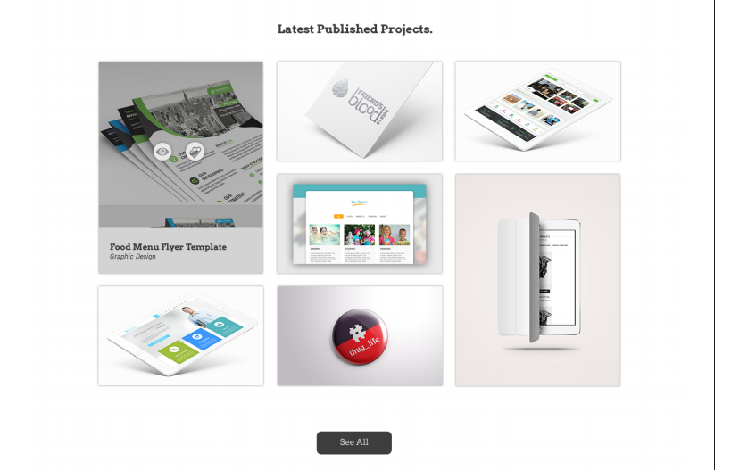
I am trying to build a certain layout for a section in React application, the layout is similar to this image below, Ignore the lines on the right. enter image description here here is my HTML, the boxes are empty for the moment, back to that later..

const projects = () => {
  return (
    <section className="projects">
      <div className="container fcontainer">
        <div className="fcol fcol--1">
          <div className="box-1"></div>
          <div className="box-2"></div>
        </div>
        <div className="fcol fcol--2">
          <div className="box-1"></div>
          <div className="box-1"></div>
          <div className="box-1"></div>
        </div>
        <div className="fcol fcol--3">
          <div className="box-1"></div>
          <div className="box-2"></div>
        </div>
      </div>
    </section>
  )
}
Now here is my .scss code

.fcol {
    color: #333;
    margin: 1rem;
    text-align: center;
    font-size: 3rem;
    display: flex;
    flex-direction: column;
    height: 60vh;
    flex-grow: 4;

    &--1 {
      .box-1{
        background-color: lightblue;
        flex-grow: 1;
        margin-bottom: 2rem;
      } 
      
      .box-2{
        background-color: lightgreen;
        flex-grow: 2;
      }
    }

    &--2 {
      .box-1{
        background-color: lightblue;
        flex-grow: 1;
        justify-content: space-between;
        &:not(:last-child){
          margin-bottom: 2rem;
        }
      } 
    }

    &--3 {
      .box-1{
        background-color: lightblue;
        flex-grow: 3;
        margin-bottom: 2rem;
      } 
      
      .box-2{
        background-color: lightgreen;
        flex-grow: 2;
      }
    }
  }

and here is the result..enter image description here

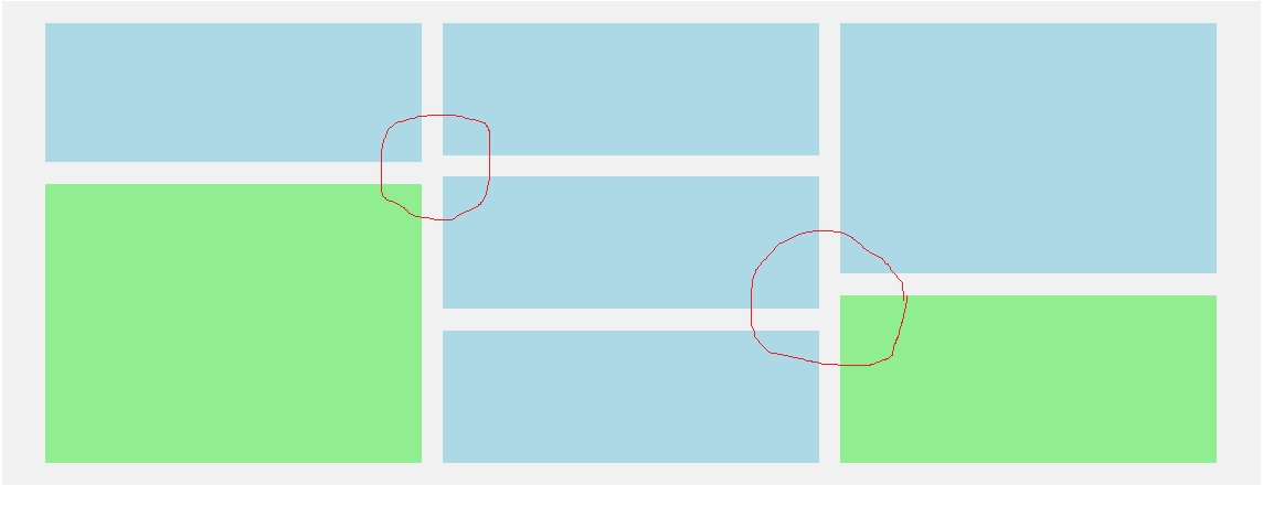
this is a codepen for you guys to edit and fix the issue if you are interested, also feel free to change the HTML and scss entire structure if you have a better approach.

the Non-dublicate part
I am a little stuck in populating each box with an image as the image always overflow outside the box even if I manually set it's height and width to 100%, nor does it work if I added the bootstrap class img-fluid. another error occures when importing and using images from the .scss file in my react app, check it out in the link, thats it, thanks very much for your time

MoSwilam
  • 824
  • 2
  • 10
  • 26
  • Have you run the code snippets to see if they work? – SuperDJ Dec 06 '18 at 17:52
  • well, I didn't run it here to be honest, but I did provide a link to a working sample in codepen – MoSwilam Dec 06 '18 at 17:56
  • The problem (at least in your [codepen](https://codepen.io/anon/pen/LXXLpG?editors=1100)) is your use of `flex-grow`. This property is designed to distribute free space in the container. Because the middle column has more free space (this column has two gaps, the other columns have one), the items will be smaller. Use `flex-basis` instead. See the duplicate for more details. – Michael Benjamin Dec 06 '18 at 18:00
  • thanks Michael, that helped, the question actually consists of two parts, and yeah the first part turned out to be duplicate but the second is not I guess, plus, I actually referred to another question I have at the end which nobody also answered, could you please consider checking that out and then maybe you want to unmark it duplicate, thanks – MoSwilam Dec 06 '18 at 18:31
  • hello again Michael, could you please consider rereading my question, thanks – MoSwilam Dec 06 '18 at 20:42

1 Answers1

1

Is this what you are trying to do?

https://codepen.io/t_sg/pen/NEQayz

The HTML:

<section class="projects">
  <div  class="container fcontainer">
    <div class="fcol fcol--1">
      <div class="box box-1"></div>
      <div class="box box-2"></div>
    </div>
    <div class="fcol fcol--2">
      <div class="box box-1"></div>
      <div class="box box-1"></div>
      <div class="box box-1"></div>
    </div>
    <div class="fcol fcol--3">
      <div class="box box-2"></div>
      <div class="box box-1"></div>
    </div>
  </div>
</section>

And the CSS:

.fcontainer {
  display: flex;
  align-items: stretch;
  background-color: #f1f1f1;
  padding: 10px 30px;

  .fcol {
    color: #333;
    margin: 1rem;
    text-align: center;
    font-size: 3rem;
    display: flex;
    flex-direction: column;
    height: 60vh;
    flex-grow: 4;
  }
}

.box {
  margin-top: 10px;
  margin-bottom: 10px;

  &-1 {
    background: lightblue;
    flex: 0 0 33.33%;
    max-height: calc(33.33% - 20px);
  }

  &-2 {
    background: lightgreen;
    flex: 0 0 66.67%;
    max-height: calc(66.67% - 20px);
  }
}
tsg
  • 205
  • 2
  • 7
  • Yes sir, that's exactly what I am trying to do :), I would appreciate if you can consider the 2nd part of the question too, related to putting an image in each box, avoiding image overflowing outside the of it. but thanks very much anyway :) – MoSwilam Dec 06 '18 at 18:10