i am Currently working on a Angular 2 Website. I wanted to have a Landing section which covers the Full screen, a content Section, which is as large as the Content inside and a Footer at the Bottom as well as a navbar that stays always on top.
I'm more of a Backend-Developer, so CSS is not my biggest Strength.
My Current code for Testing is:
Global CSS:
html, body {
    margin: 0px;
    padding: 0px;
    width: 100vw;
    height: 100vh;
}
App-Component HTML and CSS:
<app-home></app-home>
<header>
    Test
</header>
.
header {
    position: absolute;
    top: 0px;
    left: 0px;
    width: 100%;
    height: 50px;
    color: white;
    background-color: rgba(0, 0, 0, 0.8);
}
And my Home-Component HTML / CSS:
<header></header>

<div class="content"></div>

<footer></footer>
.
header {
    position: relative;
    width: 100%;
    height: 100%;
    background: blue;
}

.content {
    position: relative;
    width: 100%;
    height: 500px;
    background: red;
}

footer {
    position: relative;
    width: 100%;
    height: 50px;
    background-color: yellow;
}
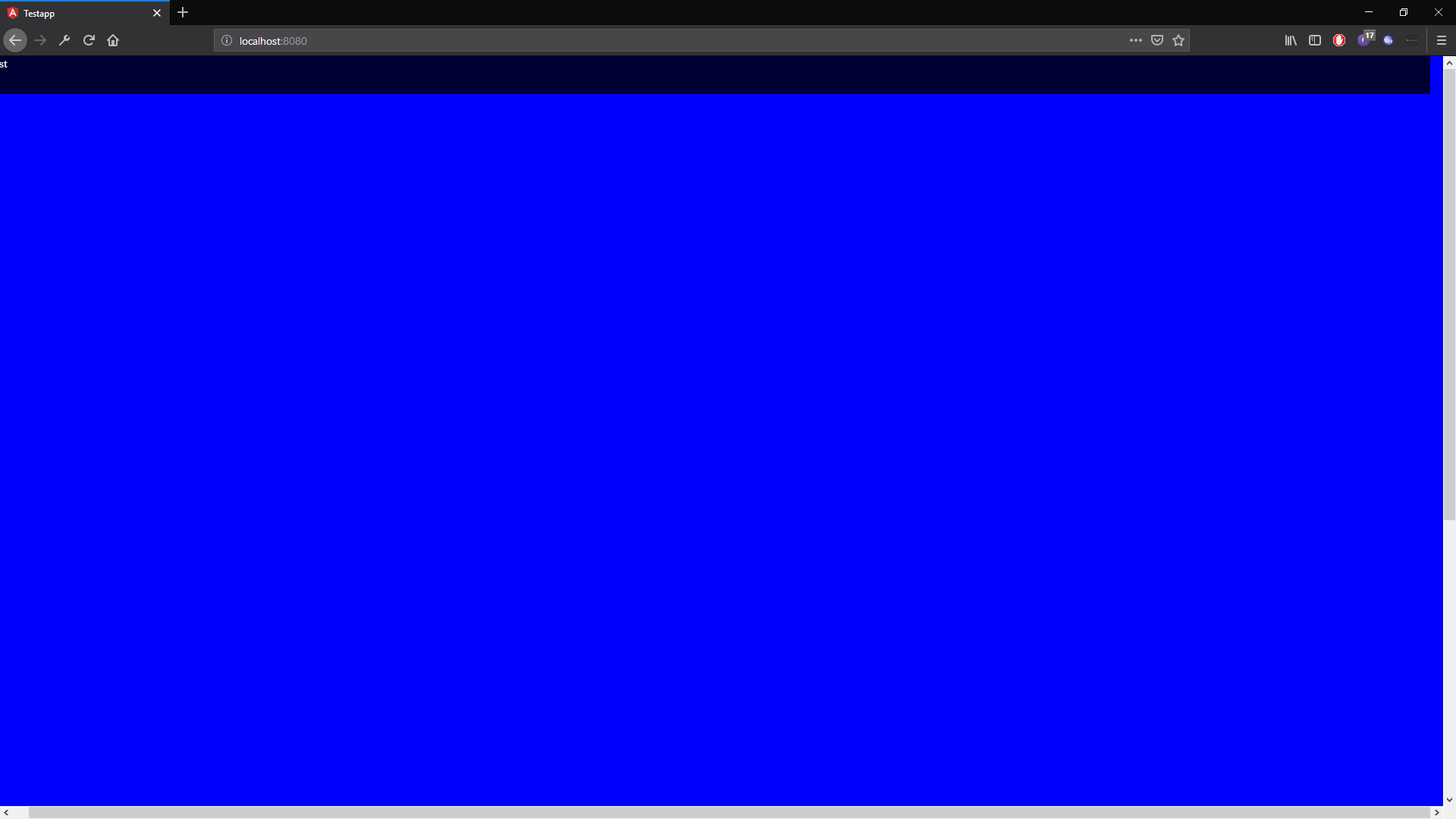
The Problem i Currently have is, that all my Containers are about 10px wider that the screen. Because of this there is a Horizontal Scrollbar at the bottom. The weird thing is that this Problem only occurs when i add the content or footer section. When i only have the header Everything is fine. Also the Navbar stays in the correct size.
Probalby it's just a stupid small mistake, but even with other solutions from Stack Overflow i tried it is still not working.
I appreciate all your Help!