I want my background image to be responsive in mobile view.
I used this to scale my background image to the whole desktop:
 html  {
   background:url("image/2.jpg") no-repeat center center fixed;
   background-size: cover;
 }
But I cant have a great result in this: (this is most requested suggestion in my search)
@media only screen and (max-width: 600px) {
  html{
    width: 100%;
  }
}
This is a desktop background 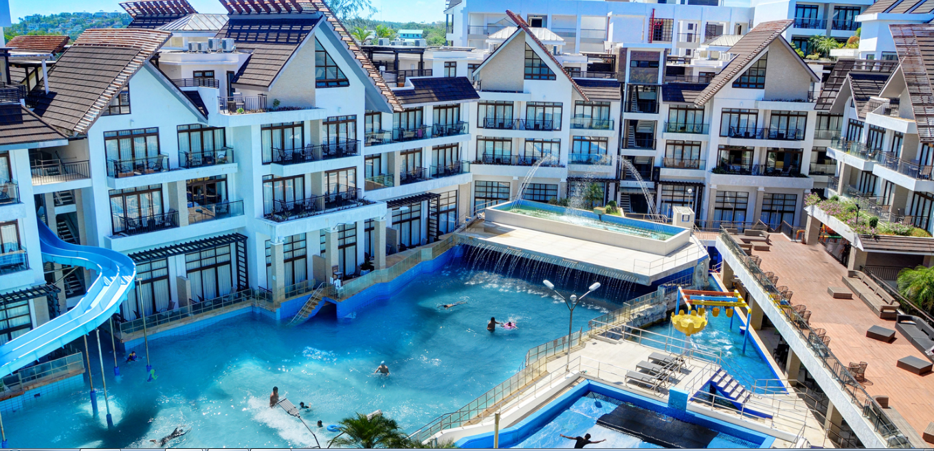
While this is what happens in my mobile view 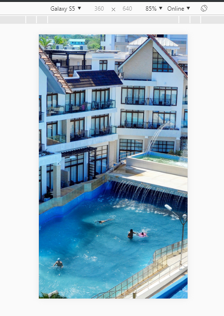