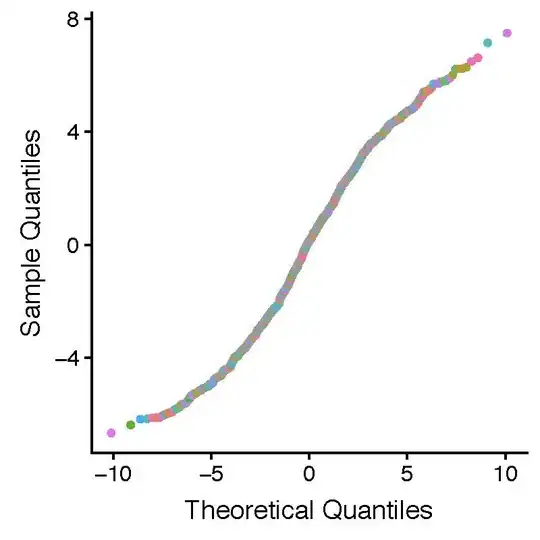
I am using qqplotr::stat_qq_point() which is an "add-on" to ggplot2 to display a quantile-quantile plot. I would like to color the points by a grouping factor and also provide a figure key. I would also like to include a 95% CI band and fit line. One coherent way to do these tasks is to use ggplot2, stat_qq_band (CI from qqplotr), stat_qq_line (best fit line in both ggplot2 and qqplotr) and stat_qq_point (plotted qq points from qqplotr). However, I cannot work out how to present the figure key.
In my code (below) have omitted the 95% CI and fit line, as they can be easily added afterwards. The code provides correctly colored points, but no legend.
I know that my code is very kludgy. If I understand correctly, aes in stat_qq_point only accepts thesample parameter and does not accept colour. This means that the normal strategies to provide colour and figure legends for plots of data points are not available.
I found a very similar question here
However, the previous question and answer is a little bit of a "hack". The strategy proposed in the previous question is to not use stat_qq_point but rather to calculate the quantiles separately using the base function qqnorm. The ggplot function geom_point can then be used with its attendant abilities to color points individually and provide a figure key.
sample data from the other question:
set.seed(1001)
N <- 1000
G <- 10
dd <- data_frame(x=runif(N),
         f=factor(sample(1:G,size=N,replace=TRUE)),
         y=rnorm(N)+2*x+as.numeric(f))
m1 <- lm(y~x,data=dd)
dda <- cbind(augment(m1),f=dd$f)
Using these data with my approach is as follows:
gg_color_hue <- function(n) {
  hues = seq(15, 375, length = n + 1)
  hcl(h = hues, l = 65, c = 100)[1:n]
}

n = length(unique(dda$f))
colores_1 = gg_color_hue(n)
dda$Color <- colores_1[dda$f]

dda$theory_quant=qqnorm(dda$.resid,plot.it=FALSE)$x
dda$sample_quant=qqnorm(dda$.resid,plot.it=FALSE)$y

library(qqplotr)

ggplot() +
stat_qq_point(
    data = dda,
    mapping = aes(sample = .resid),
    colour=dda$Color
) +
scale_colour_manual(
    values=unique(dda$Colour),
    name ="f",
    labels=c(1:10)
) +
guides(
    colour = guide_legend(override.aes = list(fill=NA),ncol=2,byrow=TRUE)
     ) +
labs(x = "Theoretical Quantiles", y = "Sample Quantiles")
And yields the following, which has colored points but no figure key:
So, in sum, I would like an approach to draw qq plots with points colored by groupings, a best fit line, 95% CI and figure key using ggplot2 and its "add-on" qqplotr. But perhaps it is simply not possible to do all of these tasks uing qqplotr.
I thought it would be of value to leave my question on SO, in case any better approaches have emerged in the previous 1.8 years since the previous question was asked.
Many thanks for your help!
