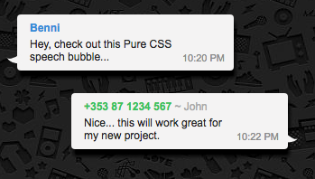
I am trying to create a speech bubble with an arrow on the left and right side. Something like below
I have used the below CSS to achieve the same :
.speech-wrapper{
  padding: 30px 40px;
  }
.chatbox {
  padding: 5px;
  margin-left: 5px;
  margin-right: 5px;
  margin-top:3px;
  background: #c7edfc;
  color: #000;
  position: relative;
  border-radius: 4px;
  overflow-wrap: break-word;
  word-wrap: break-word;
  hyphens: auto;


}
.chatbox_other{
padding: 5px;
  margin-left: 5px;
  margin-right: 5px;
  margin-top:3px;
  background: #D3D3D3;
  color: #000;
  position: relative;
  border-radius: 4px;
  overflow-wrap: break-word;
  word-wrap: break-word;
  hyphens: auto;


}

      .name_other{
        font-weight: 600;
        position: absolute;
        font-size: 12px;
        margin: 0 0 4px;
        color: #3498db;
         bottom: 8px;
        right: 10px;
      }

.timestamp_other{
        font-size: 11px;
        position: absolute;
        text-align: left;
        bottom: 0px;
        left: 10px;
        text-transform: uppercase; color: #999
}
.timestamp{
        font-size: 11px;
        position: absolute;
        bottom: 8px;
        right: 10px;
        text-transform: uppercase; color: #999
      }
/* speech bubble 13 */
      .name{
        font-weight: 600;
        font-size: 12px;
        margin: 0 0 4px;
        color: #3498db;
      }
        .bubble-arrow {
      position: absolute;
      width: 0;
      bottom:42px;
      left: -16px;
      height: 0;
      &.alt{
        right: -2px;
        bottom: 40px;
        left: auto;
      }
    }
.bubble-arrow:after {
      content: "";
      position: absolute;
      border: 0 solid transparent;
      border-top: 9px solid #c7edfc;
      border-radius: 0 20px 0;
      width: 15px;
      height: 30px;
      transform: rotate(145deg);
    }
    .bubble-arrow.alt:after {
      transform: rotate(45deg) scaleY(-1);
    }
But for me, the arrow is missing always it always comes with a box.

I am a beginner to HTML and CSS any help on this will be appreciated. Am I doing anything wrong to draw the rectangle?
EDIT:
I can see the chat bubble on chrome and all recent browsers but when I try using the very old browsers the below statement does not decode correctly. So the chat triangle was not in the appropriate position.
 transform: rotate(145deg);
    }
    .bubble-arrow.alt:after {
      transform: rotate(45deg) scaleY(-1);
    }
HTML CODE:
<div class="speech-wrapper"><div class="chatbox"><div class="txt"><p class="name">TestUser1</p>Hi<span class="timestamp">10:20 pm</span></div><div class="bubble-arrow alt"></div></div>
Is there anything else can I use apart from the transform