How to use diamond style for fab + bottom app bar? In the sketch files on the website https://material.io/tools/theme-editor/ there are such styles fab:
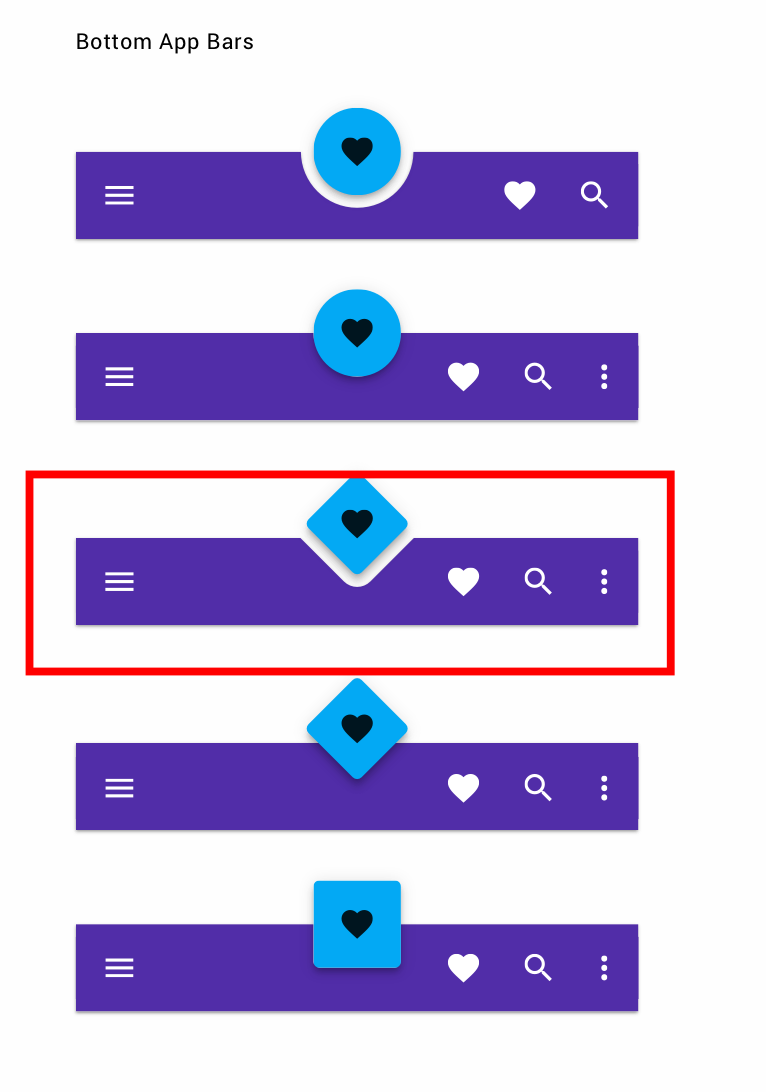
Looked at all possible styles and tags...
How to use diamond style for fab + bottom app bar? In the sketch files on the website https://material.io/tools/theme-editor/ there are such styles fab:
Looked at all possible styles and tags...
Currently there isn't a official shape for the BottomAppBar.
However with the version 1.1.0 of the material components library you can customize the shape of the FloatingActionButton using the app:shapeAppearance attribute.
You can use something like:
 <com.google.android.material.floatingactionbutton.FloatingActionButton
        app:layout_anchor="@id/bar"
        app:shapeAppearance="@style/FabDiamondOverlay"
        .../>
with this style:
 <style name="FabDiamondOverlay" parent="">
    <item name="cornerFamily">cut</item>
    <item name="cornerSize">8dp</item>
  </style>
It is the result:
Currently the shape theming attributes doesn't affect the BottomAppBar and you can only have rounded corners for the FAB cradle. There is a workaround added in the official repository.
Just use a default BottomAppBar with the attribute app:fabCradleMargin (it defines the distance between the FloatingActionButton and the BottomAppBar)
<com.google.android.material.bottomappbar.BottomAppBar
        android:id="@+id/bar"
        ...
        android:layout_gravity="bottom"
        app:fabCradleMargin="10dp"
        />
and use the BottomAppBarTopEdgeTreatment to change the shape of the BottomAppBar:
    BottomAppBar bar = findViewById(R.id.bar);
    FloatingActionButton fab2 = findViewById(R.id.fab);
    BottomAppBarTopEdgeTreatment topEdge = new BottomAppBarCutCornersTopEdge(
            bar.getFabCradleMargin(),
            bar.getFabCradleRoundedCornerRadius(),
            bar.getCradleVerticalOffset());
    MaterialShapeDrawable babBackground = (MaterialShapeDrawable) bar.getBackground();
    //It requires 1.1.0-alpha10
    babBackground.setShapeAppearanceModel(
      babBackground.getShapeAppearanceModel()
      .toBuilder()
      .setTopEdge(topEdge)
      .build());
It is the final result:
Props to Gabriele Mariotti. I used his code and changed it a little bit to give the rounded look to bottom app bar like in the original question.
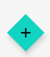
Firstly for the FAB I gave it rounded corners and rotated it 45 degrees like this:
XML code for fab:
<com.google.android.material.floatingactionbutton.FloatingActionButton
        android:layout_width="wrap_content"
        android:layout_height="wrap_content"
        android:id="@+id/fabHome"
        android:rotation="45"
        app:layout_anchor="@id/bottomBarHome"
        app:shapeAppearanceOverlay="@style/FabDiamondOverlay"/>
The FabDiamondOverlay is:
<style name="FabDiamondOverlay" parent="">
    <item name="cornerFamily">rounded</item>
    <item name="cornerSize">15%</item>
</style>
which gives the resulting FAB:

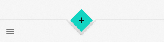
Now for the bottom bar XML:
<com.google.android.material.bottomappbar.BottomAppBar
        android:id="@+id/bottomBarHome"
        android:layout_width="match_parent"
        android:layout_height="wrap_content"
        android:backgroundTint="@color/grey"
        app:fabCradleMargin="20dp"
        app:fabCradleVerticalOffset="5dp"
        android:layout_gravity="bottom" />
and this code in OnCreate method to give bottom app bar a custom look:
    BottomAppBar bar = findViewById(R.id.bottomBarHome);

    BottomAppBarTopEdgeTreatment topEdge = new BottomAppBarCutCornersTopEdge(
            bar.getFabCradleMargin(),
            bar.getFabCradleRoundedCornerRadius(),
            bar.getCradleVerticalOffset());

    MaterialShapeDrawable bottomBarBackground = (MaterialShapeDrawable) bar.getBackground();
    bottomBarBackground.setShapeAppearanceModel(
            bottomBarBackground.getShapeAppearanceModel()
                    .toBuilder()
                    .setTopRightCorner(CornerFamily.ROUNDED,75)
                    .setTopLeftCorner(CornerFamily.ROUNDED,75)
                    .setTopEdge(topEdge)
                    .build());
Where BottomAppBarCutCornersTopEdge is by modifying Gabrielle's code:
Source
@Override
    @SuppressWarnings("RestrictTo")
    public void getEdgePath(float length, float center, float interpolation, ShapePath shapePath) {
        float fabDiameter = getFabDiameter();
        if (fabDiameter == 0) {
            shapePath.lineTo(length, 0);
            return;
        }

        float diamondSize = fabDiameter / 2f;
        float middle = center + getHorizontalOffset();

        float verticalOffsetRatio = cradleVerticalOffset / diamondSize;
        if (verticalOffsetRatio >= 1.0f) {
            shapePath.lineTo(length, 0);
            return;
        }

        float barLeftVertex = middle - (fabMargin + diamondSize - cradleVerticalOffset);
        float barRightVertex = middle + (fabMargin + diamondSize - cradleVerticalOffset);
        float depth = (diamondSize - cradleVerticalOffset + fabMargin) * interpolation;

        float heightArc = 25;
        float widthArc = 25;

        shapePath.lineTo(barLeftVertex, 0);

        shapePath.lineTo(middle-widthArc, depth-heightArc);

        shapePath.addArc(middle-widthArc-10, 35, middle+widthArc+10, depth-15, 135, -83);

        shapePath.lineTo(middle+widthArc, depth-heightArc);
        shapePath.lineTo(barRightVertex, 0);

        shapePath.lineTo(length, 0);
    }
The values here were decided with hit and trial. I couldn't understand what every variable did and there seems to be really less documentation about it. But it gets the job done! Here is the final result:
