1

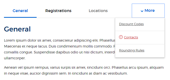
The design team for my project created a mockup for a tab component solution. In the mockup, if there are a surplus of tabs - meaning there are more tabs than can fit in the available horizontal space - any tab(s) that would be truncated is removed and placed in a flyout/drop down menu. Here is an example where there are 6 tabs, but the last three would be truncated given the screen size:

enter image description here

Here is some sample markup:

<div class="tabs-container">    
    <ul>
        <li>
            <button type="button">Tab 1</button>
        </li>
        <li>
            <button type="button">Tab 2</button>
        </li>
        <li>
            <button type="button">Tab 3</button>
        </li>
    </ul>
    <div class="tabs-panel is-active">Tab 1 Content</div>
    <div class="tabs-panel">Tab 2 Content</div>
    <div class="tabs-panel">Tab 3 Content</div>
</div>

I'm currently using the react-tabs library to render my tabs, but the feature described above is not part of that solution. This feature could be accomplished with plain javascript/jQuery, but that would be non-ideal.

Can this be accomplished with HTML/CSS or even ReactJS?

mellis481
  • 4,332
  • 12
  • 71
  • 118
  • You could use media queries to show/hide different layouts of the same content based on available screen width. – Pointy Jan 10 '19 at 14:23
  • 1
    In React you could measure the screen size and then conditionally render each tab to the desired location. – Toby Jan 10 '19 at 14:25
  • 1
    @Toby How can you measure screen size in React? – mellis481 Jan 10 '19 at 14:49
  • 1
    It's no different in React than it would be in JavaScript - `window.width`. Alternatively, you can use something a [little more advanced](https://stackoverflow.com/questions/7625718/how-to-use-javascript-conditionally-like-css3-media-queries-orientation). – Toby Jan 10 '19 at 14:50
  • @Toby Duh. Sorry. Not sure this or even Pointy's solution is a reasonable because tab header text can be any width. Am I misunderstanding something? – mellis481 Jan 10 '19 at 14:53
  • A CSS media query will blindly alter the layout regardless of independent tab size - JS will allow you fine grain control over exactly how you render the tabs based upon each tab's width. Read the link in my last comment. – Toby Jan 10 '19 at 14:55
  • I'm not sure this requires a full answer, so I'll just comment - it's not possible with CSS _alone_. Using JS, as @Toby suggested, is the right path to take. – chazsolo Jan 10 '19 at 17:06

0 Answers0