I want to visualize source-code-like structures in HTML using some sort of "block" analogy. But for whatever reason I walk into some strange sizing issues with my flexboxes. The following snippet displays a visualisation of a program that would "normally" be printed like this:
while(true) {
  goForward();
  goForward();
  goForward();
  goForward();
  goForward();
}
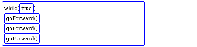
The outer box for the while is displayed as inline-flex to consume as little horizontal space as possible. But as you can see in the screenshot (or you may run the snippet yourself) there is quite a lot space wasted:
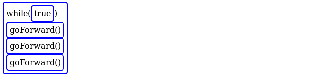
What I expect would look like this:
If you however click the goForward() blocks (which marks them with display: none), the width of the parenting block suddenly shrinks. From what I can tell it shrinks about as much as the width of the now hidden block.
The "linebreaks" between goForward() blocks are implemented using height: 0 but width: 100% elements. I also tried to do the breaks without empty elements and break-after: always, but this leads to the exact some behavior of the outer flexbox. I have observed this behavior in the most recent versions of Firefox and Chrome.
Why does the width of the outermost inline-flex element change (seemingly) with the number of items it displays vertically? And how could I "properly" implement this kind of layout where I basically want to have a block layout with arbitrary "linebreaks"?
// Hide blocks on click to demonstrate width changes
Array.from(document.querySelectorAll(".forward")).forEach(
  elem => elem.addEventListener('click', () => elem.classList.add("hide"))
);
.code-block {
border: 2px solid blue;
border-radius: 5px;
padding: 5px;
display: inline-flex;
flex-flow: row wrap;
align-items: baseline;
}
.line-break {
width: 100%;
}
.forward {
cursor: pointer;
}
.hide {
display: none;
}<div class="code-block">
<div class="terminal">while(</div>
<div class="code-block">true</div>
<div class="terminal">)</div>
<div class="line-break"></div>
<div class="code-block forward">
<div class="terminal">goForward()</div>
</div>
<div class="line-break"></div>
<div class="code-block forward">
<div class="terminal">goForward()</div>
</div>
<div class="line-break"></div>
<div class="code-block forward">
<div class="terminal">goForward()</div>
</div>
<div class="line-break"></div>
<div class="code-block forward">
<div class="terminal">goForward()</div>
</div>
<div class="line-break"></div>
<div class="code-block forward">
<div class="terminal">goForward()</div>
</div>
</div>