1

I can't label the plot, which shows the 1,2,3 attributes in the c=df["hypothyroid"] column.

I tried legend(labels=[1,2,3]) and even gca().legend(labels=1,2,3]).

print("Before PCA: ", df.shape)
seed = 7
pca = PCA(n_components=2, random_state=seed)
df_pca = pca.fit_transform(df)
pca_2 = plt.scatter(df_pca[:,0], df_pca[:,1], c=df["hypothyroid"],                 
cmap="autumn")
plt.title("2_components PCA")
plt.xlabel("Principal Component 1")
plt.ylabel("Pringipal Component 2")
plt.gca().legend(["0","1","2"])
plt.show()
print("After PCA: ", df_pca.shape)

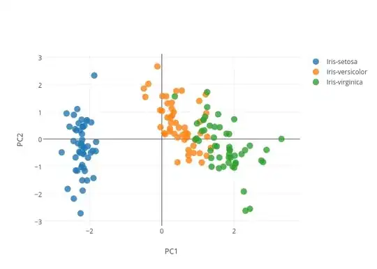
I need the plot to have the legend of the 1 2 3 hypothyroid classes. Like this image shows the iris classification. label

1 Answers1

1

Solution

As per this example from the Matplotlib docs, the accepted way to get labels for each category in a scatter plot is to run plt.scatter once for the data in each category. Here's a complete example (still with the Iris dataset):

import matplotlib.pyplot as plt

from sklearn import datasets
from sklearn.decomposition import PCA
from sklearn.discriminant_analysis import LinearDiscriminantAnalysis

iris = datasets.load_iris()

X = iris.data
y = iris.target
target_names = iris.target_names

pca = PCA(n_components=2)
df_pca = pca.fit_transform(X)

for label in np.unique(y):
    plt.scatter(df_pca[y==label, 0], df_pca[y==label, 1], label=label)

plt.legend()
plt.show()

Output:

enter image description here

Caveat

Just like the y array in my example, you'll already have to have some data structure that matches a category label with each of your data points. Otherwise, Matplotlib (or any plotting program) won't have any way of figuring out which points are in which category.

tel
  • 13,005
  • 2
  • 44
  • 62
  • np.unique(y)............... worked. Thank you! I forgot about unique(). – Ankur Patel Jan 20 '19 at 07:37
  • Glad I could help. If the answer solves your problem, you should [mark it as accepted](https://stackoverflow.com/help/someone-answers). – tel Jan 20 '19 at 07:42