YES: It's completely doable, You can assign overriding properties directly on an element without doing the ugly process many are using of creating a special one-off dictionary entry just for the specific element in question.
I don't know if its caused by a bug in WPF, but there's an initial requirement...
Your dictionary-referenced base style might need to include any properties that you want to be overridable. For some reason different properties seem to exhibit different behavior. But at least in the case of Padding, if you don't include Padding on your ControlTemplate TemplateBinding, you won't be able to override it on your element.
Additionally, in the case of margin, there seems to be some kind of "doubling" effect that happens if you include Margin in the ControlTemplate TemplateBinding. If you don't templateblind the margin, you can still override margin but the behavior changes.
STEP 1
Define a base style with a ControlTemplate. Make sure that your ControlTemplate includes a TemplateBinding for all properties that you may want to customize/override on individual elements.
<Style TargetType="Button">
    <Setter Property="Foreground" Value="White"/>
    <Setter Property="Background" Value="{StaticResource BaseButtonBG}"/>
    <Setter Property="Margin" Value="0"/>
    <Setter Property="Padding" Value="0"/>
    <Setter Property="BorderThickness" Value="0"/>
    <Setter Property="Template">
        <Setter.Value>
            <ControlTemplate TargetType="{x:Type Button}">
                <Border
                    Background="{TemplateBinding Background}"
                    BorderThickness="{TemplateBinding BorderThickness}"
                    Padding="{TemplateBinding Padding}"
                    Margin="{TemplateBinding Margin}"
                    >
                    <ContentPresenter HorizontalAlignment="Center" VerticalAlignment="Center"/>
                </Border>
            </ControlTemplate>
        </Setter.Value>
    </Setter>
    <Style.Triggers>
        <Trigger Property="IsMouseOver" Value="True">
            <Setter Property="Background" Value="{StaticResource BaseButtonBG_IsMouseOver}"/>
        </Trigger>
        <Trigger Property="IsPressed" Value="True">
            <Setter Property="Background" Value="{StaticResource BaseButtonBG_IsPressed}"/>
        </Trigger>
    </Style.Triggers>
</Style>
I've defined a few StaticResource keys for my property colors so that I can put them altogether in another place for cleaner skinning. Here are those keys:
<SolidColorBrush x:Key="BaseButtonBG"                   Color="#5f636c"/>
<SolidColorBrush x:Key="BaseButtonBG_IsMouseOver"       Color="#898C94"/>
<SolidColorBrush x:Key="BaseButtonBG_IsPressed"         Color="#484B51"/>
STEP 2
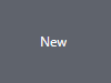
Implement actual button like this:
<Button Content="New" />
And the result of this makes a button that looks like this:
STEP 3
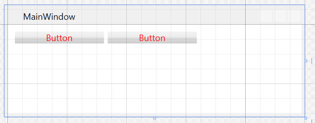
Now let's say I want all of my buttons to look squashed like that, except one. I want to add some vertical padding to make one specific button look taller. I could alter the example button like this:
<Button Content="New" Padding="0,30"/>
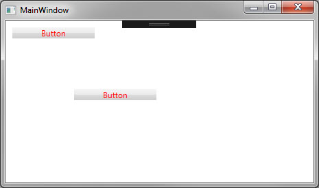
And the result:
Alternatively, you could implement the button override as follows, which gives you the ability to override Triggers or other special Style options.
<Button Content="New">
    <Button.Style >
        <Style TargetType="Button" BasedOn="{DynamicResource {x:Type Button}}">
            <Setter Property="Padding" Value="0,30"/>
        </Style>
    </Button.Style>
</Button>
TADA! We've assigned a one-off style tweak directly to the element WHERE IT BELONGS! We didn't have to create a style in a dictionary and reference it for this one case.
Important Points
In order to make this work "Padding" MUST BE defined in the ControlTemplate with the TemplateBinding code. If you don't do that, Padding directly applied to the button just gets ignored completely. Again, I'm not sure why its like this, but that seems to be the magic fix.
Further Reading: I was able to figure this out from some helpful info on this blog article:
explicit-implicit-and-default-styles-in-wpf
Interestingly, the last part of that article suggests creating a custom control with your own default style and properties that you can override similarly to how I've done here. This seems a bit overkill to me, but it might eliminate the weird bugginess problem with padding and margin behaving differently. Haven't tried that yet, though.
