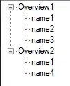
I have 6 expandable boxes that I want to behave as follows:
- Flexible layout:
- On mobile, be in a single column of 6 boxes
- On tablet / small laptop, be in 2 columns of 3 boxes each
- On desktop, be in 3 columns of 2 boxes each
- Have no space between boxes in a column, whether one or more boxes are expanded or not
DESIRED (Desktop)
.container {
    display: flex;
    flex-wrap: wrap;
    align-items: flex-start;
}
.list {
    width: 100%;  //changed with media queries to allow multiple columns
}
<div class="container">
<div class="list">
<h2>Clickable Heading</h2>
<ul class="hidden">
<!-- List items -->
</ul>
</div>
<!-- 5 more of DIV.list -->
</div>What I've tried
Achieving Goal #1 is easy with Flexbox, but the problem is that the flex direction is rows, not columns, so when a box on row 1 is expanded, ALL of row 2 moves down, including boxes in other columns. This violates Goal #2.
WRONG
Achieving Goal #2 is easy by changing flex-direction to column, but then there's no way to wrap the boxes into extra columns without specifying a fixed height to the container, which obviously can't be done when the height is dependent on whether one or more boxes are expanded or not.
Wrapping the individual boxes into DIVs within the container, and changing those DIVs' flex-wrap to column, obviously works... but only for a single layout. I'd have to re-wrap the individual boxes into DIVs for each layout, which completely negates the point of Flexbox.
Is there any way to achieve my goal?

