I’m no expert programmer, but I’m attempting to change the way in which some technical indicators are displayed in a financial charting package called TradeStation (not that the specific charting supplier is relevant).
Here is the problem: Most indicators are plotted around a Zero point, sometimes they oscillate close to this point and sometimes far away. I would like to change the way in which the indicators are plotted so that they oscillate around Zero much more. But here is the tricky part, I don’t wish to distort their shape too much; some change is fine and inevitable, but I still would like the indicators to be recognisable for what they originally were.
In the past I have tried many ways, one way was using a logarithmic type scale, but this was not successful as it made any oscillation that was at a very high value almost inconsequential- which is not the goal. The goal is to try to keep any one oscillation of the indicator almost the same, but change the placement of it so that its closer to Zero (centre). Or put another way; the goal is to make the indicators perform similar shaped oscillations, but the centre of these oscillations should be closer to Zero (the centre of the indicators scale).
Does anyone know of, or can think of a way that this can be done? Are there any algorithms that might help keep any price series oscillating more around a centre point without too much distortion to the original?
Any help on this would be greatly appreciated, thank you.
==UPDATE==
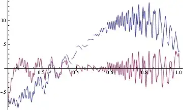
 The pink line is the original oscillator, the black line I have drawn in. It crudely represents what my goal would be for this. The circled areas show where the drawn in line crosses Zero so that its Zero value is roughly in the center of the oscillation... But the overall shape of the oscillation remains recognizable compared to the original one, also there is less discrepancy in the highs and lows of each oscillation; i.e. they are more similar in value . I have tried adding several different Detrend functions to various indicators but I have found that this distorts the shape for too much.
UPDATE 2
I have tried dividing reducing linearly the y axis by 50% and 80%, Unfortunately this seems to just act in the same was as a scale factor would? Is this correct? It does not seem to change the relationship between different oscillations. If you see my example plot, the drawn in black line has more stable high and low oscillations i.e they are more similar in value/size and this is the key goal.
Next, I am going to try to add a high pass filter to the plot to see what result that gives and if it is closer in any way to my goal.
As usual, feel free to post any comments as they are gratefully received.
Chris
UPDATE 3
I have also implemented a high pass filter to an indicator. This did not do the trick either. This also seems to act as a scale factor. What I am after essentially, is to make large oscillations smaller, and small oscillations larger. Bringing any indicator used into a more synchronised range- and do this while maintaining the basic properties of the indicator in question. A better way to describe it may be that I'm after a damping formula?
Does anyone have any other ideas, or things I should be trying?

 Seems really as @belisarius says what you want is - just do FFT on signal and remove low frequency parts. That is - you need