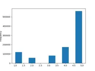
I am currently doing some analysis on Amazon's item ratings using pandas and matplotlib.
I am using the following code to generate a plot
result = ratings.copy()

result["rating"].plot(kind="hist")

fname = os.path.join("..", "figs", "my_figure.png")
plt.savefig(fname)
Where ratings is a dataframe that looks like this
0       A2VNYWOPJ13AFP  0981850006     5.0  1259798400
1       A20DWVV8HML3AW  0981850006     5.0  1371081600
2       A3RVP3YBYYOPRH  0981850006     5.0  1257984000
3       A28XY55TP3Q90O  0981850006     3.0  1314144000
4       A3VZW1BGUQO0V3  0981850006     3.0  1308268800
5       A2R9T5D7UVQZB0  0981850006     5.0  1253577600
6       A2MH49GAEWEI95  0981850006     5.0  1395532800
7        AR5DPX4ZU3D4Z  144072007X     1.0  1360886400
Unfortunately, my generated plot looks like this (notice how the bars are not all lined up)
