10

I have quite the puzzling enterprise here.

I'm building a mouse which serves as a 'torch / searchlight'. All text (inline elements, buttons, you get the point) gets inverted from the usual white to black if there is a hover happening on it, the normal background is a yellow-ish vibe.

I currently have the following setup:

const _$shadow = $('.b-cursor__shadow');
const _$front = $('.b-cursor__front');
const _$back = $('.b-cursor__back');

$(document).on('mousemove', (e) => {
  _$back.css({
    left: e.pageX,
    top: e.pageY
  });
  _$front.css({
    left: e.pageX,
    top: e.pageY
  });
  _$shadow.css({
    left: e.pageX,
    top: e.pageY
  });
});
html,
body {
  padding: 0;
  margin: 0;
  cursor: none;
  background: red;
}

.test {
  background: darkblue;
}

p {
  color: white;
  font-family: sans-serif;
  font-size: 20px;
  max-width: 30rem;
  padding: 1rem;
  margin: 1rem;
  border: 1px solid white;
}

p,
span,
a {
  position: relative;
  z-index: 105;
}

.b-cursor__back,
.b-cursor__front,
.b-cursor__shadow {
  position: fixed;
  width: 8rem;
  height: 8rem;
  margin-left: -4rem;
  margin-top: -4rem;
  border-radius: 50%;
}

.b-cursor__shadow {
  box-shadow: 0px 0px 10px 10px rgba(231, 232, 192, 1);
}

/* background changes */
.b-cursor__back {
  z-index: 104;
  background: #18173e;
  clip-path: circle(50% at 50% 50%);
}

.b-cursor__front {
  z-index: 106;
  background: white;
  clip-path: circle(50% at 50% 50%);
  mix-blend-mode: difference;
}
<script src="https://cdnjs.cloudflare.com/ajax/libs/jquery/3.3.1/jquery.min.js"></script>

<p>Lorem ipsum dolor sit amet, consectetur adipiscing elit. Duis pretium pharetra ipsum, at placerat ante maximus vitae. Duis lacus urna, posuere id dapibus in, semper vitae massa. Quisque at egestas nisl. In ex elit, imperdiet eu interdum a, auctor vitae ante. Pellentesque efficitur imperdiet elementum. Integer at nibh gravida nisl sodales ornare ut quis est. Suspendisse sem odio, congue vitae felis at, tincidunt interdum purus. Morbi vitae efficitur est, non congue ante. Proin vel odio et metus sodales lobortis quis ut justo. Phasellus rhoncus eu urna vitae tristique. Suspendisse potenti. Curabitur quis quam lobortis mi laoreet lacinia. Cras non ultrices eros. Nam sed leo et tortor vestibulum cursus nec eu massa. Suspendisse potenti.</p>

<section class="b-cursor">
  <div class="b-cursor__shadow"></div>
  <div class="b-cursor__back"></div>
  <div class="b-cursor__front"></div>
</section>
<div class="test">
  <p>ja uh misschien werkt dit wel niet
    <p>
</div>

(codepen)

This nearly produces the desired result, except the border-radius: 50% doesn't handle semi-nice stacking divs correctly. Pixel drama! Image for clarification:

Screenshot

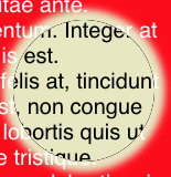
Question: How can I remove the black border created by stacking these two elements with identical size while preserving the current effect on text?

Temani Afif
  • 245,468
  • 26
  • 309
  • 415
roberrrt-s
  • 7,914
  • 2
  • 46
  • 57
  • 1
    I think you might be able to get away more easily by using a single SVG with a radial gradient as the cursor, then apply mix-blend-mode on the SVG to composite it with difference on the background... – AKX Feb 13 '19 at 16:18
  • 2
    Unrelated to your issue, but scrolling really throws off the spotlight positioning. – Turnip Feb 13 '19 at 16:20
  • @AKX Hey AKX, I tried to apply this effect within a single SVG, but i'm using z-index stacks to have content appear 'between' the elements, so the difference effect is working on white text. – roberrrt-s Feb 13 '19 at 16:21
  • @Turnip I'm using a full-width/height div for the final project, so the actual position of the mouse will not be affected in that case. Thanks for your heads up though! – roberrrt-s Feb 13 '19 at 16:22
  • 1
    Looks related to [this question](https://stackoverflow.com/questions/8948939/box-shadow-and-border-rendering-bug), but not a duplicate – Christian Vincenzo Traina Feb 13 '19 at 16:23
  • @CristianTraìna Hi Cristian, thanks for the heads up, but this problem persist regardless of the `box-shadow`. – roberrrt-s Feb 13 '19 at 16:24
  • 1
    https://codepen.io/anon/pen/OdwoWY Maybe just use an inset box shadow (I know it's not exactly the same result but, no black bar) – Superdrac Feb 13 '19 at 16:29
  • @Superdrac Thanks for your comment! However, this will not be enough for the designers that created it, nor the customers wishes. – roberrrt-s Feb 18 '19 at 20:48

3 Answers3

9

I would simply add another element above using pseudo element to hide that small border and simplify the code by moving the container instead of each element. Also no need for the clip-path

const _$cursor = $('.b-cursor');

$(document).on('mousemove', (e) => {
  _$cursor.css({
    left: e.pageX,
    top: e.pageY
  });
});
html,
body {
  padding: 0;
  margin: 0;
  cursor: none;
  background: red;
}

.test {
  background: darkblue;
}

p {
  color: white;
  font-family: sans-serif;
  font-size: 20px;
  max-width: 30rem;
  padding: 1rem;
  margin: 1rem;
  border: 1px solid white;
}

p,
span,
a {
  position: relative;
  z-index: 105;
}

.b-cursor { /*no z-index here !!!*/
  position: absolute;
  width: 8rem;
  height: 8rem;
  margin-left: -4rem;
  margin-top: -4rem;
}
/*the magic element*/
.b-cursor:before {
  content:"";
  position:absolute;
  top:-1px;
  left:-1px;
  right:-1px;
  bottom:-1px;
  border:2px solid rgba(231, 232, 192, 1);
  border-radius:50%;
  z-index:999;
}
/**/

.b-cursor__back,
.b-cursor__front,
.b-cursor__shadow {
  position:absolute;
  top:0;
  left:0;
  width:100%;
  height:100%;
  border-radius: 50%;
}

.b-cursor__shadow {
  box-shadow: 0px 0px 10px 10px rgba(231, 232, 192, 1);
}

/* background changes */
.b-cursor__back {
  z-index: 104;
  background: #18173e;
}

.b-cursor__front {
  z-index: 106;
  background: white;
  mix-blend-mode: difference;
}
<script src="https://cdnjs.cloudflare.com/ajax/libs/jquery/3.3.1/jquery.min.js"></script>

<p>Lorem ipsum dolor sit amet, consectetur adipiscing elit. Duis pretium pharetra ipsum, at placerat ante maximus vitae. Duis lacus urna, posuere id dapibus in, semper vitae massa. Quisque at egestas nisl. In ex elit, imperdiet eu interdum a, auctor vitae ante. Pellentesque efficitur imperdiet elementum. Integer at nibh gravida nisl sodales ornare ut quis est. Suspendisse sem odio, congue vitae felis at, tincidunt interdum purus. Morbi vitae efficitur est, non congue ante. Proin vel odio et metus sodales lobortis quis ut justo. Phasellus rhoncus eu urna vitae tristique. Suspendisse potenti. Curabitur quis quam lobortis mi laoreet lacinia. Cras non ultrices eros. Nam sed leo et tortor vestibulum cursus nec eu massa. Suspendisse potenti.</p>

<section class="b-cursor">
  <div class="b-cursor__back"></div>
  <div class="b-cursor__front"></div>
  <div class="b-cursor__shadow"></div>
</section>
<div class="test">
  <p>ja uh misschien werkt dit wel niet</p>
</div>

Here is anoher idea with less of code and pure JS without jQuery:

document.onmousemove = function(e) {
  document.body.style.setProperty('--mx',(e.pageX)+'px');
  document.body.style.setProperty('--my',(e.pageY)+'px');
  
  document.body.style.setProperty('--x',(e.clientX)+'px');
  document.body.style.setProperty('--y',(e.clientY)+'px');
  

}
html {
  background:red;
}
body{
  padding: 1px;
  margin: 0;
  min-height:100vh;
  cursor: none;
  background:
    radial-gradient(circle at var(--x) var(--y),#18173e 4rem,transparent 4rem) fixed;
}

.test {
  background:
    radial-gradient(circle at var(--x) var(--y),#18173e 4rem,transparent 4rem) fixed,
    darkblue;
}

p {
  color: white;
  font-family: sans-serif;
  font-size: 20px;
  max-width: 30rem;
  padding: 1rem;
  margin: 1rem;
  border: 1px solid white;
}

.b-cursor { /*no z-index here !!!*/
  position: absolute;
  width: 8rem;
  height: 8rem;
  top:var(--my);
  left:var(--mx);
  margin-left: -4rem;
  margin-top: -4rem;
}
/*the magic element*/
.b-cursor:before{
  content:"";
  position:absolute;
  top:-1px;
  left:-1px;
  right:-1px;
  bottom:-1px;
  border:2px solid rgba(231, 232, 192, 1);
  border-radius:50%;
  z-index:999;
}
.b-cursor:after {
  content:"";
  position:absolute;
  top:0;
  left:0;
  right:0;
  bottom:0;
  box-shadow: 0px 0px 10px 10px rgba(231, 232, 192, 1);
  border-radius:50%;
  z-index:998;
}
/**/
.b-cursor > div {
  position:absolute;
  top:0;
  left:0;
  width:100%;
  height:100%;
  border-radius: 50%;
  z-index: 997;
  background: white;
  mix-blend-mode: difference;
}
<p>Lorem ipsum dolor sit amet, consectetur adipiscing elit. Duis pretium pharetra ipsum, at placerat ante maximus vitae. Duis lacus urna, posuere id dapibus in, semper vitae massa. Quisque at egestas nisl. In ex elit, imperdiet eu interdum a, auctor vitae ante. Pellentesque efficitur imperdiet elementum. Integer at nibh gravida nisl sodales ornare ut quis est. Suspendisse sem odio, congue vitae felis at, tincidunt interdum purus. Morbi vitae efficitur est, non congue ante. Proin vel odio et metus sodales lobortis quis ut justo. Phasellus rhoncus eu urna vitae tristique. Suspendisse potenti. Curabitur quis quam lobortis mi laoreet lacinia. Cras non ultrices eros. Nam sed leo et tortor vestibulum cursus nec eu massa. Suspendisse potenti.</p>

<section class="b-cursor">
  <div></div>
</section>
<div class="test">
  <p>ja uh misschien werkt dit wel niet</p>
</div>

You can still optimize more if we consider another gradient that will replace the shadow and the border that we used to fix the black one:

document.onmousemove = function(e) {
  document.body.style.setProperty('--mx',(e.pageX)+'px');
  document.body.style.setProperty('--my',(e.pageY)+'px');
  
  document.body.style.setProperty('--x',(e.clientX)+'px');
  document.body.style.setProperty('--y',(e.clientY)+'px');
  

}
html {
  background:red;
}
body{
  padding: 1px;
  margin: 0;
  min-height:100vh;
  cursor: none;
  background:
    radial-gradient(circle at var(--x) var(--y),#18173e 4rem,transparent 4rem) fixed;
}

.test {
  background:
    radial-gradient(circle at var(--x) var(--y),#18173e 4rem,transparent 4rem) fixed,
    darkblue;
}

p {
  color: white;
  font-family: sans-serif;
  font-size: 20px;
  max-width: 30rem;
  padding: 1rem;
  margin: 1rem;
  border: 1px solid white;
}

.b-cursor { /*no z-index here !!!*/
  position: absolute;
  width: 8rem;
  height: 8rem;
  top:var(--my);
  left:var(--mx);
  margin-left: -4rem;
  margin-top: -4rem;
}

.b-cursor:before{
  content:"";
  position:absolute;
  top:-10px;
  left:-10px;
  right:-10px;
  bottom:-10px;
  background:
    radial-gradient(farthest-side, 
      transparent calc(100% - 18px),rgba(231, 232, 192, 1) calc(100% - 15px),
      rgba(231, 232, 192, 1) calc(100% - 10px),transparent 100%);
  border-radius:50%;
  z-index:999;
}

.b-cursor:after {
  content:"";
  position:absolute;
  top:0;
  left:0;
  width:100%;
  height:100%;
  border-radius: 50%;
  z-index: 998;
  background: white;
  mix-blend-mode: difference;
}
<p>Lorem ipsum dolor sit amet, consectetur adipiscing elit. Duis pretium pharetra ipsum, at placerat ante maximus vitae. Duis lacus urna, posuere id dapibus in, semper vitae massa. Quisque at egestas nisl. In ex elit, imperdiet eu interdum a, auctor vitae ante. Pellentesque efficitur imperdiet elementum. Integer at nibh gravida nisl sodales ornare ut quis est. Suspendisse sem odio, congue vitae felis at, tincidunt interdum purus. Morbi vitae efficitur est, non congue ante. Proin vel odio et metus sodales lobortis quis ut justo. Phasellus rhoncus eu urna vitae tristique. Suspendisse potenti. Curabitur quis quam lobortis mi laoreet lacinia. Cras non ultrices eros. Nam sed leo et tortor vestibulum cursus nec eu massa. Suspendisse potenti.</p>

<section class="b-cursor">
</section>
<div class="test">
  <p>ja uh misschien werkt dit wel niet</p>
</div>

Safari doesn't support the gradient syntax with at as detailed in this question so here is another alternative:

document.onmousemove = function(e) {
  document.body.style.setProperty('--mx',(e.pageX)+'px');
  document.body.style.setProperty('--my',(e.pageY)+'px');
  
  document.body.style.setProperty('--x',(e.clientX)+'px');
  document.body.style.setProperty('--y',(e.clientY)+'px');
  

}
html {
  background:red;
}
body{
  padding: 1px;
  margin: 0;
  min-height:100vh;
  cursor: none;
  background:
    radial-gradient(farthest-side ,#18173e 100%,transparent 100%)
    calc(var(--x) - 4rem) calc(var(--y) - 4rem)/8rem 8rem  fixed no-repeat;
}

.test {
  background:
    radial-gradient(farthest-side ,#18173e 100%,transparent 100%)
    calc(var(--x) - 4rem) calc(var(--y) - 4rem)/8rem 8rem  fixed no-repeat,
    darkblue;
}

p {
  color: white;
  font-family: sans-serif;
  font-size: 20px;
  max-width: 30rem;
  padding: 1rem;
  margin: 1rem;
  border: 1px solid white;
}

.b-cursor { /*no z-index here !!!*/
  position: absolute;
  width: 8rem;
  height: 8rem;
  top:var(--my);
  left:var(--mx);
  margin-left: -4rem;
  margin-top: -4rem;
}

.b-cursor:before{
  content:"";
  position:absolute;
  top:-10px;
  left:-10px;
  right:-10px;
  bottom:-10px;
  background:
    radial-gradient(farthest-side, 
      transparent calc(100% - 18px),rgba(231, 232, 192, 1) calc(100% - 15px),
      rgba(231, 232, 192, 1) calc(100% - 10px),transparent 100%);
  border-radius:50%;
  z-index:999;
}

.b-cursor:after {
  content:"";
  position:absolute;
  top:0;
  left:0;
  width:100%;
  height:100%;
  border-radius: 50%;
  z-index: 998;
  background: white;
  mix-blend-mode: difference;
}
<p>Lorem ipsum dolor sit amet, consectetur adipiscing elit. Duis pretium pharetra ipsum, at placerat ante maximus vitae. Duis lacus urna, posuere id dapibus in, semper vitae massa. Quisque at egestas nisl. In ex elit, imperdiet eu interdum a, auctor vitae ante. Pellentesque efficitur imperdiet elementum. Integer at nibh gravida nisl sodales ornare ut quis est. Suspendisse sem odio, congue vitae felis at, tincidunt interdum purus. Morbi vitae efficitur est, non congue ante. Proin vel odio et metus sodales lobortis quis ut justo. Phasellus rhoncus eu urna vitae tristique. Suspendisse potenti. Curabitur quis quam lobortis mi laoreet lacinia. Cras non ultrices eros. Nam sed leo et tortor vestibulum cursus nec eu massa. Suspendisse potenti.</p>

<section class="b-cursor">
</section>
<div class="test">
  <p>ja uh misschien werkt dit wel niet</p>
</div>
Temani Afif
  • 245,468
  • 26
  • 309
  • 415
  • 4
    wow this is cool - found it over the meta post. if you scrollwheel w/o moving the mouse you get a blue circle and the inverter effect stays where it was but as soon as you move the mouse 1 pixel they gt re-united – Patrick Artner Feb 17 '19 at 09:31
4

This might work for your needs.

const _$shadow = $('.b-cursor__shadow');
const _$front = $('.b-cursor__front');
const _$back = $('.b-cursor__back');

$(document).on('mousemove', (e) => {
  _$back.css({
    left: e.pageX,
    top: e.pageY
  });
  _$front.css({
    left: e.pageX,
    top: e.pageY
  });
  _$shadow.css({
    left: e.pageX,
    top: e.pageY
  });
});
html, body {
    padding: 0;
    margin: 0;
    cursor: none;
    background: red;
}
.test {
    background: darkblue;
}
p {
    color: white;
    font-family: sans-serif;
    font-size: 20px;
    max-width: 30rem;
    padding: 1rem;
    margin: 1rem;
    border: 1px solid white;
}
p, span, a {
    position: relative;
    z-index: 105;
}
.b-cursor__shadow2, .b-cursor__back, .b-cursor__front, .b-cursor__shadow {
    position: fixed;
    width: 8rem;
    height: 8rem;
    margin-left: -4rem;
    margin-top: -4rem;
    border-radius: 50%;
}
.b-cursor__shadow {
    box-shadow: 0px 0px 10px 20px rgba(231, 232, 192, 1);
    z-index: 107;
    height: 8rem;
    width: 8rem;
}
.b-cursor__shadow2 {
    background: radial-gradient(circle at center, #18173e 100%, #18173e 25%);
    z-index: 109;
    height: 8rem;
    width: 8rem;
    background-color: transparent;
}
/* background changes */
.b-cursor__back {
    z-index: 104;
    height: 8rem;
    width: 8rem;
    background: radial-gradient(circle at center, #18173e 100%, #18173e 25%);
    background-size: 100% 100%;
    background-position: 50% 50%;
}
.b-cursor__back:after {
    width: 7rem;
    height: 7rem;
    content: '';
    border-radius: 50%;
    background: transparent;
    position: absolute;
    top: 50%;
    left: 50%;
    transform: translate(-50%, -50%);
    box-shadow: 0px 0px 0px 1rem #18173e;
    transition: all 0.3s linear;
    mix-blend-mode: normal;
}
.b-cursor__front {
    z-index: 106;
    height: 8rem;
    width: 8rem;
    background: white;
    background: radial-gradient(circle at center, #ffffff 100%, #ffffff 25%);
    background-position: 50% 50%;
    mix-blend-mode: difference;
}
.b-cursor__front:after {
    width: 7rem;
    height: 7rem;
    content: '';
    border-radius: 50%;
    background: transparent;
    position: absolute;
    top: 50%;
    left: 50%;
    transform: translate(-50%, -50%);
    box-shadow: 0px 0px 0px 1rem #ffffff;
    transition: all 0.3s linear;
    mix-blend-mode: normal;
}
<script src="https://cdnjs.cloudflare.com/ajax/libs/jquery/3.3.1/jquery.min.js"></script>

<p>Lorem ipsum dolor sit amet, consectetur adipiscing elit. Duis pretium pharetra ipsum, at placerat ante maximus vitae. Duis lacus urna, posuere id dapibus in, semper vitae massa. Quisque at egestas nisl. In ex elit, imperdiet eu interdum a, auctor vitae
  ante. Pellentesque efficitur imperdiet elementum. Integer at nibh gravida nisl sodales ornare ut quis est. Suspendisse sem odio, congue vitae felis at, tincidunt interdum purus. Morbi vitae efficitur est, non congue ante. Proin vel odio et metus sodales
  lobortis quis ut justo. Phasellus rhoncus eu urna vitae tristique. Suspendisse potenti. Curabitur quis quam lobortis mi laoreet lacinia. Cras non ultrices eros. Nam sed leo et tortor vestibulum cursus nec eu massa. Suspendisse potenti.</p>

<section class="b-cursor">
  <div class="b-cursor__shadow"></div>
  <div class="b-cursor__back"></div>
  <div class="b-cursor__front"></div>
  <div class="cursor_now"></div>
</section>
<div class="test">
  <p>ja uh misschien werkt dit wel niet
    <p>
</div>
Katy H.
  • 224
  • 1
  • 10
0

try adding

filter:blur(1.4px); /* or anywhere between 0.7px to 1.9px */

to the outer circle or inner circles. in your CSS

roberrrt-s
  • 7,914
  • 2
  • 46
  • 57
Ryan Stone
  • 345
  • 4
  • 19