Trying to nail this curved header with pure CSS but using border radius isn't keeping the left & right border edges as sharp as they are in the image. Any help would be appreciated.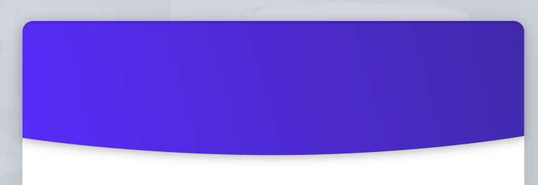
Asked
Active
Viewed 1.4k times
-2
cbcp
- 339
- 2
- 6
- 12
-
1Take a look at this: https://stackoverflow.com/questions/41609308/curved-border-with-stroke-in-pure-css where are you now? Where is your code that’s not working? – soulshined Feb 16 '19 at 02:29
1 Answers
12
You can do this in many ways, one such thing is using border-radius. So, for the shape you just need to have a border-bottom-left-radius: and border-bottom-right-radius:.
Here I have attached the code,
body{
  background-color:#f3f2f4;
}
.header{
  width:105%;
  height:40%;
  left:-3%;
  position:absolute;
  background-image: linear-gradient(#8459f9, #4c3196);
  border-top-left-radius:10px;
  border-top-right-radius:10px;
  border-bottom-left-radius: 50% 20%;
  border-bottom-right-radius: 50% 20%;
}
.container{
  width:60vw;
  height:80vh;
  background-color:white;
  border-radius:10px;
  position:absolute;
  top:50%;
  overflow:hidden;
  left:50%;
  transform:translate(-50%,-50%);
}
<!DOCTYPE html>
<html>
<head>
<meta charset="utf-8">
<meta name="viewport" content="width=device-width">
<title>JS Bin</title>
</head>
<body>
<div class="container">
<div class="header">
</div>
</div>
</body>
</html>
chintuyadavsara
- 1,509
- 1
- 12
- 23