I am trying add up an animation diagonally. The rectangle height and width I know (dynamically adding up). Now trying to animated a line from N to L, or O to M or other ways. I tried with svg and increasing the line's x1, y1, x2, y2 but this is getting complicated. Any easier or simpler solution?
2 Answers
You can give your lines a stroke-dashoffset
and animate it to 0. To calculate the values for stroke-dasharray
and stroke-dashoffset
I've used the getTotalLength() method to calculate the values for stroke-dasharray
and stroke-dashoffset
. I hope it helps.
svg{background:#efefef;width:100vh}
rect,line{stroke:black; fill:none}
#om{stroke-dasharray:94.34px;
stroke-dashoffset:94.34px;
animation: om 1s linear forwards;}
@keyframes om {
to {
stroke-dashoffset: 0;
}
}
<svg viewBox = "0 0 100 70">
<rect x="10" y="10" width="80" height="50" />
<line id="om" x1="90" y1="60" x2="10" y2="10" />
</svg>
And this is with both lines animated this time with m to o and l to n: just change the values for x1 to x2 and viceversa. The same for y. This will change the direction of the line.
svg{background:#efefef;width:100vh}
rect,line{stroke:black; fill:none}
#mo,#ln{stroke-dasharray:94.34px;
stroke-dashoffset:94.34px;
animation: om 1s linear forwards;}
@keyframes om {
to {
stroke-dashoffset: 0;
}
}
<svg viewBox = "0 0 100 70">
<rect x="10" y="10" width="80" height="50" />
<!--<line id="om" x1="90" y1="60" x2="10" y2="10" />
<line id="nl" x1="90" y1="10" x2="10" y2="60" />-->
<line id="mo" x2="90" y2="60" x1="10" y1="10" />
<line id="ln" x2="90" y2="10" x1="10" y1="60" />
</svg>
I'm using the same animation for both #om
and #nl

- 31,608
- 5
- 29
- 42
-
1This is perfect. The example you added, its O to M, I figured for L to N I changed the line to `
`, kind of confused how to make this work with N to L and M to O? – Subhendu Kundu Feb 18 '19 at 11:28 -
That's pretty much it. If you draw the line in the same direction as the first one, then you can re-use the CSS animation: https://jsfiddle.net/0xodvb82/ – Paul LeBeau Feb 18 '19 at 12:24
-
Thanks a ton guys. This worked. :) However https://developer.mozilla.org/en-US/docs/Web/API/SVGPathElement/getTotalLength doesnt work in IE and safari. :( – Subhendu Kundu Feb 19 '19 at 08:07
-
There are other methods to get the size of the line. After all your lines are the hypotenuse in a right angled triangle. This in the case you need to calculate it dynamically. – enxaneta Feb 19 '19 at 08:21
-
Yes there are (I fixed that with `const pathWidth = Math.sqrt(Math.pow(LO, 2) + Math.pow(ON, 2))` but `stroke-dasharray` not working in IE11. Any polyfill for this? – Subhendu Kundu Feb 20 '19 at 16:30
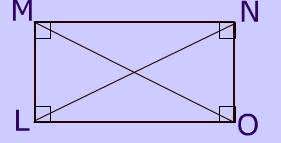
Here is a simple idea with background coloration. You simply need to increase the background-size
to draw the lines:
.box {
width:200px;
height:100px;
border:2px solid;
background:
/*M - O*/
linear-gradient(to top right,
transparent calc(50% - 3px),red calc(50% - 2px),
red calc(50% + 2px),transparent calc(50% + 3px)) top left,
/*N - L*/
linear-gradient(to bottom right,
transparent calc(50% - 3px),#000 calc(50% - 2px),
#000 calc(50% + 2px),transparent calc(50% + 3px)) bottom left;
background-repeat:no-repeat;
background-size:0 0;
transition:1s linear;
}
.box:hover {
background-size:100% 100%;
}
<div class="box">
</div>
Change the background-position
to change the animation start:
.box {
width:200px;
height:100px;
border:2px solid;
background:
/*M - O*/
linear-gradient(to top right,
transparent calc(50% - 3px),red calc(50% - 2px),
red calc(50% + 2px),transparent calc(50% + 3px)) bottom right,
/*N - L*/
linear-gradient(to bottom right,
transparent calc(50% - 3px),#000 calc(50% - 2px),
#000 calc(50% + 2px),transparent calc(50% + 3px)) top right;
background-repeat:no-repeat;
background-size:0 0;
transition:1s linear;
}
.box:hover {
background-size:100% 100%;
}
<div class="box">
</div>
UPDATE
Here is a version without the use of calc()
that will work with IE. It will be a bit tricky to find the correct values and you will need a background-position
animation which is also tricky:
.box {
width:200px;
height:100px;
border:2px solid;
background:
/*M - O*/
linear-gradient(to top right,
transparent 176px,red 176px,
red 181px,transparent 181px) left 200% top 200%,
/*N - L*/
linear-gradient(to bottom right,
transparent 176px,black 176px,
black 181px,transparent 181px) left -100% bottom -100%;
background-repeat:no-repeat;
background-size:200% 200%;
transition:1s linear;
}
.box:hover {
background-position:0 0,left 0 bottom 0;
}
<div class="box">
</div>
Check this answer for more details about the different values: https://stackoverflow.com/a/51734530/8620333

- 245,468
- 26
- 309
- 415
-
1
-
@DogukanCavus yes in the second example because the background-position is getting recalculated again when the size is changing, so rendring issue – Temani Afif Feb 18 '19 at 11:26