1

I need to make a box with arrow for a tooltip but I can't use pseudo-elements because :

  1. The box background is a little transparent
  2. It has border

here is the example :

.box {
  margin: 60px 0 0 0;
  width: 250px;
  height: 50px;
  background-color: rgba(255, 144, 89, 0.5);
  border-radius: 5px;
  position: relative;
  border: 2px solid #ff6e26;
}

.box:after,
.box:before {
  bottom: 100%;
  left: 50%;
  border: solid transparent;
  content: " ";
  height: 0;
  width: 0;
  position: absolute;
  pointer-events: none;
}

.box:after {
  border-color: rgba(136, 183, 213, 0);
  border-bottom-color: rgba(255, 144, 89, 0.5);
  border-width: 10px;
  margin-left: -10px;
}

.box:before {
  border-color: rgba(194, 225, 245, 0);
  border-bottom-color: #ff6e26;
  border-width: 12px;
  margin-left: -12px;
}
<div class="box"></div>

https://codepen.io/Masoudm/pen/qgvJGX

as you see when I make the background transparent it doesn't works for the arrow, because I already used ::before behind it for its border. I wonder if there is another approach which allows me to keep the box size dynamic.

Update:

the box should be something like this ( except the top curvy line)
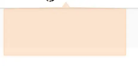
enter image description here

Temani Afif
  • 245,468
  • 26
  • 309
  • 415
masoud
  • 321
  • 5
  • 15

2 Answers2

1

Based on this previous answer I will adjust slightly the code to have a transparent background. There is two main tricks. Half the coloration of the pseudo element to avoid the intersection with the main element and the use of gradient on the main element to create the border top and create the hole for the pseudo element:

body {
 margin:0;
 background-image:linear-gradient(to right,yellow,pink);
}

.box {
  border: 2px solid red;
  border-top:transparent; /*make border-top transparent*/
  margin: 50px;
  height: 50px;
  position:relative;
  /* Use gradient to mimic the border top with a transparent gap */
  background:
    linear-gradient(red,red) left top /calc(50% - 10px*1.414) 2px,
    linear-gradient(red,red) right top/calc(50% - 10px*1.414) 2px,
    rgba(0,255,0,0.4);
  background-repeat:no-repeat;
}

.box:before {
  content: "";
  position: absolute;
  width: 20px;
  height: 20px;
  border-top: 2px solid red;
  border-left: 2px solid red;
  top: -11px;
  left: calc(50% - 11px);
  transform: rotate(45deg);
  background:linear-gradient(-45deg,transparent 50%,rgba(0,255,0,0.4) 50%);
}
<div class="box">

</div>
Temani Afif
  • 245,468
  • 26
  • 309
  • 415
0

* {
    box-sizing: border-box;
    font-family: inherit;
}

html {
    font-size: 62.25%;

}

body {
    padding: 50px;
}


.outter {
    width: 200px;
    height: 100px;
    position: relative;
}

.box {
    padding: 20px;
    width: 100%;
    height: 100%;
    background: rgba(255, 68, 0, 0.568);
    border: 3px solid orangered;
    border-radius: 5px;
    clip-path: polygon(0 0,45% 0,45% 10px,calc(45% + 15px) 10px,calc(45% + 15px) 0,100% 0,100% 100%,0 100%,0 0)
}

.arrow {
    width: 15px;
    height: 8px;
    background: rgba(255, 68, 0, 0.568);
    transform: translate(-67%, 100%);
    position: absolute;
    left: 50%;
    bottom: 98%;
}

.arrow::after {
    border: 3px solid transparent;
    border-left-color: orangered;
    border-top-color: orangered;
    border-right: 0px solid transparent;
    border-bottom: 0px solid transparent;
    width: 11px;
    height: 11px;
    position: absolute;
    left: 0;
    bottom: 34%;
    content: '';
    transform: rotate(45deg);
    background: linear-gradient(134deg,rgba(255, 68, 0, 0.56) 0%,rgba(255, 68, 0, 0.56) 50%,transparent 50%, transparent 100%);
}
<div class="outter">
    <div class="arrow"></div>
    <div class="box"></div>
</div>
Gaurav Bhardwaj
  • 328
  • 2
  • 8