I'm trying to build navigation which will be vertical. Navigation's outer width will be fixed and when the item will be increased then other items will go to the next column.
I tried it with flexbox and added flex-wrap: wrap; in the container. But cant design this.
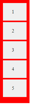
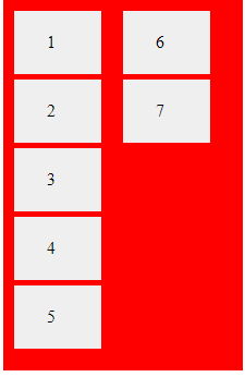
I tried with these codes.
.container {
  display: flex;
  flex-direction: column;
  height: 320px;
  width: 80px;
  flex-wrap: wrap;
  background: red;
  padding: 10px
}

.item {
  padding: 20px 30px;
  background: #efefef;
  display: inline-block;
  margin: 0 5px 5px 0;
  width: 20px
}
<div class="container">
<div class="item">1</div>
<div class="item">2</div>
<div class="item">3</div>
<div class="item">4</div>
<div class="item">5</div>
<div class="item">6</div>
<div class="item">7</div>
</div>