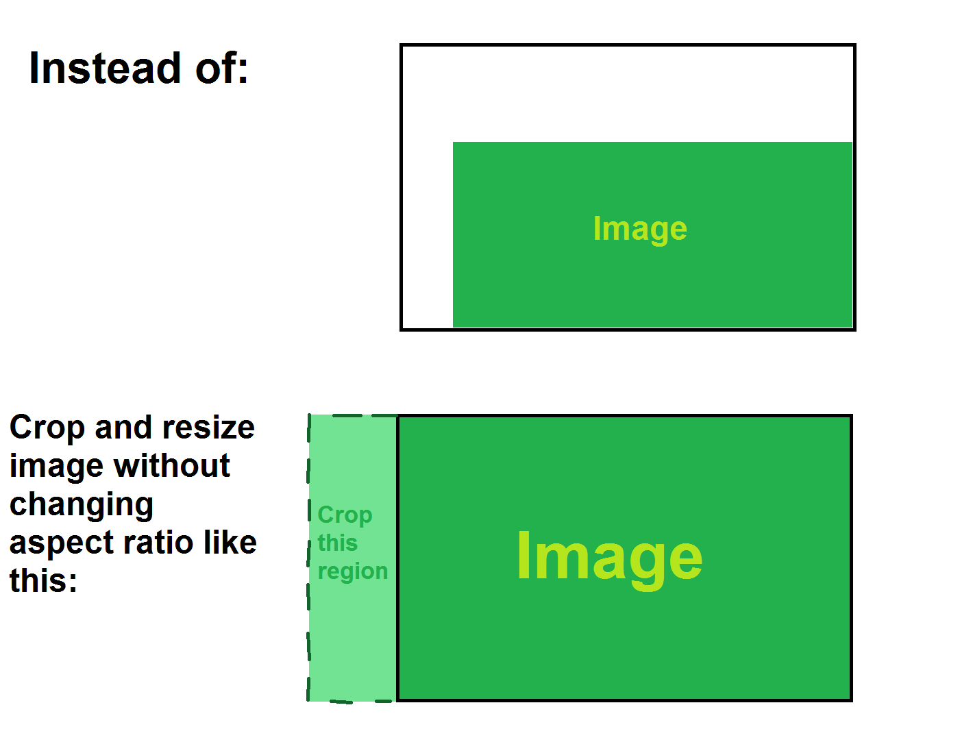
Need some help with image placement. I want my picture to float to bottom right corner and in case image size doesn't match window inner width or height, fill window with said image without changing aspect ratio. To explain it more thorough I'm adding a picture: Explanation.
Tried different approaches but all of them failed:
- Using width:100% and height:100% for "img" in CSS (issue being image aspect ratio change depending on window size)
- Using height:100% for "img" in CSS and changing "img" margin-left with JavaScript( setting left margin equal to window.innerWidth - document.getElementById("image.png").width pixels) to cut one of the sides off (issue being that resized image sometimes lacks width to begin with and couldn't get proper margin values)
Tried running through a lot of similar posts in "stackoverflow" but couldn't find one that helps.