18

Is it possible to use the built in Laravel Nova confirm dialogue in your own tool? All I would like to use is interact with it how Nova does itself.

The docs are quite light on the JS topic, as the only built in UI you seem to be able to work with is the toasted plugin: https://nova.laravel.com/docs/1.0/customization/frontend.html#javascript

Built in Laravel Nova confirm dialogue

Thomas Nadin
  • 1,167
  • 10
  • 22
  • For those not familiar with nova, can you clarify what you mean by "_use the built in Laravel Nova confirm dialogue_"? Are you talking about the dialogue/modal itself (html,css,js) or some functionality related to it? – Daniel Feb 25 '19 at 20:34
  • 1
    He's talking about Nova's "modal" functionality seen in his screenshot. – 1000Nettles Feb 25 '19 at 22:31

2 Answers2

10

You can use <modal> component whenever you want.

Here is how it work internally in Nova:

<template>
    <modal
        data-testid="confirm-action-modal"
        tabindex="-1"
        role="dialog"
        @modal-close="handleClose"
        class-whitelist="flatpickr-calendar"
    >
        <form
            autocomplete="off"
            @keydown="handleKeydown"
            @submit.prevent.stop="handleConfirm"
            class="bg-white rounded-lg shadow-lg overflow-hidden"
            :class="{
                'w-action-fields': action.fields.length > 0,
                'w-action': action.fields.length == 0,
            }"
        >
            <div>
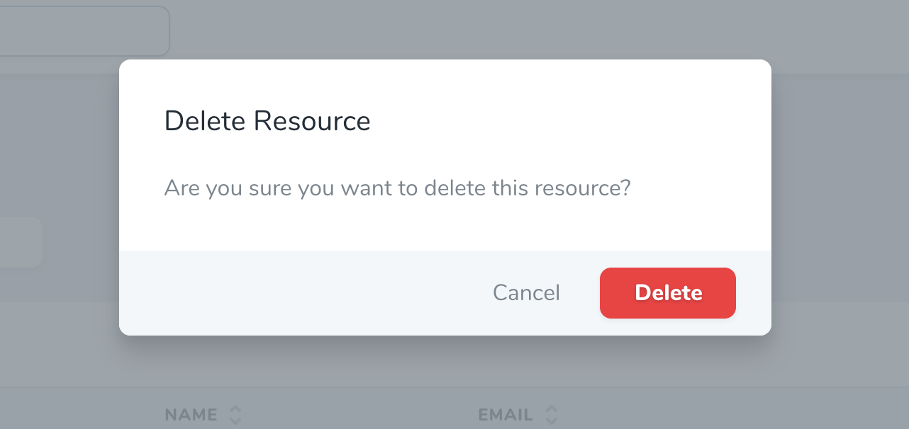
                <heading :level="2" class="border-b border-40 py-8 px-8">{{ action.name }}</heading>

                <p v-if="action.fields.length == 0" class="text-80 px-8 my-8">
                    {{ __('Are you sure you want to run this action?') }}
                </p>

                <div v-else>
                    <!-- Validation Errors -->
                    <validation-errors :errors="errors" />

                    <!-- Action Fields -->
                    <div class="action" v-for="field in action.fields" :key="field.attribute">
                        <component
                            :is="'form-' + field.component"
                            :errors="errors"
                            :resource-name="resourceName"
                            :field="field"
                        />
                    </div>
                </div>
            </div>

            <div class="bg-30 px-6 py-3 flex">
                <div class="flex items-center ml-auto">
                    <button
                        dusk="cancel-action-button"
                        type="button"
                        @click.prevent="handleClose"
                        class="btn text-80 font-normal h-9 px-3 mr-3 btn-link"
                    >
                        {{ __('Cancel') }}
                    </button>

                    <button
                        ref="runButton"
                        dusk="confirm-action-button"
                        :disabled="working"
                        type="submit"
                        class="btn btn-default"
                        :class="{
                            'btn-primary': !action.destructive,
                            'btn-danger': action.destructive,
                        }"
                    >
                        <loader v-if="working" width="30"></loader>
                        <span v-else>{{ __('Run Action') }}</span>
                    </button>
                </div>
            </div>
        </form>
    </modal>
</template>

<script>
export default {
    props: {
        working: Boolean,
        resourceName: { type: String, required: true },
        action: { type: Object, required: true },
        selectedResources: { type: [Array, String], required: true },
        errors: { type: Object, required: true },
    },
    /**
     * Mount the component.
     */
    mounted() {
        // If the modal has inputs, let's highlight the first one, otherwise
        // let's highlight the submit button
        if (document.querySelectorAll('.modal input').length) {
            document.querySelectorAll('.modal input')[0].focus()
        } else {
            this.$refs.runButton.focus()
        }
    },
    methods: {
        /**
         * Stop propogation of input events unless it's for an escape or enter keypress
         */
        handleKeydown(e) {
            if (['Escape', 'Enter'].indexOf(e.key) !== -1) {
                return
            }
            e.stopPropagation()
        },
        /**
         * Execute the selected action.
         */
        handleConfirm() {
            this.$emit('confirm')
        },
        /**
         * Close the modal.
         */
        handleClose() {
            this.$emit('close')
        },
    },
}
</script>

Here is simplified example:

<modal>
    <form
            autocomplete="off"
            class="bg-white rounded-lg shadow-lg overflow-hidden"
    >
        <div>
            <heading :level="2" class="border-b border-40 py-8 px-8">test</heading>
            test
        </div>
        <div class="bg-30 px-6 py-3 flex">
            <div class="flex items-center ml-auto">
                <button
                        type="button"
                        class="btn text-80 font-normal h-9 px-3 mr-3 btn-link"
                >
                    {{ __('Cancel') }}
                </button>

                <button
                        ref="runButton"
                        type="submit"
                        class="btn-danger"
                >
                    <span>{{ __('Run Action') }}</span>
                </button>
            </div>
        </div>
    </form>
</modal>

Kirk Beard
  • 9,569
  • 12
  • 43
  • 47
Sanasol
  • 892
  • 8
  • 24
0
  • You need to create a new component in the same folder of Tool.vue
  • I'll attach the component I used here
  • Then in the "handleConfirm" method, you can add a Ajax call to API
  • You can add you logic in that API.
  • You can find the API file in path, ToolName/routes/api.php
/* CustomModal.vue */

<template>
   <modal tabindex="-1" role="dialog" @modal-close="handleClose">
       <form @keydown="handleKeydown" @submit.prevent.stop="handleConfirm" class="bg-white rounded-lg shadow-lg overflow-hidden w-action">
           <div>
               <heading :level="2" class="border-b border-40 py-8 px-8">Confirm action</heading>
               <p class="text-80 px-8 my-8"> Are you sure you want to perform this action? </p>
           </div>
           <div class="bg-30 px-6 py-3 flex">
               <div class="flex items-center ml-auto">
                   <button type="button" @click.prevent="handleClose" class="btn btn-link dim cursor-pointer text-80 ml-auto mr-6">
                       Cancel
                   </button>
                   <button :disabled="working" type="submit" class="btn btn-default btn-primary">
                       <loader v-if="working" width="30"></loader>
                       <span v-else>Confirm</span>
                   </button>
               </div>
           </div>
       </form>
   </modal>
</template>

<script>
export default {
 methods: {
   handleConfirm() {
     // Here you can add an ajax call to API and you can add your logic there.
   },
   handleClose() {
     // Logic to hide the component
   },
 },
}
</script>

For more detailed explanation : https://medium.com/vineeth-vijayan/how-to-use-confirm-dialogs-in-a-laravel-nova-tool-b16424ffee87

Vineeth Vijayan
  • 1,215
  • 1
  • 21
  • 33