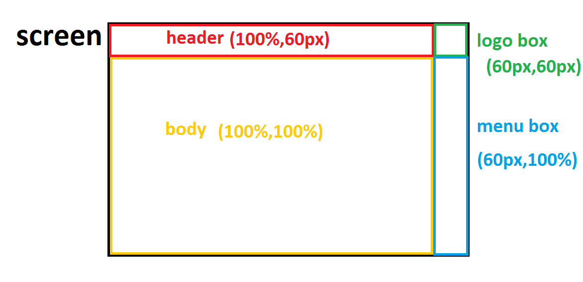
I want make divs like first photo:
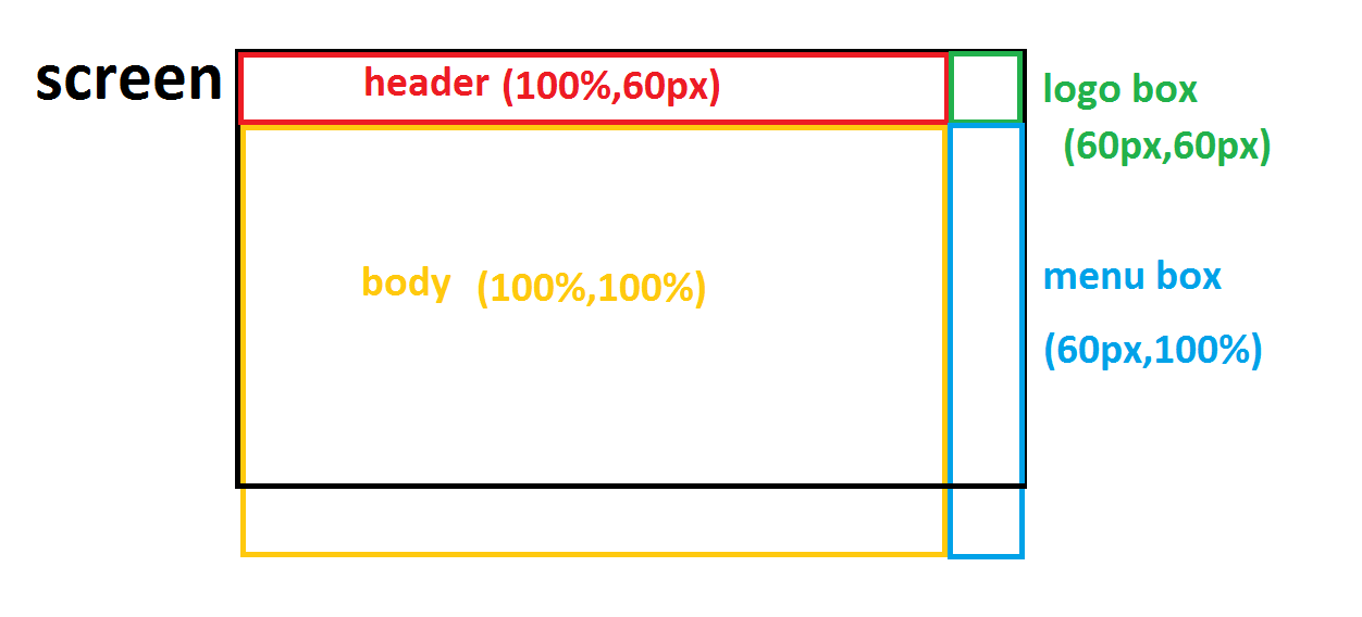
 but when I use 100% for height of yellow and blue divs
they came out of screen like second photo:
but when I use 100% for height of yellow and blue divs
they came out of screen like second photo:
 what should I do?
Asked
Active
Viewed 3,350 times
4
siyavash
- 168
- 2
- 14
-
Can you post your css/html? It looks like you're using some padding or margin to push everything down 60px. By doing this, the remaining height of the screen that you need to fill is no longer 100%. – Tyler Sells Mar 03 '19 at 05:26
-
When u use percentage values u have to make sure the wrapping div has non percentage values in order for it to work. Also please include ur HTML and CSS code. – Amiratak88 Mar 03 '19 at 05:34
-
short answer: you can always use the css calc function, like header you can use ( width:calc(100%-60px); and so – Burhan Kashour Mar 03 '19 at 10:33
-
And 1 more thing, you can use the position fixed for top header and make it full width with padding from sides to put the logo in a new layer with higher z-index ;) – Burhan Kashour Mar 03 '19 at 10:34
3 Answers
4
- Set the
flexparent (bodyin this case) tomin-height: 100vhand set its direction tocolumnso children stack - Set the body of the page (
main) toflex-grow: 1so it takes up all available space, but not more than what's available - Create a few nested
flexboxes using the defaultrowdirection - Push nested contents to the right using
justify-content: flex-end;
body, html { margin: 0 }

body, header, main {
  display: flex;
}

header, main {
  justify-content: flex-end;
}

.logo, .menu-box {
  flex-basis: 60px;
}

body {
  flex-direction: column;
  min-height: 100vh;
}

main {
  flex-grow: 1;
  background-color: #ccc;
}

.logo {
  height: 60px;
  background-color: lightgreen;
}

.menu-box {
  background-color: green;
}
<header>
<div class="logo"></div>
</header>
<main>
<aside class="menu-box"></aside>
</main>
Andy Hoffman
- 18,436
- 4
- 42
- 61
2
If you just wanted to address the hight issue you could use vh combined with calc.
.header {
   height: 60px;
}

.content {
  height: calc(100vh -60px);
}
this would fill the height of the page minus 60px.
Heres an example; https://jsfiddle.net/0ndbw3to/
Mark
- 2,061
- 1
- 16
- 26
-
What if `.header` grows taller than `60px`? Also, what about `logo box` and `menu box`? – Andy Hoffman Mar 03 '19 at 05:35
-
yeah totally @AndyHoffman if that was the case then it would need to be updated. – Mark Mar 03 '19 at 05:37
0
A simple solution using CSS Grid layout(for current support see here):
Set the layout height as 100vh.
grid-template-columns: 1fr 60px: sets the columns - the logo and menu box at 60px and the header and content take the remaining space horizontally.grid-template-rows: 60px 1fr: set the rows - the header and the logo at 60px and the content and the menu box take the remaining space vertically.
See demo below:
body {
  margin: 0; /* remove the default browser margin */
}
.wrapper {
  display: grid;
  grid-template-columns: 1fr 60px; /* set the columns */
  grid-template-rows: 60px 1fr; /* set the rows */
  height: 100vh; /* set the height of the layout */
}

/* presentation styles */
.wrapper>*{border:1px solid}.header{background:#00f}.logo{background:orange}.content{background:#f0f8ff}.aside{background:grey}
<div class="wrapper">
<div class="header"></div>
<div class="logo"></div>
<div class="content"></div>
<div class="aside"></div>
</div>
kukkuz
- 41,512
- 6
- 59
- 95