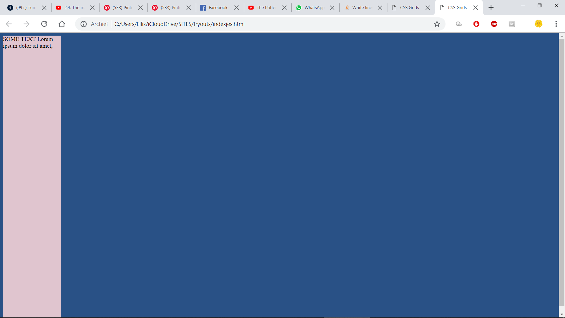
Im making a grid layout and im getting these white lines around my screen. I do not have any grid gaps or anything in my code. Its also only around the sides of my screen. Is it because the header/sidebar is in the wrapper? Then how will I make the sidebar stick to the side of the screen. Im new to grid so i'm not sure how to make the sidebar keep to the side..
<!DOCTYPE html>
<html>
<head>
  <title>CSS Grids</title>
  <style>


html {
  background-color: rgb(41, 81, 134);
 height: 100%;
}

body {
 height: 100%;
}

.wrapper{
  height: 100vh;
  width:100vh;
  display:grid;
  grid-template-columns:1r 5fr;
  grid-template-rows: 1fr;
  grid-template-areas:
  "header slideshow"
}

.header {
  grid-area: header;
  background-color: #e0c5cf;
  width: 30%;
}


.slideshow {
  grid-area: slideshow;
}
 </style>

</head>
<body>

  <div class="wrapper">
    <div class="header">
        SOME TEXT Lorem ipsum dolor sit amet,
<div="text">

    </div>

    <div class="slideshow">
    </div>

  </div>
</body>
</html>