I should think that as the content behind a backdropped element moves, the element's background color adapts to appear as if the content was shining through it. In this example, it's not the case:
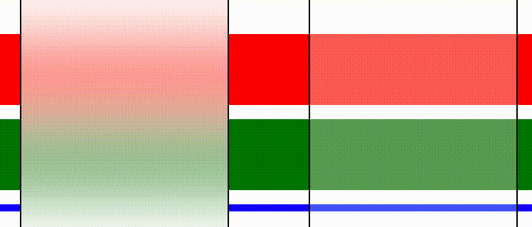
What's wrong? Tested this on Safari 12.0.3, macOS Mojave 10.14.3.
.container {
  width: 100%;
  height: 150px;
  overflow-y: scroll;
}

.block {
  height: 50px;
  margin: 10px;
}

.block:nth-child(1) {
  margin-top: 30px;
  background-color: red;
}

.block:nth-child(2) {
  background-color: green;
}

.block:nth-child(3) {
  background-color: blue;
}

.glass {
  position: absolute;
  background-color: rgba(255, 255, 255, 0.3);
  top: 0;
  width: 25%;
  border: 1px solid black;
  height: 100%;
}

.clear {
   left: 55%;
}

.frosted {
  left: 20%;
  background-color: rgba(255, 255, 255, 0.5);
  -webkit-backdrop-filter: blur(20px);
  backdrop-filter: blur(20px);

  -webkit-transform: translate3d(0, 0, 0);
  -moz-transform: translate3d(0, 0, 0);
   -ms-transform: translate3d(0, 0, 0);
  transform: translate3d(0, 0, 0);
}
<div id="app">
<div class="container">
<div class="block"></div>
<div class="block"></div>
<div class="block"></div>
<div class="glass clear"></div>
<div class="glass frosted"></div>
</div>
</div>