6

CODEPEN

Background:

I'm experimenting with Grid CSS and trying to get to this layout which is currently implemented to scale
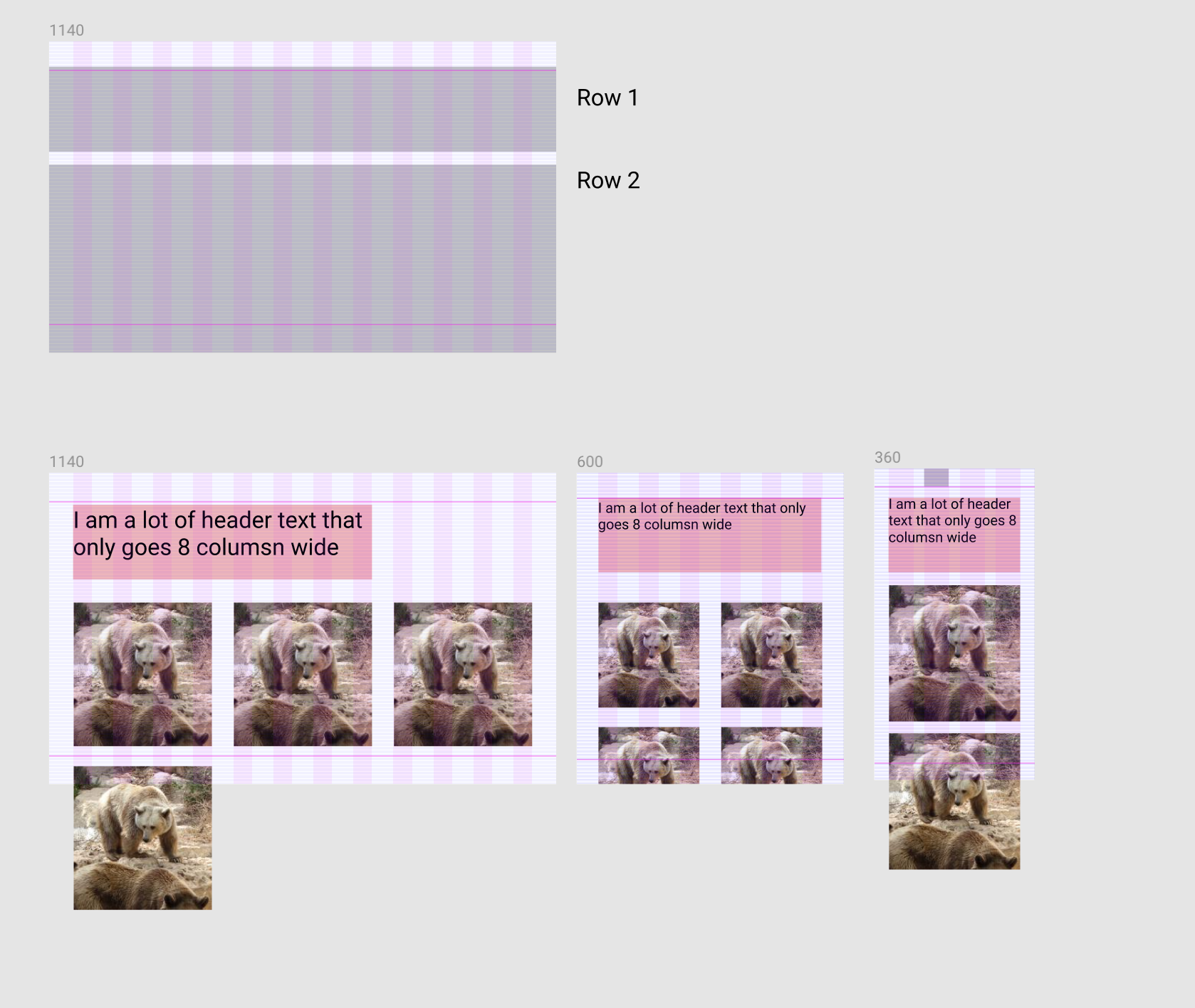
Expected Layout enter image description here

Problem: On desktop the element-header should be 8 columns wide and if I don't add grid-rows to element-header and element than <div class="element">1</div> will fill in the next to element-header. Now if I add grid-rows my element will no longer wrap.

Current Layout (problem) enter image description here enter image description here

Question How can I fix my grid to match the "expected layout" screenshot above? i.e. .element will wrap and start on the second grid row

Code:

HTML:

<section class="section">
  <div class="container">
    <div class="samba-grid">
      <div class="element-header"><h1>I am a lot of header text that only goes 8 columsn wide</h1></div>
      <div class="element">1</div>
      <div class="element">2</div>
      <div class="element">3</div>
      <div class="element">4</div>     
    </div>
  </div>
</section>

CSS:

.section {
  width: 100%;
  display: block;
  background: red;
  box-sizing: border-box;
  padding: 40px 24px;

  @media screen and (min-width: 600px) and (max-width: 1139px) {
    background: orange;
    padding: 56px 48px;
  }

  @media screen and (min-width: 1140px) {
    padding: 64px 48px;
    background: green;
  }
}

.container {
  margin: 0 auto;
  background: rgba(244,244,244, .25);
  max-width: 599px;

  @media screen and (min-width: 600px) and (max-width: 1139px) {
    max-width: 1039px;
    background: rgba(244,244,244, .25);
  }

  @media screen and (min-width: 1140px) {
    max-width: 1032px;
    background: rgba(244,244,244, .25);
  }
}

.samba-grid {
  display: grid;
  background: inherit;
  width: 100%;
  grid-template-columns: repeat(4, 1fr);
  grid-template-rows: 'auto auto';
  grid-gap: 24px;

  @media screen and (min-width: 600px) and (max-width: 1139px) {
    grid-template-columns: repeat(6, 1fr);
    grid-gap: 48px;
  }

  @media screen and (min-width: 1140px) {
    grid-template-columns: repeat(12, 1fr);
    grid-gap: 48px;
  }
}

h1 {
  font-size: 52px;
}
.element-header {
  grid-row: 1;
  grid-column: span 8; // SET THIS TO "span 12" TO SEE EXPECTED BEHAVIOR
}

.element {
  display: grid; // important to do this.
  background: rgba(0,0,0,.3);
  grid-column: span 3;
  grid-row: 2; // REMOVE THIS TO SEE EXPECTED BEHAVIOR

  @media screen and (min-width: 600px) and (max-width: 1139px) {
    grid-column: span 3;
  }

  @media screen and (min-width: 1140px) {
    grid-column: span 4;
  }
}
Temani Afif
  • 245,468
  • 26
  • 309
  • 415
Armeen Moon
  • 18,061
  • 35
  • 120
  • 233
  • Can you add the images that cause the issue into the CodePen example? – Andy Hoffman Mar 13 '19 at 23:13
  • @AndyHoffman done@! – Armeen Moon Mar 13 '19 at 23:21
  • I added `span 12` where you instructed as well as commented out `grid-row: 2`, but cannot replicate the issue you're describing. The images wrap *down* but not up next to the header. Can you fork your Pen and provide a link to the fork with the exact issue? – Andy Hoffman Mar 13 '19 at 23:25
  • Yeah sorry this is a difficult problem to describe. Ignore those comments. Heres what I want: I want the images to: start on the second row & wrap down and I also want to keep the header to `span 8` – Armeen Moon Mar 13 '19 at 23:28

4 Answers4

2

You can make the text to take the full row and then inside you decrease its width so it only take the needed width. Like that you will block the 1st row and no element can go there.

Here is a simplified example:

.samba-grid {
  display: grid;
  background: inherit;
  width: 100%;
  grid-template-columns: repeat(12, 1fr);
  grid-gap: 24px;
  border:1px solid;
}

.element-header {
  grid-row: 1;
  grid-column: 1/-1;
}
.element-header > h1 {
  /*we take 8 colmuns (without gaps) + 7 gaps*/
  width:calc(8*(100% - 11*24px)/12 + 7*24px);
  background:red;
  margin:0;
}
.samba-grid > span {
  height:50px;
  grid-column: span 2;
  background:green;
}
<div class="samba-grid">
  <div class="element-header">
    <h1>I am a lot of header text that only goes 8 columsn wide</h1>
  </div>
  <span></span>
  <span></span>
  <span></span>
  <span></span>
  <span></span>
  <span></span>
  <span></span>
  <span></span>
</div>

To make it more dynamic and easy to handle you can consider CSS variables:

:root {
  --grid:12;
  --gap:24px;
}

.samba-grid {
  display: grid;
  background: inherit;
  width: 100%;
  grid-template-columns: repeat(var(--grid), 1fr);
  grid-gap: var(--gap);
  border:1px solid;
}

.element-header {
  grid-row: 1;
  grid-column: 1/-1;
  --grid-column:8; /*simply adjust this value to control the column*/
}
.element-header > h1 {
  width:calc(var(--grid-column)*(100% - (var(--grid) - 1)*var(--gap))/var(--grid) + calc(var(--grid-column) - 1)*var(--gap));
  background:red;
  margin:0;
}
.samba-grid > span {
  height:50px;
  grid-column: span 2;
  background:green;
}
<div class="samba-grid">
  <div class="element-header">
    <h1>I am a lot of header text that only goes 8 columsn wide</h1>
  </div>
  <span></span>
  <span></span>
  <span></span>
  <span></span>
  <span></span>
  <span></span>
  <span></span>
  <span></span>
</div>

Another idea is to consider a hidden element that will take the remaining space of the first row:

.samba-grid {
  display: grid;
  background: inherit;
  width: 100%;
  grid-template-columns: repeat(12, 1fr);
  grid-gap: 24px;
  border:1px solid;
}

.element-header {
  grid-row: 1;
  grid-column: span 8;
  background:red;
  order:-2;
}

.samba-grid:before {
 content:"";
 order:-1;
 grid-column: span 4;
 background:blue;
 height:2px;
}

.samba-grid > span {
  height:50px;
  grid-column: span 2;
  background:green;
}
<div class="samba-grid">
  <div class="element-header">
    <h1>I am a lot of header text that only goes 8 columsn wide</h1>
  </div>
  <span></span>
  <span></span>
  <span></span>
  <span></span>
  <span></span>
  <span></span>
  <span></span>
  <span></span>
</div>

As a side note, setting grid-row: 2 doesn't mean start from the second row but it means be inside the second row which is creating the issue.

Temani Afif
  • 245,468
  • 26
  • 309
  • 415
  • Ok so at a high level, your solution is, 1 - make a wrapper 2 - use calc to calculate the "subgrid" – Armeen Moon Mar 13 '19 at 23:31
  • @MatthewHarwood yes basically, like that you will block the first row to your element and inside you decrease the height like you want. another idea is to use a hidden element, I will edit to add it – Temani Afif Mar 13 '19 at 23:32
  • Given this layout should I still use grid-row? I feel like it will result in the same error. The hidden block becomes a bit cumbersome also because on tablet and mobile the header is full bleed. – Armeen Moon Mar 13 '19 at 23:34
  • @MatthewHarwood you no more need grid-row in this case, and the hidden element won't be an issue but you have to change it like you do with the header one on small scree, it's like you deal with an extra element (I edited to inlude this) – Temani Afif Mar 13 '19 at 23:36
  • Ahh the order and :after is super clever too! I love these answers so far but Still don't quite understand why the grid-row logic is breaking the intended layout. I feel like intutively grid-row makes the most sense but looks like it still wont work – Armeen Moon Mar 13 '19 at 23:38
  • @MatthewHarwood the issue isn't with grid-row itself but the fact that you still have space on the right that can contain an element .. grid-row may prevent this but it will also change how the grid behave creating some issue. In your case you are forcing them to be on the second row (all of them) – Temani Afif Mar 13 '19 at 23:41
  • @MatthewHarwood grid-row isn't doing what you expect (start from second row) but it's putting them in the second row – Temani Afif Mar 13 '19 at 23:43
  • Ok That makes sense but why is it when you specify a no grid-row it wraps naturally? Is it making a new row? Is it possible to set the "start" of a grid-row but make the grid-row-end inherit the default "auto wrap" behavior? – Armeen Moon Mar 13 '19 at 23:45
  • @MatthewHarwood this is called the *implict grid*, if nothing is specified, the grid algorithm will place the element using a certain logic. but if you specify things like grid-row then it become an explicit grid and the browser should follow the instructions. We can control the wrap but not sure if we can control the *when it should wrap* (will try to think about it) – Temani Afif Mar 13 '19 at 23:47
  • thank so much on this knowledge drop. I'm gonna leave this thread open for a few more answers. But I've learned more in this thread than reading all the articles over the last few months. Also, I know it's a stretch but I'd love for a method of explicitly setting the implicit grid ;) yeahh? – Armeen Moon Mar 13 '19 at 23:48
  • @MatthewHarwood I made another edit to include CSS variable for the first example – Temani Afif Mar 14 '19 at 00:24
  • Marking this correct but it would be great if you ever have any other cool ideas on how to reset the `implict grid` – Armeen Moon Mar 14 '19 at 20:25
  • 1
    @MatthewHarwood Yes I am keeping this in mind ;) will get back If I find a cool solution ... Actually all the idea are somehow *hacks* – Temani Afif Mar 14 '19 at 20:38
  • If you got a min I got another whammy for ya. https://stackoverflow.com/questions/55175808/grid-css-container-that-scrolls-horizontally-when-children-use-grid-column Learning CSS Grid is so much harder than floats and Flex – Armeen Moon Mar 15 '19 at 05:24
1

Take the header out of the grid container. Make it a standalone block-level element.

Below, place the grid container with only the images.

Michael Benjamin
  • 346,931
  • 104
  • 581
  • 701
  • Given your solution, I'm essentially forcing rows based on DOM instead of the CSS? I trust your judgement based on your 154k points, so, I'm surely using/understanding Grid CSS incorrectly then, eh? Do you have anything more to add why I shouldn't/cannot use grid-row? – Armeen Moon Mar 13 '19 at 23:19
  • 1
    I appreciate your confidence in me, but I'm going to need to come back to this later, as I can't test much from a mobile device. – Michael Benjamin Mar 13 '19 at 23:23
  • Come back soon please! – Armeen Moon Mar 13 '19 at 23:23
  • Other great grid / flex experts here, as well. Hopefully, they can help you now. – Michael Benjamin Mar 13 '19 at 23:25
1

I'm instructing .element-header to always span the maximum number of available columns. For the h1, I added a rule into the larger @media query that keeps it scaling properly (8 of 12 columns). In addition, I commented out .grid-row: 2.

.element-header {
  grid-column-start: 1;
  grid-column-end: -1;
}

h1 {
  …  
  @media screen and (min-width: 1140px) {
    width: calc(80% / 120 * 100); /* 8 of 12 columns */
 }

Demo (using compiled CSS)

.section {
  width: 100%;
  display: block;
  background: red;
  box-sizing: border-box;
  padding: 40px 24px;
}
@media screen and (min-width: 600px) and (max-width: 1139px) {
  .section {
    background: orange;
    padding: 56px 48px;
  }
}
@media screen and (min-width: 1140px) {
  .section {
    padding: 64px 48px;
    background: green;
  }
}

.container {
  margin: 0 auto;
  background: rgba(244, 244, 244, 0.25);
  max-width: 599px;
}
@media screen and (min-width: 600px) and (max-width: 1139px) {
  .container {
    max-width: 1039px;
    background: rgba(244, 244, 244, 0.25);
  }
}
@media screen and (min-width: 1140px) {
  .container {
    max-width: 1032px;
    background: rgba(244, 244, 244, 0.25);
  }
}

.samba-grid {
  display: grid;
  background: inherit;
  width: 100%;
  grid-template-columns: repeat(4, 1fr);
  grid-template-rows: 'auto auto';
  grid-gap: 24px;
}
@media screen and (min-width: 600px) and (max-width: 1139px) {
  .samba-grid {
    grid-template-columns: repeat(6, 1fr);
    grid-gap: 48px;
  }
}
@media screen and (min-width: 1140px) {
  .samba-grid {
    grid-template-columns: repeat(12, 1fr);
    grid-gap: 48px;
  }
}

h1 {
  font-size: 52px;
}
@media screen and (min-width: 1140px) {
  h1 {
    width: calc(80% / 120 * 100);
  }
}

.element-header {
  grid-row: 1;
  grid-column-start: 1;
  grid-column-end: -1;
}

.element {
  display: grid;
  background: rgba(0, 0, 0, 0.3);
  grid-column: span 3;
}
@media screen and (min-width: 600px) and (max-width: 1139px) {
  .element {
    grid-column: span 3;
  }
}
@media screen and (min-width: 1140px) {
  .element {
    grid-column: span 4;
  }
}

.element img {
  width: 100%;
}
<section class="section">
  <div class="container">
    <div class="samba-grid">
      <div class="element-header"><h1>I am a lot of header text that only goes 8 columns wide</h1></div>
      <div class="element"><img src="https://placebear.com/160/90" alt=""></div>
      <div class="element"><img src="https://placebear.com/160/90" alt=""></div>
      <div class="element"><img src="https://placebear.com/160/90" alt=""></div>
      <div class="element"><img src="https://placebear.com/160/90" alt=""></div>     
    </div>
  </div>
</section>

CodePen demo

Andy Hoffman
  • 18,436
  • 4
  • 42
  • 61
  • Thats a cool trick! but I want the element-header to go to the 8th column and the items to start on the second row and wrap! I love the attention this question is getting I'm learning so much! – Armeen Moon Mar 13 '19 at 23:36
  • Hey Andy, I'll probably do this for the interim. However, check out our conversation temani and myself. The final explict grid row with implict grid behavior, would be cool eh? Any ideas. – Armeen Moon Mar 13 '19 at 23:56
  • @MatthewHarwood Ah, that would be very useful. CSS is still missing a lot of features. We don't even have a way to get the previous element yet. – Andy Hoffman Mar 14 '19 at 00:04
-1

I would add an empty element just to fill the space for the higher resolution.

The HTML

<div class="element-header"><h1>I am a lot of header text that only goes 8 columsn wide</h1></div>
<div class='filler'></div>
<div class="element"><img src="https://placebear.com/160/90" alt=""></div>

The CSS

.filler {
  display: none;

  @media screen and (min-width: 1140px) {
    grid-column: 9 / span 4;
    display: initial;
  }
}

That way you have something to put on that space and the auto placement algorithm doesn't use it.

You can just hide if on smaller resolutions.

arieljuod
  • 15,460
  • 2
  • 25
  • 36