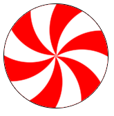
How to stack divs in a circular manner in which last div should come beneath the first div but above the second last div. Is it possible with the css? any helps would be appreciated.
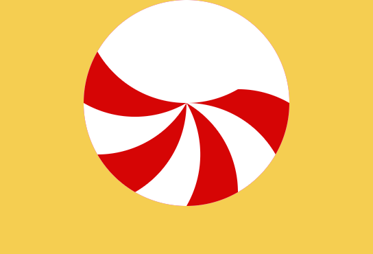
Please find the Codepen. Giving the sample code snippet
<div class="frame">
  <div class="lolly-pop__wrapper">
    <div class="lollypop-top">
      <div class="lollypop-top__item"></div>
      <div class="lollypop-top__item"></div>
      <div class="lollypop-top__item"></div>
      <div class="lollypop-top__item"></div>
      <div class="lollypop-top__item"></div>
      <div class="lollypop-top__item"></div>
      <div class="lollypop-top__item"></div>
      <div class="lollypop-top__item"></div>
      <div class="lollypop-top__item"></div>
      <div class="lollypop-top__item"></div>
      <div class="lollypop-top__item"></div>
      <div class="lollypop-top__item"></div>
    </div>
  </div>
</div>


.frame {
  position: absolute;
  display: flex;
  justify-content: center;
  top: 50%;
  left: 50%;
  width: 400px;
  height: 400px;
  margin-top: -200px;
  margin-left: -200px;
  border-radius: 2px;
  box-shadow: 4px 8px 16px 0 rgba(0,0,0,0.1);
  overflow: hidden;
  background: #F5CE51;
  color: #333;
  font-family: 'Open Sans', Helvetica, sans-serif;
  -webkit-font-smoothing: antialiased;
  -moz-osx-font-smoothing: grayscale;
}

.lollypop-top {
    position: relative;
    height: 150px;
    width: 150px;
    background-color: #fff;
    border-radius: 100%;
    overflow: hidden;

    .lollypop-top__item {
        position: absolute;
        height: 150px;
        width: 150px;
        top: -50%;
        border-radius: 100%;
        transform-origin: bottom;
        background-color: #fff;

        &:nth-child(odd) {
            background-color: #D70606;
        }

        &:nth-child(1) {
            transform: rotate(30deg);
        }

        &:nth-child(2) {
            transform: rotate(60deg);
        }

        &:nth-child(3) {
            transform: rotate(90deg);
        }

        &:nth-child(4) {
            transform: rotate(120deg);
        }

        &:nth-child(5) {
            transform: rotate(150deg);
        }

        &:nth-child(6) {
            transform: rotate(180deg);
        }

        &:nth-child(7) {
            transform: rotate(210deg);
        }

        &:nth-child(8) {
            transform: rotate(240deg);
        }

        &:nth-child(9) {
            transform: rotate(270deg);
        }

        &:nth-child(10) {
            transform: rotate(300deg);
        }

        &:nth-child(11) {
            transform: rotate(330deg);
        }

        &:nth-child(12) {
            transform: rotate(360deg);
        }
      }
    }
.frame {
  position: absolute;
  display: flex;
  justify-content: center;
  top: 50%;
  left: 50%;
  width: 400px;
  height: 400px;
  margin-top: -200px;
  margin-left: -200px;
  border-radius: 2px;
  box-shadow: 4px 8px 16px 0 rgba(0, 0, 0, 0.1);
  overflow: hidden;
  background: #F5CE51;
  color: #333;
  font-family: 'Open Sans', Helvetica, sans-serif;
  -webkit-font-smoothing: antialiased;
  -moz-osx-font-smoothing: grayscale;
}

.lollypop-top {
  position: relative;
  height: 150px;
  width: 150px;
  background-color: #fff;
  border-radius: 100%;
  overflow: hidden;
}

.lollypop-top .lollypop-top__item {
  position: absolute;
  height: 150px;
  width: 150px;
  top: -50%;
  border-radius: 100%;
  transform-origin: bottom;
  background-color: #fff;
}

.lollypop-top .lollypop-top__item:nth-child(odd) {
  background-color: #D70606;
}

.lollypop-top .lollypop-top__item:nth-child(1) {
  transform: rotate(30deg);
}

.lollypop-top .lollypop-top__item:nth-child(2) {
  transform: rotate(60deg);
}

.lollypop-top .lollypop-top__item:nth-child(3) {
  transform: rotate(90deg);
}

.lollypop-top .lollypop-top__item:nth-child(4) {
  transform: rotate(120deg);
}

.lollypop-top .lollypop-top__item:nth-child(5) {
  transform: rotate(150deg);
}

.lollypop-top .lollypop-top__item:nth-child(6) {
  transform: rotate(180deg);
}

.lollypop-top .lollypop-top__item:nth-child(7) {
  transform: rotate(210deg);
}

.lollypop-top .lollypop-top__item:nth-child(8) {
  transform: rotate(240deg);
}

.lollypop-top .lollypop-top__item:nth-child(9) {
  transform: rotate(270deg);
}

.lollypop-top .lollypop-top__item:nth-child(10) {
  transform: rotate(300deg);
}

.lollypop-top .lollypop-top__item:nth-child(11) {
  transform: rotate(330deg);
}

.lollypop-top .lollypop-top__item:nth-child(12) {
  transform: rotate(360deg);
}
<div class="frame">
<div class="lolly-pop__wrapper">
<div class="lollypop-top">
<div class="lollypop-top__item"></div>
<div class="lollypop-top__item"></div>
<div class="lollypop-top__item"></div>
<div class="lollypop-top__item"></div>
<div class="lollypop-top__item"></div>
<div class="lollypop-top__item"></div>
<div class="lollypop-top__item"></div>
<div class="lollypop-top__item"></div>
<div class="lollypop-top__item"></div>
<div class="lollypop-top__item"></div>
<div class="lollypop-top__item"></div>
<div class="lollypop-top__item"></div>
</div>
</div>
</div>
