4

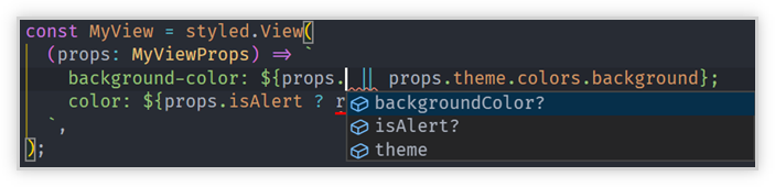
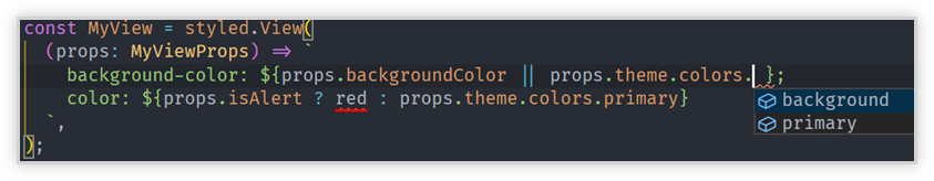
I'm new to styled components and I'd like to be able to type my styled components correctly so that when I pass props "vs code" I can autodetect all those props I have, not just the one in the theme or the ones I could put with an interface.

Would there be any way without using a HOC for it as I've seen in some other answer? Is it possible to get a general prop to use in all without having to be defining in each property of style this as in the example?

app.theme.ts

export const theme = {
  palette: {
    primaryColor: '#FF5018',
    secondaryColor: '#252729',
    tertiaryColor: '#1A1C1E',
    textColor: 'white',
  },
};

export type Theme = typeof theme;

navigation-bar.styled.component.ts

export const NavigationBarStyled = styled.div`
  grid-area: navigation-bar-item;
  padding-left: 2rem;
  display: flex;
  align-items: center;
  color: ${({ theme }) => theme.palette.primaryColor};
  background-color: ${({ theme }) => theme.palette.primaryColor};
`;

Thanks in advance, Best

frangaliana
  • 793
  • 8
  • 17

4 Answers4

9

It could be solved as @Huy-Nguyen said but in practice, you lose properties on Styled Components or you have to define the same many times.

So the best option is this as the Styled-Components website says (to define a theme interface):

theme.ts

export default interface ThemeInterface {
  primaryColor: string;
  primaryColorInverted: string;
}

styled-components.ts

import * as styledComponents from "styled-components";

import ThemeInterface from "./theme";

const {
  default: styled,
  css,
  createGlobalStyle,
  keyframes,
  ThemeProvider
} = styledComponents as styledComponents.ThemedStyledComponentsModule<ThemeInterface>;

export { css, createGlobalStyle, keyframes, ThemeProvider };
export default styled;

And then, you use that:

import styled from 'app/styled-components';

// theme is now fully typed
const Title = styled.h1`
  color: ${props => props.theme.primaryColor};
`;

Just pass the link: https://www.styled-components.com/docs/api#define-a-theme-interface

Thank you so much for all.

frangaliana
  • 793
  • 8
  • 17
2

For some reason (possibly due to the way styled-components's typescript definition is written), the typing for Theme works if you remove one of level of nesting. This snippet typechecks with no error for me (v4) i.e. typescript knows that primaryColor is a string:

const theme = {
  primaryColor: '#FF5018',
  secondaryColor: '#252729',
  tertiaryColor: '#1A1C1E',
  textColor: 'white',
};

type Theme = typeof theme;

type Props = Theme & {
  // ... other keys
}

const NavigationBarStyled = styled.div<Props>`
  grid-area: navigation-bar-item;
  padding-left: 2rem;
  display: flex;
  align-items: center;
  color: ${props => props.primaryColor};
  background-color: ${props => props.primaryColor};
`;
Huy Nguyen
  • 2,840
  • 1
  • 14
  • 18
  • Hi @Huy-Nguyen, thank you for the answer but with this implementation of Props you don't lose other properties about Styled Components or React? Because you reduce the possibilities simply to have either theme properties or the custom ones you enter or not? – frangaliana Mar 15 '19 at 23:25
  • And... Is it possible to call accessories once to use them all? Thanks in advance! – frangaliana Mar 16 '19 at 07:03
2

We approached this is a different way.
NOTE: Styled Components v5 with React Native

  • Define your theme type.

    // MyTheme.ts
    
    export type MyTheme = {
      colors: {
        primary: string;
        background: string;
      };
    };
    
  • Use the type on your themes.

    // themes.ts
    
    export const LightTheme: MyTheme = {
      colors: {
        primary: 'white',
        background: 'white',
      },
    };
    
    export const DarkTheme: MyTheme = {
      colors: {
        primary: 'grey',
        background: 'black',
      },
    };
    
  • Use declaration merging to "merge" the MyTheme type into Styled Components default theme.

    // styled.d.ts
    
    import 'styled-components';
    import { MyTheme } from '../src/themes/MyTheme';
    
    declare module 'styled-components' {
      // eslint-disable-next-line @typescript-eslint/no-empty-interface
      export interface DefaultTheme extends MyTheme {}
    }
    

OK, cool. The theme prop is correctly typed.
What about the components themselves?

  • Wrap your specific component props in the StyledProps type.

    import { StyledProps } from 'styled-components';
    import styled from 'styled-components/native';
    
    type MyViewProps = StyledProps<{
      backgroundColor?: string;
      isAlert?: boolean;
    }>;
    
    const MyView = styled.View(
      (props: MyViewProps) => `
        background-color: ${props.backgroundColor || props.theme.colors.background};
        color: ${props.isAlert ? red : props.theme.colors.primary}
      `,
    );
    

In this example both props.backgroundColor and props.theme.colors.background will auto-complete. When you update MyTheme type or the specific component type it should just work.

component auto-complete

them auto-complete

GollyJer
  • 23,857
  • 16
  • 106
  • 174
  • I swear this approach has always worked for me. But something in the current project I'm working on is different and all I'm seeing for the type on `props` is `any`. The only thing I'm doing different is I'm using `StyledComponentsThemeProvider`. Do you have any ideas why I'm just getting any on props? – juliusbangert Jun 13 '20 at 18:29
0

I don't know if it's the best method. But I found a solution as follows.

// theme.ts
const theme = {
  colors: {
     ...
  }
};
export type themeTypes = typeof theme;
export default theme;


// styled.d.ts ( in root folder )
import 'styled-components'
import { themeTypes } from '@/styles/theme'

declare module 'styled-components' {
  // eslint-disable-next-line @typescript-eslint/no-empty-interface
  export interface DefaultTheme extends themeTypes {}
}
Dharman
  • 30,962
  • 25
  • 85
  • 135
Kasim ŞEN
  • 743
  • 7
  • 10