Sorry for the generically worded title, anyway, I have some simple HTML like so:
<div class="block flex-1 mx-4 relative w-1/2">
    <div class="form-group label-floating">
        <label class="control-label">Password</label>
        <input class="form-control" placeholder="" type="password">
        <span class="material-input"></span>
    </div>
</div>
Now, whenver a person clicks the input, I am shrinking the label size like so:
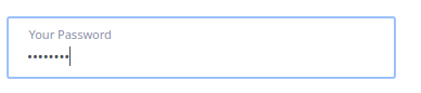
With the following css:
&.label-floating {

    &:focus-within {
        & > .control-label {
            top: 10px;
            font-size: 11px;
            line-height: 1.07143;
        }
    }
}
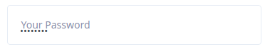
Now, my problem is, if the input is not empty and the user leaves the input, the label will return to the normal size. So I have tried things like so:
with the following css:
&.label-floating {

    &:focus-within {
        & > .control-label {
            top: 10px;
            font-size: 11px;
            line-height: 1.07143;
        }
    }

    & input:not(:empty){
        & .control-label {
            top: 10px;
            font-size: 11px;
            line-height: 1.07143;
        }
        & < .control-label {
            top: 10px;
            font-size: 11px;
            line-height: 1.07143;
        }
    }
}
With no avail, so, my question is, is there a way to achieve what I want, with pure css?
edit: can someone please edit the OP to embed the images, please.
Updated with pure css:
.form-group {
  margin-bottom: 1.5rem;
  position: relative;
}

.form-group > .control-label {
  color: #888da8;
}

.form-group.label-floating:focus-within > .control-label {
  top: 10px;
  font-size: 11px;
  line-height: 1.07143;
}

.form-group.label-floating input:not(:empty) .control-label {
  top: 10px;
  font-size: 11px;
  line-height: 1.07143;
}