I have a data frame that looks like this:
  rowname  Class Sec    ES.2um Mean_WPBs   ES.2um_ZS   Mean_ES  VWF_Sec    name
        1 Formin HAI 113.37340  147.1792  0.16078492 131.69309 112.5219  DIAPH1
        2 Formin PMA  43.90661  121.9017 -0.11594028  75.37296 137.4212    FMN2
        3 Septin HAI  64.32138  132.7591 -0.16218581  66.23765 150.9011 SEPTIN5
        4 Septin PMA  53.15791  145.7871 -0.86969449  81.92690 140.2647   LRCH3
        5 Arp2/3 PMA  68.67222  161.0516 -0.05404113  82.51804 158.2623   ARPC3
        6 Arp2/3 HAI  71.00643  149.0704 -0.38119473  82.91458 130.5494   WASF3
In the "Sec" column, the row can either be "HAI" or "PMA". I am currently using gghighlight to identify a class of proteins:
plot_ll <- ggplot(df, aes(ES.2um_ZS, VWF_Sec, col = Sec,)) +
    geom_point(size = 2.5) +
    geom_point(aes(col=Sec)) +
    geom_point() +
    labs (col="Secretaogue") +
    xlim(-1.25,0.7) + ylim(70,178) +
    scale_colour_manual(values=c("HAI" = "blue", "PMA" = "red")) +
    gghighlight(Class == "Formin", use_direct_label = FALSE, label_key = name, unhighlighted_colour = alpha("green", 0.0)) +
    ggtitle("Formin Proteins Highlighted") +
    theme_bw() +
    theme(plot.title = element_text(hjust =0.5)) +
    xlab("Mean Exit Site Z-Score (Area >2um)") + ylab("Secretion") +
    geom_hline(yintercept = mean_VWF, color = "black", linetype = "dashed") +
    annotate("text", -1.2, 173, label="Mean", color = "black") +
    geom_vline (xintercept = mean_ES.Z, color = "black", linetype = "dashed") +
    annotate("text", 0.5, 70, label = "Mean", color = "black")
Which gives something looking like this (sorry this isn't quite the same as the sample data frame above, but that data will given a similar chart for the purposes of the question):
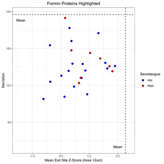
Please note that gghighlight is working, it's just the alpha value for the bleached points is set to 0 so you can't see them.
I also want to label the points with the protein names from the "name" column, so turned on use_direct_label:
plot_ll <- ggplot(df, aes(ES.2um_ZS, VWF_Sec, col = Sec,)) +
    geom_point(size = 2.5) +
    geom_point(aes(col=Sec)) +
    geom_point() +
    labs (col="Secretaogue") +
    xlim(-1.25,0.7) + ylim(70,178) +
    scale_colour_manual(values=c("HAI" = "blue", "PMA" = "red")) +
    gghighlight(Class == "Formin", use_direct_label = TRUE, label_key = name, unhighlighted_colour = alpha("green", 0.0)) +
    ggtitle("Formin Proteins Highlighted") +
    theme_bw() +
    theme(plot.title = element_text(hjust =0.5)) +
    xlab("Mean Exit Site Z-Score (Area >2um)") +
    ylab("Secretion") +
    geom_hline(yintercept = mean_VWF, color = "black", linetype = "dashed") +
    annotate("text", -1.2, 173, label="Mean", color = "black") +
    geom_vline (xintercept = mean_ES.Z, color = "black", linetype = "dashed") +
    annotate("text", 0.5, 70, label = "Mean", color = "black")
This of course gets rid of the legend. However, now there is no way to know which are "HAI" points and which are "PMA":
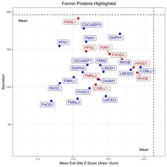
How can I retain the legend to differentiate between HAI and PMA, whilst labelling each point with the corresponding protein name?
One way might be to just manual add a legend - is this possible?
Any help would be really appreciated