0

I wanted to do when window size is getting small or mobile mode picture will shown below to the navbar and then my name and other details will be shown. I dont understand how to use media query in that.
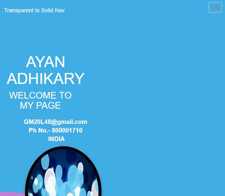
DESKTOP PREVIEW

enter image description here

MOBILE PREVIEW

enter image description here

@media (min-width: 700px) {
  .col-md-8 {
    margin-top: 5px !important;
    float: left;
    display: block;
  }
}
<div id="s">
  <div class="row">
    <div class="col-md-8">
      <h1>AYAN ADHIKARY</h1>
      <h4> WELCOME TO MY PAGE</h4>
      <p> GM20L48@gmail.com <br> Ph No.- 800001710 <br> INDIA
      </p>
    </div>
    <div class="col-md-4">
      <img src="1.png">
    </div>
  </div>
</div>
DreamTeK
  • 32,537
  • 27
  • 112
  • 171
AYAN ADHIKARY
  • 33
  • 1
  • 4
  • 12
  • https://stackoverflow.com/questions/41698747/using-media-breakpoints-in-bootstrap-4-alpha – Moe Mar 20 '19 at 13:40

2 Answers2

0

First of all., overriding bootstrap class is not good practice. Check this code.

Replace with your image

<link href="https://maxcdn.bootstrapcdn.com/bootstrap/4.0.0/css/bootstrap.min.css" rel="stylesheet"/>
<div class="row">
 
  
<div class="col-12 col-sm-4 col-sm-push-8">
    <img class="img-fluid" src="C://Users/sabarinath j/Pictures/Screenshots/Screenshot (1).png">
  </div>
<div class="col-12 col-sm-8 col-sm-pull-4 text-center text-sm-left">
   <h1>AYAN ADHIKARY</h1>
   <h4> WELCOME TO MY PAGE</h4>
    <p> GM20L48@gmail.com <br>
      Ph No.- 800001710 <br>
      INDIA</p>
  </div>  
</div>
sabarinath
  • 39
  • 9
0

There's no need to make changes to Bootstrap classes, the point of Bootstrap is to add classes to define how you want your content to display on each screen. Remember that the grid system for Bootstrap uses 12 columns; so if you define a column to use the 12 spaces, the next element will go to a new row.

In the snippet I'm telling the first element of the row to use 12 out of 12 columns on mobile devices and 8 columns on tablet devices and above, and the second element to use also 12 out of 12 columns and 4 columns on tablet devices and above;

All you have to do is play with the classes to arrange your elements that way you need.

<link href="https://stackpath.bootstrapcdn.com/bootstrap/4.3.1/css/bootstrap.min.css" rel="stylesheet" />
<div id="s">
  <div class="row">
    <div class="col-12 col-md-8">
      <h1>AYAN ADHIKARY</h1>
      <h4> WELCOME TO MY PAGE</h4>
      <p> GM20L48@gmail.com <br> Ph No.- 800001710 <br> INDIA
      </p>
    </div>
    <div class="col-12 col-md-4">
      <img src="https://via.placeholder.com/300" class="img-fluid">
    </div>
  </div>
</div>
IvanS95
  • 5,364
  • 4
  • 24
  • 62