I'm generating scatter plot of the comparison of 2 variables in a data frame, where the colors of the points were determined by their type (another column in the data frame). However, there are many points that overlap each other and therefore I want an estimation of how many points there are in a given part of the grid. (for example: In case of hexbin package, one can estimate how many values there are in a given hexagon on the grid)
My question is: how can I use the hexbin package where for every group I will have another color scale, so in that way it will be possible to distinguish between the groups and get an evaluation of how many values there are.
I tried to google it but didn't find any satisfying solution. All the options that I found were focused only on the distinction between the groups.
My code so far:
ggplot(data_for_scatter_plot,aes(x=Log2FoldChange, y=TT_frequency, color=factor(Type))) +
geom_point(alpha = 0.6)
where my data_for_scatter_plot data frame is:
 Gene             Log2FoldChange  length  TT_frequency  Type
 ENSG00000007968  1.928153        24791   0.05623008    up_regulated
 ENSG00000009724  2.209263        20711   0.05842306    down_regulated
 ENSG00000010219  1.794972        53099   0.08250626    other_genes
 ENSG00000053438  3.815411        2479    0.10851150    up_regulated
And the graph that I get is:

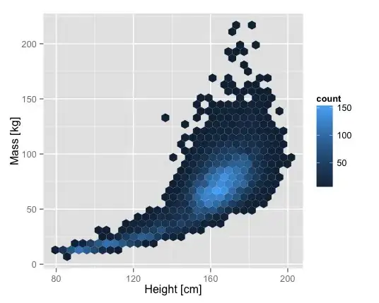
While I want to get the following graph for each group in a different color scale: