> dput(head(inputData))
structure(list(Date = c("2018:07:00", "2018:06:00", "2018:05:00",
"2018:04:00", "2018:03:00", "2018:02:00"), IIP = c(125.8, 127.5,
129.7, 122.6, 140.3, 127.4), CPI = c(139.8, 138.5, 137.8, 137.1,
136.5, 136.4), `Term Spread` = c(1.580025, 1.89438, 2.020112,
1.899074, 1.470544, 1.776862), RealMoney = c(142713.9916, 140728.6495,
140032.2762, 139845.5215, 139816.4682, 139625.865), NSE50 = c(10991.15682,
10742.97381, 10664.44773, 10472.93333, 10232.61842, 10533.10526
), CallMoneyRate = c(6.161175, 6.10112, 5.912088, 5.902226, 5.949956,
5.925538), STCreditSpread = c(-0.4977, -0.3619, 0.4923, 0.1592,
0.3819, -0.1363)), row.names = c(NA, -6L), class = c("tbl_df",
"tbl", "data.frame"))
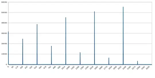
I want to make my autoregressive plot like this plot:

#------> importing all libraries
library(readr)
install.packages("lubridtae")
library("lubridate")
install.packages("forecast")
library('ggplot2')
library('fpp')
library('forecast')
library('tseries')

#--------->reading data
inputData <- read_csv("C:/Users/sanat/Downloads/exercise_1.csv")

#--------->calculating the lag=1 for NSE50

diff_NSE50<-(diff(inputData$NSE50, lag = 1, differences = 1)/lag(inputData$NSE50))
diff_RealM2<-(diff(inputData$RealMoney, lag = 1, differences = 1)/lag(inputData$RealMoney))


plot.ts(diff_NSE50)
#--------->
lm_fit = dynlm(IIP ~ CallMoneyRate + STCreditSpread + diff_NSE50 + diff_RealM2, data = inputData)
summary(lm_fit)
#--------->
inputData_ts = ts(inputData, frequency = 12, start = 2012)

#--------->area of my doubt is here

VAR_data <- window(ts.union(ts(inputData$IIP), ts(inputData$CallMoneyRate)))
VAR_est <- VAR(y = VAR_data, p = 12)
plot(VAR_est)
I want to my plots to get plotted together in same plot. How do I serparate the var() plots to two separate ones.
Current plot:
My dataset : dataset