I have this website that looks like how I want it to look like on desktop. When I view the website in the console (eg, check responsiveness) the website looks fine. But, when I upload the changes to AWS and view the website on my phone the vh and flexbox aren't working like I'm expecting them to.
View the website on your desktop and go to the console. From the console change toggle the device toolbar and change it the view to any of the phones. It works as intended. But then check the website out on your phone. What your viewing on the console is not what you'll see on your own phone.
I'd like the nav-bar, question, and chatbox, and input box all on one screen. Right now a use has to scroll through the chat in order to reach the input box. Once they reach the inputbox, they can't see the navbar or the question.
I'm trying to follow this guide
Chrome / Safari not filling 100% height of flex parent
But I'm still struggling. Not sure if anyone can go to my website and see the what's causing the problem.
There is too much code for me to put on here to hone in on the problem
I got rid of ALL height:100% css styles. I have very few height: ??px css styles. All 100:vh attributes are correctly implemented (I believe) as well as display:flex properties. If anyone can help, that'd be amazing.
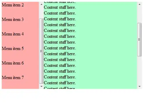
Heres how mobile looks in the web console (which is what I want)
Heres how it looks (as an example) when you go on the website on your mobile phone. (Which is what I do NOT want)
EDIT can someone delete this post?
I fixed it by using display:flex and flex:1 in the correct divs. (I missed a few)

