So I'm trying to code the following layout using css and bootstrap 4:
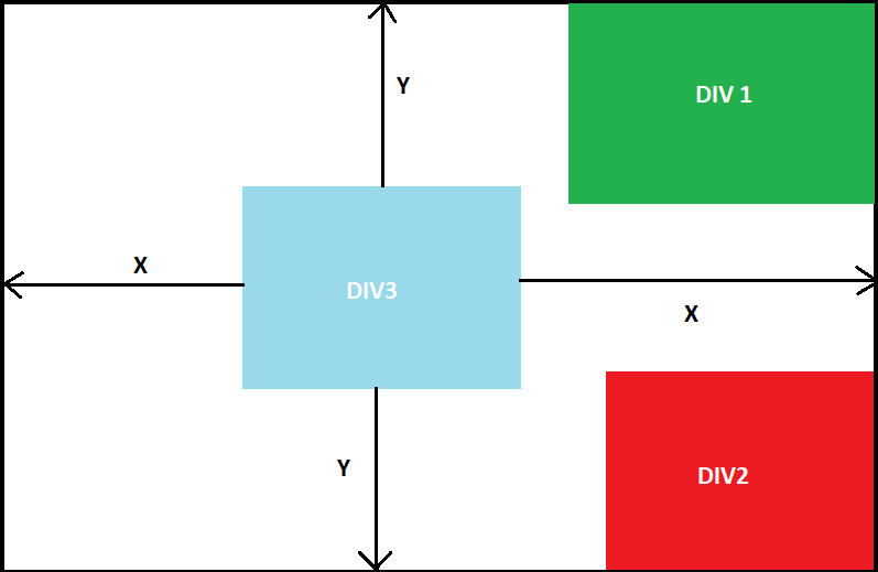
Basically DIV1 and DIV2 are part of the background and should always stay where they are, i.e. DIV1 always right upper corner, DIV2 right bottom corner.
I achieved that with:
#DIV1 {
    position: relative;
}
#DIV1 img {
    position: absolute;
    top: 50px;
    right: 25px;
    width: 20%;
    height: auto;
}

#DIV2 {
    position: relative;
}

#DIV2 img {
    position: fixed;
    bottom:-150px;
    right:-50px;
    width: 40%;
    height: auto;
}
But I can't figure out how to have the DIV3 which is not part of the background and should cover DIV1 and DIV2 if needed. DIV3 should be centered vertically and horizontally and should be responsive, i.e. should scale down on smaller screens. I'm not sure how to achieve that, would that be a use case for the bootstrap grid? Should I place the DIV1 DIV2 and DIV3 in a grid?