15

I'm trying to do a "search contact list" feature with some chips representing selected contacts, and a user can type on text field to filter and add more contacts:

Desired result

This is done with a Wrap widget, wrapping a list of Chip widgets, and ending the list with a Container of a TextField widget.

What I've tried:

If I do not set the width of the TextField, it defaults to occupy a whole line. Let's make it red for clarity:

Default width is whole line

I do not want a whole line for it, so I set it to a small value, 50. But this doesn't work if the text is long:

Fixing width hides long texts

Question:

Is it possible to make the TextField starts small, and auto expands to a whole line when needed? I've tried "minWidth" in BoxConstraint but since the TextField defaults to a whole line, that doesn't work. Is using Wrap and TextField the correct way here?

WSBT
  • 33,033
  • 18
  • 128
  • 133

4 Answers4

61

Use IntrinsicWidth widget to size a child to the child's maximum intrinsic width. In this case, effectively shrink wrapping the TextField:

IntrinsicWidth(
  child: TextField(),
)

However, this will make the TextField too small when it's empty. To fix that, we can use ConstrainedBox to force a minimum width constraint. For example:

ConstrainedBox(
  constraints: BoxConstraints(minWidth: 48),
  child: IntrinsicWidth(
    child: TextField(),
  ),
)

End result:

enter image description here

WSBT
  • 33,033
  • 18
  • 128
  • 133
3

Over a whole year has passed since I asked and forgot about this question... I gave it a little bit more thoughts today, and took a different approach this time.

The key problem is that, we are not able to let TextField occupy just the right amount of space. So this approach uses a simple Text to display the text content, and use a very thin TextField (at 4 px) just to make it render the blinking cursor, shown in red:

widget composition diagram

Feel free to use this approach as a starting point if it helps anyone.

Usage:

TextChip()

Demo:

Code: (draft, works as demoed above; should only be used as a starting point)

class TextChip extends StatefulWidget {
  @override
  _TextChipState createState() => _TextChipState();
}

class _TextChipState extends State<TextChip> {
  final _focus = FocusNode();
  final _controller = TextEditingController();
  String _text = "";

  @override
  Widget build(BuildContext context) {
    return InputChip(
      onPressed: () => FocusScope.of(context).requestFocus(_focus),
      label: Stack(
        alignment: Alignment.centerRight,
        overflow: Overflow.visible,
        children: [
          Text(_text),
          Positioned(
            right: 0,
            child: SizedBox(
              width: 4, // we only want to show the blinking caret
              child: TextField(
                scrollPadding: EdgeInsets.all(0),
                focusNode: _focus,
                controller: _controller,
                style: TextStyle(color: Colors.transparent),
                decoration: InputDecoration(
                  border: InputBorder.none,
                ),
                onChanged: (_) {
                  setState(() {
                    _text = _controller.text;
                  });
                },
              ),
            ),
          ),
        ],
      ),
    );
  }
}
WSBT
  • 33,033
  • 18
  • 128
  • 133
1

I tried but failed. I have issues figuring out when the TextField overflows. This solution cannot work with dynamically changing chips since tp.layout(maxWidth: constraints.maxWidth/2); is hard coded.

There are two options to fix this solution:

  • TextController has a overflow flag

  • In tp.layout(maxWidth: constraints.maxWidth/2), LayoutBuilder can figure out the width left over from chips.

Here is my attempt

enter image description here

import 'package:flutter/material.dart';

void main() => runApp(MyApp());

class MyApp extends StatelessWidget {
  // This widget is the root of your application.
  @override
  Widget build(BuildContext context) {
    return MaterialApp(
      title: 'Flutter Demo',
      theme: ThemeData(
        primarySwatch: Colors.blue,
      ),
      home: MyHomePage(title: 'Flutter Demo Home Page'),
    );
  }
}

class MyHomePage extends StatefulWidget {
  MyHomePage({Key key, this.title}) : super(key: key);

  final String title;

  @override
  _MyHomePageState createState() => _MyHomePageState();
}

class _MyHomePageState extends State<MyHomePage> {
  TextEditingController _controller;
  String _text = "";
  bool _textOverflow = false;
  @override
  void initState() {
    // TODO: implement initState
    super.initState();
    _textOverflow = false;
    _controller = TextEditingController();
    _controller.addListener((){
      setState(() {
        _text = _controller.text;
      });
    });
  }
  @override
  void dispose() {
    // TODO: implement dispose
    super.dispose();
    _controller.dispose();
  }

  Widget chooseChipInput(BuildContext context, bool overflow, List<Widget> chips) {
    return Column(
      mainAxisAlignment: MainAxisAlignment.start,
      children: <Widget>[
        overflow ? Wrap(children: chips, alignment: WrapAlignment.start,): Container(),
        Container(
          color: Colors.red,
          child: TextField( 
            controller: _controller,
            maxLines: overflow ? null : 1,
            decoration:  InputDecoration(icon: overflow ? Opacity(opacity: 0,) : Wrap(children: chips,)),
          ),
        )

      ]
    );
  }

  @override
  Widget build(BuildContext context) {
    const _counter = 0;
    return Scaffold(
      appBar: AppBar(
        title: Text(widget.title),
      ),
      body: Center(
        child: Column(
          mainAxisAlignment: MainAxisAlignment.center,
          children: <Widget>[
            Text(
              'You have pushed the button this many times:',
            ),
            Text(
              '$_counter',
              style: Theme.of(context).textTheme.display1,
            ),

            LayoutBuilder(builder: (context, constraints){
                var textStyle = DefaultTextStyle.of(context).style;
                var span = TextSpan(
                  text: _text,
                  style: textStyle,
                );
                // Use a textpainter to determine if it will exceed max lines
                var tp = TextPainter(
                  maxLines: 1,
                  textAlign: TextAlign.left,
                  textDirection: TextDirection.ltr,
                  text: span,
                );
                // trigger it to layout
                tp.layout(maxWidth: constraints.maxWidth/2);

                // whether the text overflowed or not
                print("****** ${tp.didExceedMaxLines} ${constraints.maxWidth}");
                return chooseChipInput(
                  context, 
                  tp.didExceedMaxLines, 
                  <Widget>[Chip(label: Text("chip1"),), 
                      Chip(label: Text("chip2")),]
                );
            },),

          ],
        ),
      ),
    );
  }
}

This attempt comprised of a few parts:

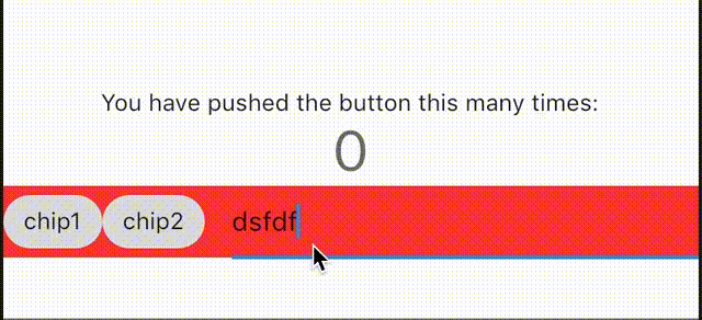
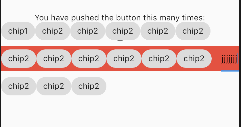
Edit3: Added picture when you add tons of chips and fix the Column(Warp) enter image description here enter image description here

Like I said, the largest problem is that I cannot figure out when the text box overflows.

Anyone else wants try? I think this question needs a custom plugin to solve

Edit2: I found the library but I did not test it https://github.com/danvick/flutter_chips_input

user1462442
  • 7,672
  • 1
  • 24
  • 27
  • +1 for the time and effort. Would this work when there are more chips and starts wrapping to the next line? For example, if 10 contacts are selected, it probably will take 2-3 lines to display the chips. – WSBT Apr 04 '19 at 17:53
  • Yea, I should had tested lots of chip. InputDecoration obviously cannot handle multiple rows. I guess we need to detect when chips moves to the next line – user1462442 Apr 04 '19 at 21:41
0

If you also want to the decoration has the same size with textfield, use

isCollapsed

In my case, the app just allows the user input maximum 8 characters and do not need to show counter text or error widgets. Here is an example:

ConstrainedBox(
            constraints: const BoxConstraints(minWidth: 50),
            child: IntrinsicWidth(
              child: TextField(
                controller: _textController,
                keyboardType: TextInputType.number,
                maxLength: 8,
                cursorColor: MyTheme.grey2,
                decoration: const InputDecoration(
                  border: textFieldBorder,
                  focusedBorder: textFieldBorder,
                  counterText: '',
                  contentPadding:
                      EdgeInsets.symmetric(vertical: 4, horizontal: 6),
                  isCollapsed: true,
                ),
                style: Theme.of(context)
                    .textTheme
                    .labelSmall
                    ?.copyWith(color: MyTheme.grey2),
              ),
            ),
          ),
NhatVM
  • 1,964
  • 17
  • 25