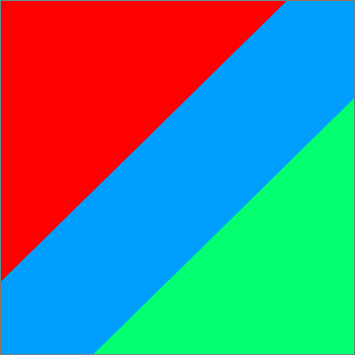
You can use a simple gradient to achieve this:
.box {
  width:150px;
  height:150px;
  background:
    linear-gradient(to bottom right,red 35%,blue 35%,blue 65%,yellow 65%);
}
<div class="box">

</div>
With 3 divs you can try like below with transform:
.box {
  width:150px;
  height:150px;
  position:relative;
  overflow:hidden;
}

.box :first-child {
  width:100%;
  height:100%;
  background:blue;
}
.box :nth-child(2),
.box :last-child {
  position:absolute;
  width:141%; /*sqrt(2)x100% */
  height:141%;
}

.box :nth-child(2) {
  top:0;
  left:0;
  background:red;
  transform:rotate(45deg) translate(-90%);
}
.box :last-child {
  bottom:0;
  right:0;
  background:yellow;
  transform:rotate(45deg) translate(90%)
}
<div class="box">
  <div></div>
  <div></div>
  <div></div>
</div>
You can easily add animation using the first method by applying multiple background:
.box {
  width:150px;
  height:150px;
  background:
    linear-gradient(to bottom right,red   50%,transparent 0),
    linear-gradient(to top left    ,yellow 50%,transparent 0),
    blue;
  background-size:200% 200%;
  background-position:100% 100%,0 0;
  transition:1s all;
}
.box:hover {
  background-position:50% 50%;
}
<div class="box">

</div>
also using the second method by adjusting the translate value:
.box {
  width:150px;
  height:150px;
  position:relative;
  overflow:hidden;
}

.box :first-child {
  width:100%;
  height:100%;
  background:blue;
}
.box :nth-child(2),
.box :last-child {
  position:absolute;
  width:141%; /*sqrt(2)x100% */
  height:141%;
  transition:1s all;
}

.box :nth-child(2) {
  top:0;
  left:0;
  background:red;
  transform:rotate(45deg) translate(calc(-1 * var(--p,120%)));
}
.box :last-child {
  bottom:0;
  right:0;
  background:yellow;
  transform:rotate(45deg) translate(var(--p,120%))
}

.box:hover{
  --p:70%;
}
<div class="box">
  <div></div>
  <div></div>
  <div></div>
</div>
It can also work responsively:
.box {
  height:100vh;
  background:
    linear-gradient(to bottom right,red    50%,transparent 50.1%),
    linear-gradient(to top left    ,yellow 50%,transparent 50.1%),
    blue;
  background-size:200% 200%;
  background-position:100% 100%,0 0;
  transition:1s all;
}
.box:hover {
  background-position:50% 50%;
}

body {
 margin:0;
}
<div class="box">

</div>
For more details about the values used with background: Using percentage values with background-position on a linear gradient